Poster 2
This drink has been rated for mature audiences only
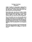
Fig 3
I have chosen this poster to look at as it is on the other side of Health issues and that is promoting alcohol. Promoting alcohol is a very sensitive subject as people are much more health consious and concerned about health issues and like cigaretttes alcohol is an addictive drug “the root of all evil”.
Here (fig3) this is the Dewars Scotch advert for the drink Absolute Vodka. You can see an attractive women on the top holding a tray with glasses of drink probably vodka on it clearly happy and enjoying her self. Underneath her is a bottle of the vodka tighly secure in a chain, padlock and key with the words “This drink has been rated for mature audiences only”. At first sight this advert is giving the message to the recipient to discourage them from under age drinking. I feel that the alcohol industry does not want the under age to drink but it does want to promote a positive attitude towards drink before they start drinking. This advert is I feel one of those from the originator aimed at those adolescents who are anxious to enter into adult life by almost encouraging them with the words “This drink has been rated for mature audiences only”
As stated in the Advertising Age “product image is probably the most important element in selling liquor” Dewar’s Scotch ran this advert as part of it’s successful long running campaign for Absolut vodka managing to create that image. As you can see in the poster it focuses on the shape of the bottle and the word Absolut I think they are trying to promate it as absolut perfection hence why the bottle is set in a halo. What the chains symbolise I am not sure but I do feel if that you are a problem drinker you will be chained to that bottle.
I do feel that this advert is aimed at the image, and making that image of drinking sexy. I do feel that this is not good for the future of our generation the children and adolescents. Cigarettes have to carry a Government Health warning and are limited to where and how the adverts are displayed and I do feel that alcohol should be treated the same, rather than promted as sexy like the cigarettes were up to world war two.
Poster 3
“AIDS how big does it have to get before you take notice”
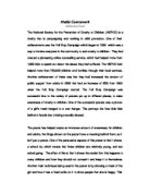
Fig 4
This next poster (fig 4) was designed by Malcolm Gaskin and David O’Connor Thompson, for the Ministry of Health and Social Security in the United Kingdom back in 1987.
The letters AIDS are engraved in what looks like a gravestone. The gravestone has been used as it symbolises death and unfortunately that is the result if you contract full AIDS. This is very haunting and should have made a huge impact on its target audience, the target audience being the general public of any sexuality.
The message this poster is giving is a very strong one telling the audience that they must use a condom with every sexual partner and implying that if they do not it could result in death. A very stark message, but it is one that the Government wanted putting across. The poster also states “how big has AIDS got to be before the you take notice”, this is telling the audience (you) that AIDS has not got to be ignored it is here and in huge proportions.
This poster is as direct and straight to the point as it could be, I think it was designed to shock the public into realising the AIDS cannot be taken lightly anymore. Unfortunately does not really give as much information as it could just by saying that a condom must be used, it does not say where they can be obtained or how AIDS is exactly contracted. This direct approach of informing the public of AIDS would have made some angry, as it is very threatening. They should have also considered those with AIDS or the people who have had to cope with AIDS in there life and are dealing with it, as those people need hope and positive thinking and I feel that this poster takes all that away.
I do feel though that this poster is giving a very straightforward and direct message. AIDS is now close to epidemic levels and why? Possibly because of the public’s ignorance or denial that it will not happen to me and the Government is trying to address that with this poster if you have sex with many partners you could possibly catch AIDS. This poster is not a pleasant one but a death through Aids is far worse.
Poster 4
Kissing doesn’t kill: Greed and indifference do
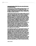
Fig 5
This poster (fig 5) that I am going to discuss now is a completely different to the previous one in figure 4. Both posters are based on AIDS but this one the recipient is the American Government and the originator the public. This poster was produced by AmFAR, American Foundation for AIDS Research, in USA 1989.
The poster is of 3 couples kissing, but the couples are modern couples from a culturally and sexually liberated society. The couples are a coloured man and a white woman; a male ethnic homosexual couple; a female homosexual couple one of whom is a mixed race lady and the other a coloured woman. These couples are displaying that it does not matter who you are but kissing is fine and does not kill. Underneath the poster it has an anti government slogan implying that it is the government that are not taking the right action against the AIDS fight.
This poster is aimed at the Government and trying to remind the government that it is their responsibility to combat AIDS it also is ridiculing the small mindedness attitude of them and pointing out that AIDS is a political crisis as well.
In comparison to the previous AIDS poster this is far more sympathetic and thoughtful it also is calming. This poster is also very thought provoking by looking and considering relationships and not casual sex it also requires a response from the audience. This is very good as it makes the audience think and take it in mentally where as the previous poster is very aggressive and hard hitting without any sympathy.
Poster 5
Eleventh Commandment: Thou shalt always wear a condom.
This poster was designed in 1995 for the British Safety Council to support the National condom week to promote safe sex.
Here the poster is displaying a picture of Pope John Paul ll wearing a safety helmet it is then followed by the wording “Eleventh Commandment: Thou shalt always wear a condom” I find this poster the worst out of all of the posters I have studied, and will study. The reason for this is that they have taken the head of the Catholic Church and used him to promote safe sex in the knowledge that it is undermining the teachings of the church on the contraception issues. The poster is also making light of the Ten Commandments by adding their own eleventh commandment. The message is a very important to raise awareness for the use of condoms but to use the Pope in this way I feel is degrading and making a joke of the Catholic’s beliefs on birth control.
The poster is a very powerful one and to those who it does not offend it gives a very strong message to. I also think that it is not very informative and does not provide the information as to why you should have safe sex and why a condom must be worn.
Poster 6
Hello Boys
This is the first of two posters that I am going to be looking at that use sex and nudity to sell their product or company name. Both posters are very similar in the way they are promoting themselves by using very few words in the Wonderbra advert or in Gucci’s case there is not any words used at all.
The Wonderbra campaign was dreamt up by Trevor Beattie of TWBA in 1994 and featured initially in magazines. It proved successful so the advert was then placed on Billboards.
This advert has an attractive woman wearing just her bra and knickers looking very attractive with an obvious cleavage. The poster is in black and white except the product name, which is in yellow, this is possibly because it hides the blemishes and most importantly is considered much sexier. The attractive model Eva Herzigova is posing very confidently looking down at here breasts as if saying hello boys look at me, deliberately asking for attention the “hello boys” is in very large black writing.
This poster is selling a product that is intended for women but the poster is selling the product to the mainly to the males. The men would be much more interested in this poster as she is very attractive and leaving little to the imagination in her clothing. The originator has done this very cleverly as both men and woman will look at this poster and both are thinking about the product. The men will be admiring it and possibly be wishing their partner had one, and the women will be looking at it thinking of the advantages that bra would have for them, attraction to men.
This poster is not particularly informative as it is selling the name and a bra not informing the public of where they can be purchase how much r option of colours. But this poster is very effective and certainly gets attention I think it has been done very tastefully.
Poster 7
Gucci - Titled Pubic Enemy
The Gucci poster as like the Wonderbra one is clearly using nudity and sex but taking it to the extreme. Here model Louise Pederson is pictured with few clothes on pulling down her knickers revealing a branding with her pubic hair shaved into the Gucci trademark “G” symbol, whilst being pushed against the wall by a male model. The young man has a dreamy expression on his face and looks very young and almost nervous.
This poster is the latest campaign from Gucci and was created by Tom Ford, who was also behind the Yves St Laurent Opium perfume advert, with Sophie Dahl wearing nothing but a pair of high-heeled shoes and posing very provocatively. Gucci have used a very controversial image without any words to create as much publicity as possible, This poster will certainly do that the public will be discussing the art of it or the vulgarity of it.
Gucci is meant to be selling clothes and you do not get much of an idea of the styles from this advert it is an advert that is just getting it’s name noticed through shocking and provoking the public and causing controversy, which results in even more publicity.
I do feel that the woman in this picture is confident and in control. This shows that by the way she is standing which is her legs are casually apart and her body is relaxed, she is holding her underwear for him, and the lad is merely doing as she requests. I do not feel this is particularly demeaning to women because she is in control. Most modern women these days are far more open sexually and know what they want and Tom Ford is displaying his awareness of this by showing that the sexual equations are changing.
I personally do not any particularly strong feeling about it, but I do find it rather amusing of the guts Gucci have to put it out. I also do feel that as a mother I would not like to have to explain that to my child. It is just a little to sexual and very close to something you would find in an adult magazine. We try to protect these sorts of images from our children in magazines and on the television and here is one that can easily be seen by children when stood at a bus stop or out in the car.
Conclusion
Concluding this assignment I would like to emphasise the importance of the poster and the power it has to pass information on to the public. Whether we like it or not they are a very powerful tool and we do notice them consciously or sub consciously, they have the power to communicate to us and manipulate us. All the posters want to be effective and the originators do this in modern posters by using sex and nudity and provoke shock, which even without any information on it we know exactly what company it is advertising, a very good company to use as an example is Benneton. The more it is used the more we as a public seem to accept.