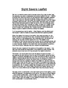
One of the main impacts of this section of the leaflet is the layout – the way the white words are positioned in the middle of a black canvas. The opposite colours look very striking and grab the reader’s attention.
The words “12p could spare this child the agony of losing his sight ……” are used as the main focus of the first part of the leaflet. Using the word “agony” is emotive language and is a clever technique aimed to tug at the reader’s heartstrings so that they take pity on the young child. People are naturally protective of children, so where there is a situation where a young child could be in danger or agony the reader will naturally want to protect them. Also the fact that is it only costs 12p appears very shocking to the reader that such a small amount could make such a huge difference to someone’s life. It makes a reader feel strangely guilty that to them the amount is so small but it could mean the world to a poorer person. As a result this is very effective as the reader feels they should give money.
The logo, which is positioned in the right hand corner of the leaflet, is very effective because it corresponds to the charity. The charity is Sight Savers – which helps to save sight - and the logo is in the shape of an eye. This reinforces the idea that the charity is about saving sight and makes a visual impact upon the reader. In the middle of the eye there is a globe, which symbolises it is a worldwide charity.
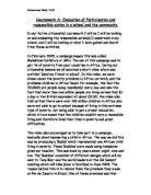
On opening the leaflet the reader is faced with the full picture of the young African boy and the realisation that the first picture was in fact cropped. A new figure is introduced and the reader can now see the full extent of the picture. The young boy is actually guiding his blind father with the stick he is holding. This creates a different perspective to the leaflet, and the reader’s impression now is that this innocent child has lost his childhood due to his father’s disability and a great responsibility rests on his young shoulders. He is not so much weak and poor anymore but an extremely strong and inspirational child.
The words “ …… and prevent him following in his father’s footsteps” have a certain irony to them, as the picture actually shows the father following in his son’s footsteps.
As the reader opens the leaflet they are faced with the question “Will you help save sight?” This rhetorical question reinforces the charity’s cause, gets the reader thinking and makes them wonder how they could help and why they should help. The use of the word “you” makes it personal to the reader and draws them into the opening paragraph, which begins with an emotive, adverb “Sadly”. The paragraph goes on to explain how “many parents have to rely on their children to act as their guides and carers” due to river blindness. Throughout the paragraph emotive words are used such as “unfortunately”, “needlessly” and “suffering” to explain the process of how river blindness effects the victim. The paragraph next to it goes on to inform the reader of the medicine that could be used to prevent river blindness. Again it uses more emotive words like “mere” to describe to amount of money it costs to stop the “pointless” loss of sight”. This use of emotive words gives the effect that the writer is trying to force a sad impression on the reader and make them feel sympathetic towards the situation and therefore successfully achieving its aim by making the reader want to give money to the charity.
My conclusion is that overall this leaflet is very original and effective due to its shock value. The cropped picture, clever writing techniques such as emotive language and rhetorical questions amount to the leaflet being a persuasive advert rather than an informative advert. Yet, without being a colourful, loud charity leaflet it manages to achieve its goal of grabbing the reader’s attention and being informative.
By Hannah Evans