iii http://www.cambridge.org/catalogue/catalogue
An Investigation into the Effects that Different Light Intensities have on the Speed of Woodlice:
Abstract:
The aim of this investigation was to find out the effects that different light intensities had on the speed of movement of woodlice. Woodlice are negatively photokinetic and therefore my HA hypothesis stated that the speed of woodlice would increase as the light intensity increased until the maximum speed of a woodlouse was reached. Thus there would be a positive correlation between light intensity and the speed of movement. My Ho hypothesis is that there would be no significant correlation found between light intensity and the speed of movement. This hypothesis was tested using the Spearman’s Rank correlation coefficient.
My method involved recording the paths of 5 woodlice using a video camera for 1 minute at 9 different light intensities. These light intensities were obtained using a battery-powered light attached to an old OHP, which could be adjusted up and down to produce different distances. Distances of 200, 300, 400, 500, 600, 700, 800, 900 and 1000mm were used and the light intensity was recorded at each of these distances using a light probe. The digital camera was connected to a television and video player so that I could simply record the paths of each woodlouse by placing a piece of acetate over the screen and following their movements using different coloured pens. This enabled me to measure, with a ruler, the distances that the woodlice travelled at each light intensity. These distances were then converted into speeds using the formula: distance= speed
Time
The results that I collected were accurate, showing a perfect positive correlation between light intensity and the speed of movement with the RS value equalling 1. The HA hypothesis was therefore accepted. However, there was variation in the data and I suggest that this was due to the thigmokinesis response of woodlice, which meant that 1 or 2 of the speeds recorded at each light intensity were often lower than the rest. My results showed a linear regression as well as more of a curve shaped graph due to the speed of movement levelling off at the higher light intensities. Thus my data allowed for two different interpretations. However, I came to the conclusion that the straight line was the better interpretation.
Introduction:
Arthropods are one of the easiest terrestrial animals to collect in large numbers throughout the year. Porceliio scaber is not difficult to identify with the naked eye and is large enough to be handled without employing special techniques. Their behaviour is relatively simple yet providing classic example of both taxis and kinesisi. A species, which shows taxis, can orient the direction of their movement with respect to the source of an external stimulus whilst kinesis is a steady-state dependence of the movement velocity on the stimulus intensity.iii Thus it is clear that kinesis will be the important response in my investigation as I am not concerned with the stimulus direction.
Woodlice therefore provide an ideal material for my investigation.
Woodlice lack a waxy cuticle on their exoskeleton and have a high surface area to volume ratio. This means that they are prone to desiccation. As a result, most of their behaviour is concerned with reducing water loss. Woodlice therefore will tend to congregate in cooler, darker and more humid regions, where their water loss will be lower.ii
Although light does not affect the physiological state of woodlice in the same way as humidity and temperature, it plays a very important part in woodlice behaviour. Woodlice have a negative photokinesis- they move directly away from a light source. This has great survival value because bright places and to be drier and dark places tend to be damper. Thus the light response reinforces the humidity response in that it means they will spend more time in humid conditions where they will not desiccate. There are wide differences in the strength of the light stimulus in different species. The less rapid the water loss of a species, the less intensely negatively photokinetic that species will be.i
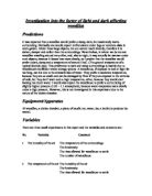
Modifications to original method:
- After having tried to suspend a projector in a safe and secure way, I found that it was going to be too complicated and dangerous to vary the light intensity in this way. Therefore, I needed to devise a safer method. Eventually I found an old piece of equipment (I think it was an old OHP), which a light could be attached to and it could be adjusted up and down easily to produce a large range of distances.
- The first light that I tried was not bright enough to give even relatively high light intensities. This was a voltage-powered bulb. Therefore, instead I tested a bigger, battery powered light and this gave a much brighter and more even light. Thus the way in which I was going to obtain my different light intensities had been changed successfully.
- However, I found that at the lower distances the light got in the way of the camera, which was secured directly above the container in which the woodlice were to be placed. As a result, I needed to re-think for the second time.
- It was the camera that needed to be changed. I realised that only a portable digital camera was going to work. This could be secured at more of a side angle rather than directly above so that the light no longer obscured its view.
Preliminary Experiments:
After finalising my method, I carried out a couple of preliminary experiments to see whether the woodlice moved faster in humid or less-humid conditions. Firstly, I placed the woodlice in a container with a damp paper towel in the bottom and then without one. Unexpectedly, I found that the woodlice moved faster in the container where there was no paper towel. I suspected that this was because they were kept, before the experiments, in a container with damp cotton wool in the bottom and thus were already reasonably hydrated. Consequently, I carried out my subsequent experiments with no wet paper towels in the bottom so the humidity was lower.
For these preliminary experiments I used a rectangular container and found that the woodlice often clumped in the corners and thus did not move as much. As a result, I found a more rounded container, which was also a bit smaller given that the camera view could not cover the entire bottom of the rectangular container.
I also found that the woodlice often crossed paths and when they came into contact with each other they slowed down and even stopped moving for a few seconds. This is because of their thigmokinesis response to other objects (or other woodlice), which is explained in my plan. Thus in my actual experiment I intend to use only 5 woodlice at each light intensity rather than 10 in order to reduce the likelihood of them crossing paths.
Last of all, I found that when I moved the light right down to the smallest distance of 10cm, it blocked the view of the camera just like it had done when employing the fixed camera. Therefore, I simply decided to only record results down to a distance of 20cm where the camera view was not obscured.
The Investigation:
A large number of woodlice were collected. These were then placed in a long-term culture container, which had potatoes with holes in them, in the bottom to help retain moisture as well as some vegetation and compost in order to mimic the woodlice’s natural habitat. After having collected the woodlice, the apparatus was set up as shown in the diagram. All the electrical equipment was switched on in order to check that it was all connected correctly and that it was working. At first, the picture on the camera would not come up on the television. However, after a good check of all the equipment, I realised that the video recorder was on the wrong channel. The correct channel was then found - AV1- and consequently, the camera picture appeared on the television screen.
The light was then adjusted to the first distance of 100cm. Both the light intensity and humidity were then recorded using the light and humidity probes, which were connected to a ‘check it’ system that displayed the values. The humidity and light probes were secured using tape, so that they remained in a fixed place and at the same angle throughout the investigation. The temperature was also checked using the thermometer. Once all relevant variables had been recorded, 5 woodlice, of similar size and of the same species, were taken from the long-term culture container and transferred carefully to a small glass container with damp cotton wool in the bottom. This was to ensure that the woodlice were well hydrated before they were used for the experiment. A blank video was then pushed into the video recorder.
The 5 woodlice were then placed carefully into the rounded container underneath the light using the plastic spoon to pick them up and the paintbrush to push them in. As soon as the last woodlouse had been pushed into the container, the ‘record’ button was pressed on the video player. Their movements were recorded for 1 minute (the time was displayed on the video player so no stop clock was needed) and then the ‘stop’ button was pressed. The 5 woodlice were then returned carefully to their long-term culture container using the same technique with the plastic spoon and the paintbrush.
This procedure was repeated for the next 8 different distances. After having completed the recording at each distance, the footage was rewound until the first readings at 100cm came on the screen. A sheet of acetate was placed on the television screen and secured with blue tack so that it would not slip out of place, ‘play’ was pressed on the video recorder and the paths of the 5 different woodlice were followed one at a time using the coloured pens. A different coloured pen was used for each woodlouse in order that the paths could be distinguished easily, especially as there was a great deal of crossing over. The distance of each path was then measured, using a ruler and the formula: Speed = distance/ time was employed so that the speed of each woodlouse could be calculated.
Analysis:
Results Table:
Distance (mm)
Speed (mm/s)
Light Intensity (lux)
Time (s)
1
2
3
4
5
1
2
3
4
5
Average Speed (mm/s)
Humidity (%)
Temp. (oC)
Standard Deviation
95% Confidence Limits
403
60
912
834
840
918
906
15.2
13.9
14
15.3
15
14.7
46.8
36.1
0.69
0.60
301
60
768
720
744
756
714
12.8
12
12.4
12.6
11.9
12.34
46.1
34.8
0.38
0.34
210
60
336
474
480
498
318
5.6
7.9
8
8.3
5.3
7.02
46.1
28.1
1.44
1.27
135
60
264
252
288
300
276
4.4
4.2
4.8
5
4.6
4.6
45.5
27.6
0.32
0.28
88
60
222
198
162
174
204
3.7
3.3
2.7
2.9
3.4
3.2
45.3
26.5
0.40
0.35
72
60
150
186
168
174
162
2.5
3.1
2.8
2.9
2.7
2.8
56.2
26.4
0.22
0.20
54
60
168
150
114
180
126
2.8
2.5
1.9
3
2.1
2.46
51.9
26.2
0.46
0.40
29
60
54
102
78
114
90
0.9
1.7
1.3
1.9
1.5
1.46
52.3
25.8
0.38
0.34
18
60
114
30
54
102
90
1.9
0.5
0.9
1.7
1.5
1.3
55.4
25.6
0.58
0.51
Graph:
At each light intensity the movements of 5 woodlice were recorded and thus I had 5 distance readings at all my different light intensities. All my distance readings were then converted into speed using the formula speed = distance/time. Averages were then taken from the speed values that were calculated. This was also done using Excel. The table below shows the results obtained at a light intensity of 403 lux. The average was calculated using the formula =AVERAGE (A2:F2).
Speed values:
A
B
C
E
F
1
1
2
3
4
5
2
15.2
13.9
14
15.3
15.1
After obtaining an average speed of movement at each light intensity I was able to plot a graph of speed of movement against light intensity, which is shown under the results table above. I then added error bars and finally a line of regression.
Trends, Patterns and Statistical Analysis:
Standard Deviation and 95% confidence limits:
The standard deviation and the 95% confidence limits of my results were then calculated, as this would allow me to see the spread of my data around the mean. This is very important because although samples may have the same mean, they may show distinct differences in the amount of variability about that mean.
I calculated this using Excel and the formula: =STDEV. I could then calculate the 95% Confidence limits using the formula =CONFIDENCE (0.05, STDEV, n). This means I know that the true mean speed lies between the measured average ± the value, 95% of the time. The confidence limits were then used to produce the error bars on my graph as shown above. This is how the error bars were made:
-
Firstly, double click on one of the points on the graph to get the Format Data Series dialogue box up which is displayed below.
-
Second, choose the Y error bars tab and click on the red arrow of the custom + box. Highlight the range of cells containing the confidence limits. Repeat for custom – box.
-
Finally, click ok.
It can be seen that the error bars are relatively small except for the highest light intensity and the third highest one. The error bar for the third highest light intensity was particularly large. I have suggested explanations for this in my evaluation.
Linear Regression: ( a line of best fit )
I then used Excel to add in a linear Regression on my graph. This generates a line of best fit called a regression line and tests to see how much of the variation in the data is explained by the regression. The null hypothesis is that the regression does not explain the variation in the data. The data output is as follows:
SUMMARY OUTPUT
Regression Statistics
Multiple R
0.993
R Square
0.986
Adjusted R Square
0.984
Standard Error
0.624
Observations
9
ANOVA
df
SS
MS
F
Significance F
Regression
1
188
188
482
1.03E-07
Residual
7
3
0.389
Total
8
190
Coefficients
Standard Error
t Stat
P-value
Lower 95%
Upper 95%
Lower 95.0%
Upper 95.0%
Intercept
0.246
0.318
0.771
0.466
-0.507
0.999
-0.507
0.999
Gradient
0.0364
0.00166
22.0
1.03E-07
0.0325
0.0403
0.0325
0.0403
The probability given in the F test is 1.03×10⁻³. This is very low, which means that the null hypothesis can be rejected in favour of the alternative hypothesis i.e. there is a very statistically significant regression in the data. The regression coefficients then can be used to generate the line of best fit, which is shown on my graph.
Spearman’s Rank Statistical Test:
I then carried out the Spearman’s rank statistical test in order to find out whether there was a correlation between light intensity and the speed of movement or not.
- First, I set out data set and ranked the x and y variables ( x=light intensity, y=Speed)
- Next, the difference between the paired ranks was calculated.
- The tied ranks were averaged in each column.
X
Y
Rank X
Rank Y
Difference2
403
14.7
9
9
0
301
12.34
8
8
0
210
7.02
7
7
0
135
4.6
6
6
0
88
3.2
5
5
0
72
2.8
4
4
0
54
2.46
3
3
0
29
1.46
2
2
0
18
1.3
1
1
0
-
rs was then calculated by:
Where N = no. of pairs ( Therefore, in this case N = 9 and D2 = 0)
- The significance was then tested using the table below:
No of pairs of measurements
Critical value
5
1.00
6
0.89
7
0.79
8
0.74
9
0.68
10
0.65
-
The null hypothesis- that there is no significant correlation at a probability of 0.05- is accepted if the rs value is below 0.68 and rejected if the rs value is above 0.68. Thus the alternative hypothesis- that there is a significant correlation at the probability of 0.05- is accepted if the rs value exceeds 0.68.
-
It is clear from my calculation above that the rs value of 1 exceeds 0.68 and therefore the null hypothesis is rejected (p<<0.05) and the alternative hypothesis is therefore accepted. In other words my results show a perfect positive correlation between the speed of movement and light intensity.
Anomalies and Inconsistencies:
I have identified some anomalous results and I have coloured them all in red in my results table. It is clear that they are all lower than they should be with regard to the other results at their respective light intensities. This must have been a result of something slowing the woodlice down. I have offered explanations of these anomalous results in my evaluation.
Evaluation:
Explanation of results:
First of all, I am going to consider the explanations for the experimental results that I obtained. My results clearly showed that the speed of movement of woodlice increases as light intensity increases. This positive correlation occurs because woodlice are negatively photokinetici. This is because they lack a waxy cuticle on their exoskeleton and they have a large surface area to volume ratio. Thus they are extremely prone to desiccation due to a high rate of water loss. As a consequence, much of the behaviour of woodlice is concerned with congregating in darker, cooler, more humid regions in order to avoid or reduce water loss and thus give them a better chance of survival. ii
There was also a degree of variability in my results and this is displayed clearly by the error bars on my graph. I suggest that this is caused by the woodlice crossing paths and thus coming into contact with other woodlice or with the sides of the container during the experiment. The response of woodlice to solid objects (or other woodlice) is called thigmokinesis. This response is such that woodlice are most active when contact with a solid object is minimal i.e. when only its feet are touching the ground. As soon as other parts of the body touch another surface, woodlice slow down and may even stop i. This explains why some of the readings are lower in comparison to others.
I then thought that another reason that could explain the anomalous results could be the slight varying sizes of the woodlice employed. Perhaps a larger woodlouse may not be able to move quite as quickly as a smaller one or visa versa. However, I do not feel that this is as good an explanation as the thigmokinesis response.
I am now going to consider whether there were any significant errors with regard to my measurements that could have explained the variability in the data. First. I determined the % accuracy of my measurements. I did this using the formula:
Error in reading the scale × 100
Amount measured
I simply worked out the error that was incurred at the longest distance and that of the shortest distance. In this way I was able to see the range of error and this range is shown in the graph below:
Shortest Dist.
(mm)
% error
Longest Dist. (mm)
% error
30
3.33
918
0.12
It is clear that the error incurred is miniscule. However, what is true is that the error increases, as the distances get shorter. Nonetheless, the error produced, even with the shorter distances is not significant enough to have any affect on the reliability of my results. After all, looking at my graph, it is evident that the error bars are mostly smaller for the lower distances/ light intensities than they are at some of the higher ones proving that even at the lower distances the extent of the error was not significant enough to affect my results and that the variability could not have been a result of any inaccuracies in my measurements.
I am now going to look at the possible procedural errors of my experiment that could have affected the reliability of my results. Firstly, the temperature varied quite significantly throughout the investigation with a difference of over 10oC between the highest and lowest temperatures recorded. I suggest this was because of heat being given off from the bulb of the light I was using. It is clear from my results table that there is a positive correlation between light intensity and temperature i.e. the temperature increases as the light intensity increases. A higher temperature would have made my results higher because it has an orthokinetic effect causing the speed of movement to rise until heat stroke and death intervenei.
There is a particularly big increase of 6-8oC between readings 6 and 7. I believe, therefore, that this temperature increase had a significant affect on readings 7 and 8 making them higher than they should have been. This explanation is backed up by the fact that although the linear regression line does fit relatively well through my points with no points being any significant distance away from it, there is no doubt that it would fit even better if the highest two light intensities were ignored. This is shown in the graph below:
It can be determined from this graph that the highest two light intensity readings were higher than they should have been. After all, they were: and in my results when they should have been closer to and as the regression line now goes through all the points showing a perfect linear relationship.
In order to avoid this problem I should have used a projector light or one, which simply gave off less heat. However, I decided in my plan that suspending a projector light would be impractical and might even be dangerous. Thus a typical battery-powered light had to be used. One way, though, of reducing the heat given off would have been to make sure that the light was not switched on until the experiment was completely ready to be carried out and that it was switched off as soon as the experiment was finished. I, perhaps, was not as disciplined with this as I should have been.
Although my results do show a linear regression, they also could show more of a curve if the linear regression line was removed. If a curved line of best fit is drawn on the graph, it shows, instead, the speed of movement levelling off producing a more curve shaped graph at the higher light intensities. I suggest this is because the woodlice are gradually reaching their maximum speed of movement; they simply cannot move much faster. Below is my graph, as before, but without the linear regression line and with a curved line drawn in by hand. Thus my data can be interpreted in two different ways.
Finally, my results were concordant with my hypothesis: that the speed of movement would increase as light intensity increases. However, there was some variability in my results explained by both the thigmokinesis response of woodlice and by the simple fact that all woodlice are different. These anomalous results are reflected in the error bars on my graph. I also found that my results could show more of a curve shaped graph, as well as a linear regression. Thus my data allows for two different interpretations. However, I believe that the straight line graph is the better interpretation because although a curve seems to fit the results that I obtained, the fact that the temperature was higher for the last two recordings suggests that they should have been slightly lower and if they had of been lower then the curve- shaped interpretation can no longer be applicable.
Further work:
If I was able to carry out further work on this investigation then I would like to spend more time trying to find a different method which would have avoided temperature from having an effect on my results. Perhaps, if I had had more time, I could have found a safe and practical way of carrying out my original method with the projector. This would have enabled me to see whether my conclusion: that the last two light intensities were higher than they should have been because of the higher temperature, was correct or not.
Moreover, I would have liked to use a wider range of light intensities. In particular, it would have been interesting to have done some readings at even higher light intensities to see whether the speed of the woodlice would still increase or whether a maximum speed would be reached as already suggested by my results. It would be interesting to know at exactly what light intensity this point was reached. Furthermore, carrying out more readings at the light intensities, which produced the most error, would have been a good idea. For example, reading number 7,at a light intensity of 210 lux, showed significantly more error than any other reading. It would have been interesting to check this reading by using a larger number of woodlice.
Woodlice, Stephen Sutton, 1972
I do not know exactly why this was but I suggest, after looking at my results, that it was a result of woodlice 1 and 5 clumping together for a significant amount of time and therefore producing much lower speeds relative to speeds 2, 3 and 4. This is because they did not travel as far and this therefore increased the variability at that light intensity.
After carefully studying my results, it is clear that at almost all light intensities this becomes a factor with one or two readings out of the 5, being significantly lower than the rest of the readings. I have coloured these readings in red in my results table.
From looking at my graph and the results of my statistical test it is true to say that the HA hypothesis: that the speed of movement would increase as the light intensity increases is correct given that the rs value is significantly above 0.68 at a probability of 0.05. In fact, the rs value of 1 shows that there is a perfect correlation, indicating that my results are very reliable. Also, the graph matches almost exactly the graph that I drew in my hypothesis, both showing the clear positive correlation between light intensity and the speed of movement.