Variables that could change the pulse rate are:
- Age of person
- Temperature
- Smoking
- Weight of person
- How often the person exercises.
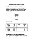
To decide what type of activity is best to measure pulse rates, I decided to record my resting pulse rate then my pulse rate after running on the spot for 2 minutes then 3 times again, once after every minute. I then go a male GCSE PE student, Jordan, to do the same and I compared results. Because I am a Core PE student, I predicted that I would have a higher pulse rate than Jordan. These are the results I recorded:
I think that these results are pretty accurate, they resulted in what I thought would happen, my pulse rate is higher than Jordan’s in all the measurements. I put this data in a graph to see whether I would see a difference between the results.
On this graph, you can clearly see that my pulse rate is higher than Jordan’s but that it also follows a similar pattern, starting lower, rising quickly and then falling low again slowly. The only piece of data which I think could be irregular is whether Jordan reached his resting pulse rate after only 2 minutes and managed to get exactly the same number as his resting pulse rate after 2 and 3 minutes.
I next asked a girl doing GCSE PE and another doing Core PE to do the same experiment so I can compare the results of a female in the same situation. This will be useful to compare with the results of the boys.
Thee results are slightly different, one of the measurements of Alex, Core, is higher than that of Katie’s, GCSE. This piece of irregular data causes the pattern to change so the graph will look slightly different to the boy’s graph.
These results aren’t as clear as the results of the boys; they follow a similar pattern but are close together it is hard to tell who does Core PE and which does GCSE PE. The irregular piece of data, when Alex’s line crossed with Katie’s, shows that perhaps the experiment wasn’t a fair test.
These practise experiments have helped me to decide the activity I should perform for my final data results. I will stay with the original activity, jogging on the spot for 2 minutes, because the results seemed clear and followed a pattern. In this activity I predict that the average pulse rate of male GCSE PE students will be the lowest results, the average pulse rate of the female Core PE students will be the highest results and the male Core PE students and female GCSE PE students will be similar in the middle. I also predict that the GCSE PE students’ pulse rate will decrease at a faster rate after the activity than the Core PE students.
To get enough data, I will need to collect information from 10 GCSE PE students (5 boys and 5 girls) and 10 Core PE students (also 5 boys and 5 girls). This will allow me to average the results into 4 groups, GCSE PE Male, GCSE PE female, Core PE male and Core PE female. I can then compare them and find out if my prediction is correct. These are the results:
Green = GCSE PE Students.
Due to limitations in time, I could not record the results after a 3 minute rest period.
Now that I have the results I can find out the averages of the 4 groups and put them in a graph to compare them. These are the averages which I worked out:
To see the differences between a Core PE group and a GCSE PE group, I can look at their data alone in a stem and lea diagram. This will help me to see how they compare to each other before and during the activity.
Core Resting Pulse Rate:
5
6 4 8
7 0 2 2 2 4
8 0 4
9 2
Core Activity Pulse Rate:
8 8 8
9
10 8
11 2
12 0 2 2
13 0
14
15
16 8
17 0
From these stem and leaf diagrams I can see that for the Core PE group most of their data is quite high and for the GCSE PE group most of theirs is quite low. This means that the GCSE PE group is fitter than the Core PE group.
The average results seem fairly predictable, the GCSE PE results are the lowest and the Core PE results are the highest, as predicted. Now, if I look at them in a graph, I can see how close to my original prediction I am.
All the results follow the same pattern of first rising quite quickly then falling quite slowly. Something which I did not expect to happen is that the Male Core PE students have the highest pulse rate; this is different from my prediction because I expected the female Core PE group to be the highest. In my prediction, I predicted that the GCSE PE student’s pulse rate would decrease at a faster rate after the activity than the Core PE group. This is a factor that did turn out to be correct.
From looking at the graph I can see that most of the data seemed to return to the resting pulse rate after 2 minutes. To see whether this is true, I can group together the data and look at the difference number between Resting and After 2 Mins.
When I looked at the difference between resting before and resting 2 minutes after the activity, I noticed that the pulse rate was actually lower after the activity than the resting pulse rate before it. This is irregular data because it suggests that your pulse rate actually gets lower after doing the activity, this could be because the heart becomes fitter after the activity or that when the student measured their resting pulse rate something else could’ve been affecting it. E.g. anxiety, nerves, etc.
In conclusion, I have found that my prediction was right; GCSE PE students are fitter than Core PE students. The results that I found were mostly correct towards my prediction but there were some which were irregular to the pattern, this could’ve been because the tests were unfair or that there were other things that could affect their pulse rate other than fitness. In the future, I could expand the data I found by asking the students whether they smoke or drink, how much exercise they do outside of school, etc. to make the results truly accurate. But, overall, I am pleased with the results that I found because they followed my prediction.
Jason Lucas 11-S