Logically speaking, the data makes sense. If you are driving at 112km/hr, you will obviously travel much further before actually pushing the brakes than someone driving at 32km/hr, simply due to the sheer velocity of the car. The actual momentum of the car is what makes braking a lengthier task at higher speeds than at slower speeds (as momentum is mass x velocity), accounting for the increasing rates of braking distance with rising velocity.
2. (a) Since the function for speed versus thinking distance is linear, we can use the form y = mx + c to determine an equation for the line:
1) y = mx + c
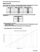
2) By using the coordinates (32,6) and (48,9) from the first graph, we can find the gradient or the m value of the equation.
x1 = 32
x2 = 48
y1 = 6
y2 = 9
Gradient = y 2 – y 1
x 2 – x 1
= (9-6)
(48-32)
= 3 (or 0.1875)
16
3) So far, we have y = 0.1875x + c. To find the constant, we can plug in the coordinate (48,9) for x and y.
9 = (0.1875)(48) + c
9 = 9 + c
c = 0
4) The final function for speed versus thinking distance looks like this:
f(x) = (3/16)x + 0
When graphing the linear function and finding its equation through the “trendline” option on Excel, I initially obtained y = 3x + 3. The computer seems to have assumed that 16km/hr was equivalent to one unit of x.
What the computer did before:
The gradient of the line consequently becomes 3 instead of 0.1875 and the constant seems to have been easily calculated by finding the difference between each y value (3). Excel considers the x-axis as ordinal instead of numerical. It ignores the fact that when speed is 0km/hr, thinking distance is naturally 0m (the line should pass through the origin but it does not).
Of course, this mistake could have been easily avoided on my part. Had I chosen a “scatter” instead of “line” graph, the numbers on the x-axis would have progressed by their true value of 16km/hr instead of 1km/hr. The instant “chart type” was changed to “scatter”, the trendline showed the correct equation of
y = 0.1875x.