The used equipment is decribed below :
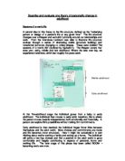
The thermometer/hygrometer(fig M.1):
The thermometer is used for hypotheses B and C. it has a cord connected to it with a sensor at its end. This measures the temperature. If you hold it in open air it measures the temperature there. You do have to wait a couple of minutes after you took your position because the temperatur of the sensor might be warm from holding it in your hand for example. It has to adapt to the conditions.
It also has another function, used for hypotheses D and E. with the same sensor it measures the relative humidity. Here it also has to adapt to the conditions.
Fig M.1 →
The windmeter:
The windmeter (Fig. M.2) is used for hypothesis A. it measures the windspeed in km/h. at the back it has two holes which the wind comes through so it gives you a direct result of what the windspeed is by a small white ball that rises when more wind blows through the holes. You have to hold the holes to where the wind comes from. Of course you may not block the wind with your body.
← Fig M.2
On the picture, the hand of the person blocks the holes!
We used some equipment to measure some distances as well (e.g. how far a measurement point was from the schoolbuilding.).
Weather on the days we Measured
Before I’m taking each hypothesis in turn to work them out with help of the results, I will be describing the general weather on the measurement days:
Day 1 (24 September 2003):
Partly cloudy, maximum temperatures of 15.8 °C. wind: West 2 bft., pressure 1031.4 hPa (so high pressure), no precipitation.
Day 2 (25 September 2003):
No clouds, maximum temperatures of 18.8 °C. wind: East-Southeast 2-3 bft., pressure 1027.5 hPa (so high pressure), no precipitation.
Day 3 (2 October 2003):
Entirely clouded, maximum temperatures of 17.1 °C. wind: east 2 bft., pressure 1011.8 hPa (so high pressure), no precipitation.
Information from the KNMI website (meteorologic institute), measured at The Bilt, which is not far away from Eindhoven.
Hypothesis A
“The average windspeed will be higher at an open place than near the ISSE schoolbuilding.”
The aim of this hypothesis is to look if there is a difference in windspeed, near a building and in an open field. I want to know this because this may influence the climate, and teherefor microclimate.
I think this hypothesis is true, because wind near a building (I’m talking about 1 meter) can be affected by the building itself and this can cause temperature differences between this place and in an open field, and so it is affecting microclimate. This can be seen in sketch A.1. the sketch shows a possible way in which an object can influence windstreams.
Sketch A.1
Two pictures of the sites where we measured. The person in the photograph is me measuring with a windmeter.
FIG. A.1 FIG. A.2
- Me, measuring at the open field site.(point A1) - Me, measuring near the building. (point A2)
(all pictures in this project were not made during one of the measurement days, on the map where the measurement points are these points are shown as point A1 and A2.)
Results
Due to the fact that windspeeds at the measurement days were not very high, differences in speed were low. This is shown in the results:
TBL. A.1
TBL. A.2
To illustrate these results of tbl. A.1 and A.2 a bar graph can be made. The averages of the windspeed per day and the averages over three days are shown in it.
FIG. A.3
These results in fig. A.3 show that the average windspeed is higher at an open place than in a closed area. The average windspeed over 3 days for the open place is 3 km/h, while for the closed area that number is 0.67 km/h. this is what we have seen previously in the table above the graph.
Analysis
In the results of the measurements we see that the windspeeds over all are quite low, but I managed to get clear results of how windspeed near the building and in the open field differ from eachother. This is shown in the tables and graphs (tbl. A.1, tbl. A.2, fig. A.3)
The maximum windspeed measured at the open field was at day 2 of the measurements (16 km/h → because during the one minute I measured at that site, 0 km/h was the minimum, and 16 km/h the maximum, ginving 8 km/h as an average) the minimum windspeed was 0 km/h, occuring at both sites.
Further, we can see that the pattern found on all measurement days, is that the average of the day was the highest on the open field. This is also seen in the averages over three days, which is a logical result if we look per day.
Conclusion
My hypothesis was proven correct. All the data fit the pattern: “the average windspeed is higher at an open place than near the ISSE schoolbuilding” the results matched my expectations, although you can never know what the weather will be in the Netherlands.
So There is microclimate refering to the differences in windspeed averages at an open area and at a closed area.
Hypoythesis B
“The average temperature will be higher on the southern side of the schoolbuilding than the average temperature on the northern side of the schoolbuilding”
The aim of this hypothesis to find out if there is a difference in temperature if we measure on the northern side of the building and the southern side of the building. Temperature is an important factor in microclimate.
I think this hypothesis is true because sunlight comes from the south, bringing a lot of warmth as well. Things like aspect can influence this warmth on a northern side of any building. This hypothesis is not specificly about influences of shade, but just about temperatures on a northern and a southern side of a building. The distance we measured from a building is about 1 meter every time.
in sketch B.1 you see a form of aspect. This is a result of Holland laying on the northern hemisphere. The sun actually shines from the sides, causing shades to be formed. This then might be affecting temperature. The small black block is a building under sunrays (arrows). The shade area is coloured in.
sketch B.1
Two pictures of the sites where we measured are shown below.
FIG. B.1 FIG. B.2
- Southern side of the building (point B1) - Northern side of the building (point B2)
Results
The measurements went very good. There were no problems at all. Below this first table of these results is shown, showing temperatures on the northern and southern side of the building, measured over three days in the morning and the afternoon.
TBL. B.1
TBL. B.2
To illustrate the results shown in tbl. B.1 and B.2, a bar graph can be made. This shown below.
FIG. B.3
The results shown in fig. B.3 show us that the average temperature on the southern side of the building is higher than the average temperature on the northern side of the building. The average temperature, measured over 3 days, on the southern side of the building is 17.01°C, while on the northern side this number is 13.72°C.
Analysis
In the results we see our measurements in a clear table and a graph (tbl. B.1, tbl. B.2, fig. B.3). because the temperatures differ from eachother, patterns might be found. This is the case in these findings.
The pattern I found is that the temperature on the northern side of the building is lower at all time. In the morning and in the afternoon this was a clear fact. The fact that these temperatures are lower can be due to radiation of the building that is higher on the Southern side, because this side picks up the heat of the sun and so the temperatures of the walls warm up during the day. (this is especially in the morning a factor which is important influencing). It can also be the result of aspect. Because the sun is not shining from straight above the buildings in Holland, shade occurs giving lower temperatures at that site.
The highest temperature at the measurement days was 24.5°C, measured on the southern side of the building in the afternoon. The lowest was ofcourse at a morining: 6.1°C, measured at the northern side of the building.
Conclusion
My hypothesis was proven correct. The average temperature on the Southern side of the building is higher than the average temperature on the northern side of the building. Because I made the hypothesis myself, and I thought it was true, this also means that the results matched my expectations.
In a sentence covering microclimate: There is microclimate with reference to the Southern side having higher temperatures than the Northern side.
Hypothesis C
“The average temperature will be higher measured on ground level than the average temperature measure at 1.50 m above the ground”
The aim of this hypothesis is to find out if the temperature on ground level differs from the temperature on 1.50 meters above the ground. Microclimate’s height range, as mentioned before, starts at 0.5 meter under ground level en goes to 2 meters above the ground.
The site we’ve chosen for this hypothesis is on concrete. We did this because the most of the area of the school is covered with concrete or it is paved.
I think this hypothesis is true because the warmth taken up by the ground makes the temperatures on ground level higher. The concrete may even hold for a time, so that radiation still gets that temperature higher than on 1.50 meter.
In sketch C.1 In sketch C.1, the thin arrows show the take-up of the black playground. The thick arrows show radiation of heat, as a result of the take-up.
Sketch C.1
Two pictures of the site where we measured for this hypothesis. One shows me measuring at 1.50 meters high, the other shows me measuring on ground level.
FIG. C.1 FIG. C.1
- 1.50 meter high measuring (point C1) - ground level measuring (point C2)]
Results
As in the previous hypothesis the measurements went very good, no problems. The results are shown in the tables below (tbl. C.1 and tbl. C.2). these show the temperatures of the measurement points over the three days of measurements and the averages of that.
TBL. C.1
TBL. C.2
To illustrate the results shown in tbl. C.1 and C.2, a bar graph can be made. This shown below.
FIG. C.3
The results shown in fig. C.3 show us that the average temperatures on ground level were higher than the average temperatures at 1.50 meter. The average temperature measured over three days on ground level was 16.28°C while the average temperature at 1.50 meter high was 14.52°C.
Analysis
Clear differences are found in the results. This can cause patterns to be formed out of our findings.
The pattern I found was that the average temperature on ground level was higher than the average temperature at 1.50 meters high at all times. This can be the result of radiation of stored heat. (especially the case in the morning). It can be the result of take-up of warmth of sunrays or that the air on the ground is not cooled by the wind as well.
The highest temperature was measured on ground level and it was 23.3°C. the lowest measured temperature is 7°C. this was measured at 1.50 meter.
Conclusion
The average temperature on ground level is higher than the average temperature at 1.50 meter high. Again the results matched my expectations, as in the previous hypotheses.
Again, there is microclimate refering to the average temperature on ground level being higher than the average temperature at 1.50 metres high.
Hypothesis D
“The average humidity will be higher above grass than the average humidity will be above concrete”
The aim of this hypothesis is to find out if the average humidity above grass is higher then the average humidity above concrete. Vegetation does not only influence climate in forms of shade, but also humidity is a factor that can influence any climate.
I think this hypothesis is true because vegetation, just as we humans, breaths and this makes humid air come out of it. This would say that the air close to the vegetation would have higher humidity levels than the air close to concrete.
Also on the measurement sites we’ve chosen to measure slightly above the grass and concrete.
Sketch D.1
Two pictures of the site where we measured for this hypothesis. One shows me measuring above grass, the other shows me measuring above concrete.
FIG. D.1 FIG. D.2
- Humudity on grass (point D1) - Humidity on concrete (point D2)
Results
The results of the measurements are shown in the tables below (tbl D.1 and tbl. D.2). there were no problems measuring the humidity levels, giving clear results.
The tables show the humidities on each day in the morning, afternoon, and the average of that. Also an average over three days is shown. This is in table D.2.
TBL. D.1
TBL. D.2
To illustrate the results shown in the tables D.1 and D.2, I made a bar graph which is shown below.
FIG D.3
The results shown in fig. D.3 show us that the average humidity was higher above grass than above concrete. The average over three days for humidity above concrete was 60.33%. this is lower than the average humidity above grass: 64.5%.
Analysis
Patterns have formed out of the results. The patterns I found were showing that the average humidity on grass and concrete differed from eachother.
The humidity being higher on grass than above concrete can be the result of damp coming from the vegetation or the soil that takes up more water than concrete.
The highest humidity level was measured on a very humid morning on grass: 89%. The lowest relative humidity was measured on a sunny afternoon: 33%.
Conclusion
As the results matched my expectations I can link back to my hypothesis to make up the conclusion. I can say that: “The average humidity above grass is higher than the average humidity above concrete.
Covering microclimate, I can say that again, there is microclimate, refering to the average humidity being higher above grass than above concrete.
Hypothesis E
“The average humidity on the northern side of the schoolbuilding will be higher than the average humidity on the southern side of the schoolbuilding”
The aim of this hypothesis is to determine the relative humidity on the northern side of the ISSE schoolbuilding and the southern side of the ISSE schoolbuilding. After that we should look for differences.
I think this hypothesis is true because on the southern side the sunlight makes the air become drier. On the northern side, effected by aspect, this should not be the case.
In sketch E.1, my explanation of why
I think the hypothesis is true is
visualised. The shade area should be
cool and humid, the sunny area
should be dry and warm.
Sketch E.1
Two pictures of the site where we measured for this hypothesis. One shows me measuring on the northern side of the building, the other shows me measuring on the southern side of the building.
FIG. E.1 FIG. E.2
- Humidity northern side (point E2) - Humidity on southern side (point E1)
Results
The results of the measurements are shown below in the tables E.1 and E.2. the tables show humidities on three days in the morning and the afternoon, the average per day is also shown. In table E.2 the average over three days is shown.
TBL. E.1
TBL. E.2
To illustrate the results shown in tbl. E.1 and E.2 a bar graph can be made. This is shown below.
FIG. E.3
In the results shown in fig. E.3, you can see that the average humidity is higher on the northern side of the building (64.83%), than it is on the southern side of the building (60.83%).
Analysis
The pattern found in the results of this last hypothesis show me and you that the humidity is higher on the northern side of the building than it is on the southern side of the building at all times. The highest humidity level was measured on day1: 92%. The lowest level was measured on day 1 and 2: 32%.
Also in the averages you can see that the humidity is higher on the northern side of the building than it is on the southern side.
Conclusion
Hypothesis E, as a last hypothesis of this project, is proven correct: The average humidity is higher on the northern side of the building than the average humidity on the southern side of the building.
Microclimate is seen here as well.
KEY :
David Sjerp 17 Nov. 2003H4d
Microclimate
project