Describe a Production Possibility Curve, and its importance. Consider points on the PPC and inside the PPC to illustrate opportunity cost.
Question 1
(a) Describe a Production Possibility Curve, and its importance. Consider points on the PPC and inside the PPC to illustrate opportunity cost.
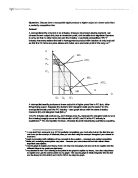
Production Possibility Curve is a curve illustrating all maximum output possibilities of two or more goods given a set of inputs. The PPF assumes that all inputs are used efficiently.
As indicated on the exhibit 1.1, points A, B, C and D represent the points at which production of grains and wines is most efficient. Point X demonstrates the point at which resources are not being used efficiently in the production of both goods and point Y demonstrates an output that is not attainable with the given inputs
The shape of this production possibility frontier also represents the concept of opportunity cost. Choosing more output of good X usually means giving up output of good Y. For instance, if the curve moves from point A to point B, the opportunity cost of 9,000 tons of grains is a reduction in output of 3,000 tons of wines.
As more of one product is produced increasingly larger amounts of other product must be given up. If a change in demand from consumers shows that more wines need to be produced (a movement along B to C) - there may not be the economic resources available to maintain the output of wines. In this example, some factors of production are suited to producing both wine and grain, but as the production of one of these commodities increases, resources better suited to production of the other must be diverted. For instance, refer to the movement along C to B, the increase of producing of wines of 3000 tons costs a decrease in grains product of 6000 tons. Experienced wine producers are not necessarily efficient grain producers, and grain producers are not necessarily efficient wine producers, so the opportunity cost increases as one moves toward either extreme on the curve of production possibilities.
Draw production possibility curve for the following and explain:
(i) The two goods are assumed to be perfect substitutes (e.g. Coke and Pepsi)
(ii) The two goods are beef and lamb
(iii) The two goods are pork and wheat
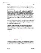
Exhibit 1.2 represents three assumed economies: curve 1 describes two goods (Coke & Pepsi) are perfect substitutes; curve 2 describes two goods (beef & lamb) are close substitutes; curve 3 describes two goods (pork & wheat) are imperfect substitute.
For the curve which two goods are perfect substitutes, say, Coke and Pepsi, the factors of production employed were equally suited to the production of output of Coke and Pepsi. Namely, the opportunity cost is constant, and the production possibilities frontier is a straight line.
In curve 2, the two goods beef and lamb are close substitute. The factors of production of beef are quite suited to producing lamb. The economy just sacrifice a little larger amount of beef output in order to produce each additional kilogram of lamb.
In economy 3, pork and wheat are imperfect substitutes. To expand the output of pork requires a large amount of facilities and experienced raiser, whereas the expansion of output of wheat requires length and breadth land and large amount of farming machines. The difference of resources required in production of beef and lamb decide their curve shape (curve 3) on PPC as shown in Exhibit 1.2.
(b) Utilise the demand-supply market models (for each market below) to graphically illustrate and explain the following:
(i) The discovery of a new "Mad Chicken Disease" (similar to BSE - Mad Cow Disease) in the USA and Europe on the Lamb Market in Australia.
To estimate the effect on Australia lamb market by discovery of "mad chicken disease", some assumption must be addressed:
( i ) The origin of mad chicken disease is concerned as the contaminated feed and Australia may become the next victim after buying potentially tainted animal feed from Britain at the height of the UK epidemic. Scientists believe that human can be contracted related illness by eating infected chicken.
( ii )Australians Consume 200,000 tones of lamb and 170,000 tones of chicken per year (source: Livestock Products, Australia (7215.0)). Since people suffered attack of mad cow disease not long ago, the following discovery of mad chicken disease badly impair consumers' confidence of meat food safety, and lamb consumption in Australia dropped by up to 30%.
( iii ) Australia exports about 112,000 tones of lamb to world markets , With Japan, the United States and the Middle East among the most important buyers (Livestock Products, Australia (7215.0)). The outbreak would put pressure on Australian exports to these key markets. Imports of Australia lamb may be suspended by these countries.
In exhibit 1.3, the fears over safety of lamb cause an decrease in demand from D1 to D2. At a price of $8 on D1 (point E1), 200000tones of lamb would be demanded per year. At this price on D2 (point A), the demand decreases to 120000 tone. The decrease of Australian exports to overseas markets cause an increase in supply on domestic market. The rightward shift from S1 to S2 means that a greater quantity of 50000 tones of lamb will be offered for sale at any price. At equilibrium point E1, the price per KG charged is $8 and the quantity of lamb consumption is 200000 tones. Following the discovery of a new "mad chicken disease", the decrease in demand from D1 to D2 and the increase in supply from S1 to S2 establish equilibrium E2. At E2, sellers charge the lower price of $4 per kg and the equilibrium quantity of lamb consumption drops to 187500 tones.
(ii) Technological advances have improved the productivity in organic vegetables (e.g. cauliflower). At the same time consumers are more aware of the health benefits of organic foods and also the negative environmental consequences of chemicals in agriculture, and genetically modified (GM) crops. Show the effects on market for an organic vegetable and a non-organic or GM vegetable.
Assumption 1:
Organic vegetables, by definition, is vegetables that has not had chemical fertilizers, insecticides, fungicides, herbicides or pesticides sprayed on it or any post harvest treatment such as waxing. The advantages of organic vegetables for the environment and for livestock are obvious and it would seem logical that there are benefits for human health too. Recently, there has been a surge in the demand for these products. The main disadvantage of organic food is the cost (Canbiotech Inc 2003).
Assumption 2:
Technological advances have improved the productivity in organic vegetables. At the same time, ...
This is a preview of the whole essay
Assumption 1:
Organic vegetables, by definition, is vegetables that has not had chemical fertilizers, insecticides, fungicides, herbicides or pesticides sprayed on it or any post harvest treatment such as waxing. The advantages of organic vegetables for the environment and for livestock are obvious and it would seem logical that there are benefits for human health too. Recently, there has been a surge in the demand for these products. The main disadvantage of organic food is the cost (Canbiotech Inc 2003).
Assumption 2:
Technological advances have improved the productivity in organic vegetables. At the same time, organic vegetables farmers increase from 290 to 520 because of the increased demand.
Exhibit 1.4 indicates the market for cauliflower. Suppose this market is at equilibrium E1, the going price is $6 per kg, and 20,000 tones cauliflower are bought and sold per year. Now suppose consumers' concerns about the health benefits of organics foods and the environment protection increase the demand for cauliflower. The demand curve shifts rightward from D1 to D2. At the same time increased number of sellers and improved productivity cause an increase in supply from S1 to S2. This creates a temporary surplus at the initial equilibrium price of $6. Suppliers respond by reducing their price from $6 to $4 per kg, making them within the reach of the average customer, the market is in equilibrium again at point E2, and consumers buy 30000tones per year.
(iii) Though once part of European diet, horsemeat consumption has fallen dramatically in recent years. The Wall Street Journal cites higher costs associated with inefficient processing and specialised butchers along with the activities of animal rights groups (who would want to eat Mr. Ed?!) Graphically illustrate what happened to the horsemeat market.
Assumption:
The cost of production of horsemeat is increase sharply due to enforcing regulations of specialized butcher process. Nearly 50% of horsemeat producers have moved out of business because of excessively high cost and sharply fall of market demand.
In exhibit 1.5, begin at equilibrium E1 in horsemeat industry and assume that a significant decrease in the output of horsemeat shifts the supply leftward from S1 to S2. A consumer reaction on demand for horsemeat shifts downward from D1 to D2. At the initial equilibrium (E1), the price is $5 per kg and supplied 10,000 kg to market. As the supply decreasing due to quit of half producers, the demand also decrease isochronous. The isochronous decrease both in supply and demand gives a new equilibrium (E2) which the price still keep same level ($5) as E1 but quantity of horsemeat products decreased by 5000 tones.
Question 2:
Describe the concept of elasticity of demand and graphically illustrate 'elasticity'.
Price elasticity of demand is a measure of responsiveness of the quantity demanded to a change in price. Specifically, price elasticity of demand is the ratio of the percentage change in quantity demanded to the percentage change in price. By definition it is always negative but by convention it is always shown without the negative sign.
Exhibit 2.1 present the steel porcupines rock band's five different demand curve graphs.
What are the determinants of elasticity of demand? (explain with examples).
Elasticity coefficients of various goods and services vary a great deal. For example, the demand for cars is elastic. On the other hand, the demand for petrol is inelastic. Determinants of price elasticity of demand include (a) Availability of substitutes; (b) Degree of necessity; (c) The length of time allowed for adjustment
Availability of substitutes: the larger the number of close substitutes for the good then the easier the household can shift to alternative goods if the price increases. Generally, the larger the number of close substitutes, the more elastic the price elasticity of demand. When Consumers have limited alternatives, the demand for a good or service is more price inelastic. If the price of cars rises, consumers can switch to buses, trains, bicycles and walking. On the other hand, if the price of housing keeps rising, consumers still have to buy or rent houses since every consumer need an accommodation, and consumers have few substitutes for housing.
Degree of necessity: If the good is a necessity item then the demand is unlikely to change for a given change in price. This implies that necessity goods have inelastic price elastic ties of demand. The dairy products account for a large part of people's budgets. Consumers will attempt to economize on their expenditure on these goods if those prices raise a lot.
The length of time allowed for adjustment: In general, the price elasticity coefficient of demand is higher the longer a price change persists. As time passes, buyers can respond fully to a change in the price of a product by finding more substitutes. We separate the elasticity coefficients of air travel into short-run and long-run. The short-run elasticity coefficient is more inelastic at 0.1, than the long-run elasticity coefficient of 2.4. In the short run, people find it hard to cut back their air traveling on schedule when the price rises sharply. They are accustomed to the comfort of traveling by air. If high prices persist over time, buyers can switch to coaches, trains and cut unnecessary travel.
Question 3:
(a) Around the mid 80s, beer used to be produced by nearly 450 companies in the U.S.A. However, it has been gradually reduced to 44 companies with a significant share of the production contributed by the largest 4 companies (Anheuser-Busch (Budweiser brand), Miller, Stroh and Coors). Using the theory in chapter 6, describe what kind of long-run cost condition would contribute to such restructuring in the production (use appropriate graphs).
Around the mid 80s, beer used to be produced by nearly 450 companies in the U.S.A. The 450 companies consisted of many young and small companies, some medium-size and a few large companies. All the companies expanded the scales of operation and builds larger plants.
As the scale of operation expands, the LRAC curve (exhibit 3.1) can exhibit three different patterns. Over the lowest range of output from zero to Q1, the companies experiences economies of scale. Economies of scale exist when the long-run average cost curve declines as the companies increased output.
Compared with small companies, larger companies can increase the division of labour and use of specialization and produce more efficiently with greater efficiency of capital. The scale of operation is important for competitive reasons.
Consider a young firm producing less than output Q1 and competing against a more extavlished firm that has reaped all economies of scale and is now producing in the range of output between Q1 and Q2. The LRAC curve shows that the older firm has an average cost advantage.
That is, the larger the scale of a company's operation, the lower its per-unit cost will be. This means that larger companies can undercut its smaller rivals and drive them out of business.
Between some levels of output, such as Q1 and Q2 the LRAC curve no longer declines. In this range of output, the firm increases its plant size, but the LRAC curve remains flat. This is constant returns to scale. Constant returns to scale exist when long-run average cost does not change as the firm increases output.
Under this long-run cost condition, some small companies were put out of business and some companies had to be merged. The 450 companies have been gradually reduced to 44 companies. The largest 4 companies have a significant share of the production because they reached output levels between Q1 and Q2 and have an average cost advantage.
The 40 smaller companies which have not reach the output level Q1 still survive with a average cost above $25 per unit, and they can only have a small share of production. If they produce quantity of output of Q1, they will confront a higher average cost of $30. They have to stay with the small share of the production in the short run.
Examine the case of another industry you think has undergone (or likely to undergo in the future) similar restructuring (search websites, books, articles, use your creative genius (!) and explain your points).
Because the perfectly competitive firm must take the price determined by market supply and demand forces, market conditions can change the prevailing price. When the market price drops, the firm can do nothing but adjust its output to make the best of the situation. Exhibit 3.3 shows the short-run loss point A and short-run shutdown point B. In exhibit 3.3, the marginal cost curve at first decreases, then reaches a minimum, and then increases as output increases. The MC curve intersects both the average variable cost (SVC) curve and the average total cost (ATC) curve. The marginal revenue (MR1) curve intersects the average total cost at the minimum point A where the price is $44 per unit. The marginal revenue (MR2) curve intersects the average variable cost at the minimum point B where the price is $30 per unit.
Suppose a decrease in the market demand for components causes the market price to fall to $44. As a result, the firm's horizontal demand curve shifts downward to the new position shown in exhibit 3.3. From this point, the firm makes no profit because any price along the demand curve is below the ATV curve. The firm has the option of continuing to operate or shutting down in the short-run. If it continues to operate and the market price drops below $30 below the minimum point on the AVC curve, the best course of action is for the firm to shut down. The revenue from each unit produced cannot cover the variable cost per unit. To operate under there conditions would involve total losses in excess of those incurred if the firm were to shun down. Rather than losing more than the total fixed cost, the firm would be better off shutting down and producing zero output. While shut down, the firm would keep its factory, pay fixed costs and hope for higher prices soon.
Question 4:
(a) Suppose the lawn mowing industry approximates a perfectly competitive industry. Suppose also that a single firm buys all the assets of the lawn mowing firms and establishes a monopoly. Contrast these two market structures with respect to price, output and allocation of resources. Draw a graph of the market demand and market supply for lawn mowing services before and after the takeover. Would you expect the monopoly to survive?
Exhibit 4.1 shows a comparison of monopolistic competition and perfect competition in the long run. In exhibit 4.1(a) it is assumed that the lawn mowing market is monopolistically competitive. In exhibit 4.1(b) it is assumed that the market is perfectly competitive. It is also assumed that the cost remain unchanged when the market structure changes to become perfectly competitive.
In part (a), lawn mowing industry is monopolistically competitive firm that sets its price at $1,200 per acres and provides 500 acres per week. As a monopolistic competitor, the firm earns zero economic profit and does not produce at the lowest point on its LRAC curve.
Under conditions of perfect competition in part (b), the firm becomes a price taker. Here the firm faces a horizontal demand curve at a price of $1,000 per acre. The output is 800 acres per week, which corresponds to the lowest point on the LRAC curve. Therefore, the price is lower, and the output is 300 acres per week is higher when the firm operates as a perfectly competitive firm rather than as a monopolistically competitive firm.
Now we compare and evaluate these market structures.
A comparison of part (a) and (b) reveals two important points. First, both the monopolistic competitor and perfect competitor earn zero economic profit in the long run. Second, the long-run equilibrium output of the monopolistically competitive firm is to the left of the minimum point on the LRAC curve. The monopolistically competitive firm therefore charges a higher price and produces less output than a perfectly competitive firm.
Perfectly competitive firm is a price taker, whereas the monopolistically competitive firm is a price marker.
Perfectly competitive firms charge all consumers the same low prices. The monopolistically competitive firm can, because it faces a downward-sloping demand curve, try to practice price discrimination. For example, monopolistic competitors can charge lower prices for seniors and travel agencies the give discounts to students.
Price discrimination allows the monopolist to increase profits by charging different buyers different prices, rather than charging a single price to all buyers. A common reaction to price discrimination is that it is unfair. However many buyers benefit from price discrimination by not being excluded from purchasing the product.
Perfect competition means more output for less, whereas monopolistic competition fails the standard efficiency test.
The monopolistically competitive firm may produce too little output at inflated prices and waste society's resources in the process. With perfect competition each firm would produce a greater output at a lower price and with a lower average cost.
Monopolistic competitive firms offer greater consumer choice compare with perfect competitive firms
Monopolistic competitive firms offer differentiated products and give consumers much more choice. In the case of most goods and services, consumers would prefer the variety comes with product differentiation in monopolistically competitive markets than be faced with no choice in a perfectly competitive market in which all firms sell identical products. Although product differentiation means lower output and higher prices, it would seem that the benefits of variety usually far outweigh the benefit from lower prices that would result from production of identical goods and services in perfectly competitive market.
(b) Explain why monopolies are bad.
Monopoly disadvantages are these:
(1) A monopolist charges a higher price than a perfectly competitive firm;
(2) Resource allocation is inefficient because the monopolist produces less output than if competition existed. Stated differently, the monopolist is responsible for a misallocation of resources because it charges a price greater than marginal cost. In perfectly competitive industries, price is set equal to marginal cost, and the result is an optimal allocation of resources;
(3) Monopoly produces higher long-run profits than if competition existed;
(4) Monopoly transfers income from consumers to producers, compared with the outcome under perfect competition.
(c) Consider a monopoly (or close to monopoly) firm in 'real world' and comment on its behaviour (use websearch, your knowledge, creativity and data to answer this question. Draw any appropriate data graphs if data is available).
The Australia Intergovernmental Agreement on access to natural gas pipelines was signed in November of last year. It regulated the foundation of gas transaction industry trade is based on monopoly regimes. The means which seek to achieve this are very heavy handed regulation.
Government controls the pipeline industry in the ways below:
The regulation state based on monopoly regimes indicates that it does not pave the way for free market entrepreneurial action.
The provisions for pricing and access are in fact highly prescriptive and where there is flexibility it is often in directions that offer too much discretion to the regulator and thereby reduce certainty on the part of the operator. Such loss of certainty is likely to raise the return needed to justify pipeline operations and reduce activity in the business.
The pricing basis for existing pipelines leaves too much discretion to the regulator and is likely to be over complex in establishing prices for different services. In terms of the price base, although it is agreed that optimized deprival value be used there is provision for other approaches. At the minimum, pricing must be based on replacement costs---the alternative sets the price too low and leads to both excess demand for the service and inadequate incentive to increase capacity or build rival lines. (Moran 1999)
Question 5:
(a) Describe oligopoly market structure and comment on 'Cartel' form of oligopoly.
Oligopoly is a market structure characterized by (1) few sellers; (2) either a homogeneous or a differentiated product; and (3) barriers to market entry.
(1) Few sellers:
Economists measure the seller concentration ratio of an industry to determine whether it is an oligopoly. Seller concentration ratios are based on the percentage of sales of the four largest firms in the market, as a percentage of all sales in the market. This ratio is then compared to the total sales of the twenty largest firms in the market.
An important feature of firm in an oligopoly market structure is that they tend to be mutually interdependent. Mutual interdependence is a condition in which an action by one firm may cause a reaction on the part of other firms. If one firm changes its prices, this will have an effect on the sales of all other firms in the market.
(2) Homogeneous of differentiated product
Under oligopoly, firms can produce either a homogeneous or a differentiated product or service such as producers of oil and standardized products.
(3) Barriers to market entry
These barriers include very large financial requirements to enter the market, control of an essential resource by existing firms, patent rights held by existing firms. But the most significant barrier to entry in an oligopoly market structure is economies of scale.
A cartel is an official agreement between several firms in an oligopoly. The agreement sets the price all firms will charge and often specifies quotas or market shares of the various firms. Cartels are illegal in most countries of the world. OPEC is a major example of a cartel. It exists because it is beyond the control of an individual country.
Problems in maintaining a cartel can be: (1) it is illegal under antitrust law; (2) individual companies have an incentive to cheat (lower price or produce more output) because the MR for member of the cartel is not the same as for all the firms. When output increase, all firms absorb the lost revenues of the price drop. (3) When firms cheat, lose the gains of the cartel.
Cartel approaches include:
- Price Fixing
- Cartel agreement fixing prices and outputs
- Price leadership: more subtle
- Leader sets signals a price
- Firms follow:
Most successful if firms have separate market areas
Problems in maintaining a cartel can be: (1) it is illegal under antitrust law; (2) individual companies have an incentive to cheat (lower price or produce more output) because the MR for member of the cartel is not the same as for all the firms. When output increase, all firms absorb the lost revenues of the price drop. (3) When firms cheat, lose the gains of the cartel.
(b) Consider an 'oligopoly' (or close to oligopoly) market structures of 'kinked demand' or 'price leadership' type in real world and comment on behaviour (use websearch, your knowledge, creativity and data to answer this question. Draw any data graphs if data is available).
The kinked demand curve model of oligopoly is based on the assumption that each firm believes that:
If it raises its price, others will not follow.
2 If it cuts its price, so will the other firms.
The demand of a firm in oligopoly is made of two segments of two separate demand curves. The upper part is highly elastic because if the firm raises its price, the other firms will not follow, and the firm will lose its market share. The lower part is inelastic because if the firm lowers its price, the other firms follow, and no firm can expand its market share.
Exhibit 5.1 shows the demand curve that a firm believes it faces. The demand curve has a kink at the current price, P, and quantity, Q. A small price rise above P brings a big decrease in the quantity sold. The other firms hold their current price and the firm has the highest price for the good, so it loses its market share. Even a large price cut below P brings only a small increase in the quantity demanded. In this case, other firms match the price cut, so the firm gets no price advantage over its competitors.
The kink in the demand curve creates a break in the marginal revenue curve (MR). To maximize profit, the firm produces the quantity at which marginal cost equals marginal revenue. That quantity, Q, is where the marginal cost curve passes through the gap ab in the marginal revenue curve. If marginal cost fluctuates between a and b, like the marginal cost curves MC0 and MC1, the firm does not change its price or its output. Only if marginal cost fluctuates outside the range ab does the firm change its price and output. So the kinked demand curve model predicts that price and quantity are insensitive to small cost changes.
A problem with the kinked demand curve model is that the firms' beliefs about the demand curve are not always correct and firms can figure out that they are not correct. If marginal cost increases by enough to cause the firm to increase its price and if all firms experience the same increase in marginal cost, they all increase their prices together. The firm's belief that others will not join it in a price rises in incorrect. A firm that bases its actions on beliefs that are wrong does not maximize profit and might even end up incurring an economic loss (Economicsplace 2002)
An oligopoly form of market is characterized by the presence of a few dominant firms. There may be a large number of small firms, but only the major firm have the power to retaliate. This results in a high concentration of the industry in only 2-10 firms with large market shares.
The gasoline industry is an oligopoly in the United States: it is dominated by a few giant firms. However, many small firms exist in the market: small independent gas stations which sell in just one city or just a limited region.
Several gas stations are often found next to each other at major highway intersections. They also often have same or similar prices. The demand curve has a kink at the current price. If one gas station tries to increase its price from the current price 125.9 to 127.9, customers will go across the street and the gas station will lose revenues. If the same gas station lowers its price to 123.9, it will attract new customers only until the other also drop their prices; then all will lose revenues (John Petroff 2002).
References:
Canbiotech Inc 2003, Organic Food market: Trends and opportunities [on line].
Available at URL:
http:// www.canbiotech.com
[Accessed 16 April. 2003]
Commonwealth of Australia 2001, Meat production and slaughtering, [on line].
Available at URL:
http:// www.yprl.vic.gov.au
[Accessed 12 April. 2003]
Economicsplace 2002, The kinked Demand Curve Model, [on line].
Available at URL:
http://www.economicsplace.com
[Accessed 16 April. 2003]
Moran, A 1999, Gas industry regulatory development[on line].
Available at URL:
http://www.ipa.org.au
[Accessed 16 April. 2003]
Assignment-1 ECON 20023
Created by Zhiqin Zhang