MATHS GCSE COURSEWORK
SECOND HAND CARS
All cars depreciate in value and there are several factors that influence this depreciation. Therefore the objective of this assignment is to statistically analyse the data of second hand cars provided as apart of the coursework and using mathematical knowledge conclude which factors affect the price of a second hand car and furthermore conclude how much influence these factors have on the second hand price.
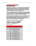
Firstly in order to differentiate the key factors that influence the price of a second hand car, I have re-arranged the list of 100 cars by depreciation (lowest to highest). I decided to do this in order to become aware of any price affecting patterns and thus set myself an appropriate hypothesis in order to achieve the most accurate results possible.
I have decided to represent the price depreciation of a car as a percentage. This is mainly due to the reason that each car has factors restricted to that car only. For example the price of a second hand car is dependant on its original value as well as the other influential factors. Consequently this will allow me to compare the data in one constant flow and allow a correlation to be seen when illustrated as graphs.
The percentage is worked out using the following calculation:
Original Price - 2nd Hand Price= Price Differentiation
Price Differentiation / Original Price = Depreciation
Depreciation x 100= Depreciation as a %
Below is the list of cars:

After thorough inspection of the rearranged data it is easily identifiable that mileage, as well as age, have major influences to the depreciation of a car. Therefore I have added the mileage and age information to the table.
I also found that the number of previous owners, the car’s MOT and insurance expiration and if the car has been serviced or not has influences to the depreciation of a car. However after examining this information specifically I have found that these four factors hardly have any noteworthy influence to the % depreciation of a car.
...
This is a preview of the whole essay
After thorough inspection of the rearranged data it is easily identifiable that mileage, as well as age, have major influences to the depreciation of a car. Therefore I have added the mileage and age information to the table.
I also found that the number of previous owners, the car’s MOT and insurance expiration and if the car has been serviced or not has influences to the depreciation of a car. However after examining this information specifically I have found that these four factors hardly have any noteworthy influence to the % depreciation of a car.
Another influential factor may be the actual brand and/or origin of a car; however I will look into this more specifically later.
Overall from scanning the table I have noticed a pattern with all the cars, that regardless of how much a car depreciates, the mileage and age of a car will also always increase.
Therefore my first hypothesis is:
‘the greater the mileage of a car, the greater the depreciation’.
This hypothesis was decided upon initial practicality, and after analysing the data, the likeliness of this hypothesis has increased.
My second hypothesis is:
‘the greater the age of a car, the greater the depreciation will be’.
This hypothesis was determined after brief study of the table. The table illustrates this prediction and shows evidence that however old a car is, the depreciation tends to increase.
Initially I will use scatter graphs in order to demonstrate the relationship between the mileage and age in contrast with the depreciation of the price of a car. However firstly I will need a selected sample of cars to compare.
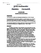
Using the RAN# function on my calculator I have taken a varied random sample of 20 cars. Below, displayed in a table, are those 20 samples with the information needed in relation to my study.
I have used a moderately large sample database of 20, in order to make my data more useful. Also using a large sample like this will make my results more precise to the actual results of the entire population. I believe a database any larger than this, 30 max, will make the data difficult to analyse which would lead to inaccurate results.
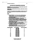
In order to make the data from the table clearer, below is the same data presented in frequency tables as well as the mean, median and range information for each factor:
Mileage:
Mean = 48,711.11
Median = 49,000
Range = 59,270
Age:
Mean = 5.45 years
Median = 5.5 years
Range = 10 years
Price Depreciation:
Mean = 62.98%
Median = 63.93%
Range = 47.24%
From this data I have found that when a car is approx. 5.45 years old, the mileage should have reached approx. 48,711.11 and therefore the car would have a depreciation of approx. 62.98%.
In order to test this and notice a correlation, I have illustrated the frequency information as scatter diagrams:
The scatter diagram shows positive correlation allowing my hypothesis to stand true, that the greater the mileage, the greater the depreciation.
As can be seen, I have drawn a line of best fit. Further to my previous inspection of the data, the line of best fit shows that when a car has a depreciation of approx. 62.98% then the car would have reached a mileage of 50,000.
Yet again the scatter diagram shows positive correlation allowing my second hypothesis to stand true, that the greater the age, the greater the depreciation.
The line of best fit shows that when a car has reached a depreciation of approx. 62.98% then the car would have reached an age of approx. 5.6 years.
A correlation was found between the averages of mileage and age affecting the % depreciation of a car. This proves that mileage and age do influence the depreciation of a car. If a correlation wasn’t noticeable, then my hypothesis would have been incorrect.
In conclusion, upon analysing the data from the 20 sampled cars, I have found that my hypothesis is correct; that the mileage and age does have an effect on the price depreciation of a car.
However the initial data showed that when a car is 5.45 years old, the mileage should be 48,711.11 and the car would have a depreciation of 62.98%. However it is noticeable from the scatter diagrams that the line of best fit wasn’t 100% accurate as the mileage and age weren’t exactly how they should have been. Therefore I have been faced with the conclusion that there may be other factors that affect the depreciation of a car.
I have already examined four factors, which had no significant influences. Therefore I will extend my investigation by looking at the difference in price depreciation between two different car brands: Fiat (Italian) and Rover (was British, now German). I will do this in order to investigate whether there are any specific price depreciations from cars within different origins.
My new hypothesis is:
‘the price depreciation differs depending on the brand and origin of a car’.
Below is a list of the 20 sampled cars I have selected within the range of Fiat and Rover:
Fiat:
Rover:
In order to signify a more useful representation of this data, I have displayed the data in frequency tables and furthermore represented this data using histograms:
Fiat:
Rover:
The depreciation rates are quite evenly dispersed varying from 30 – 90%.
The depreciation rates are not evenly dispersed; they tend to depreciate towards the high end varying from 60 – 90%.
The frequency polygon diagram shows that Fiat’s rates have a wider range compared to Rover where their rates have a narrow range and lie more towards the high end. For example Rover has 6 vehicles in the 80 – 90% range, where-as Fiat only has 2. In contrast this proves my hypothesis right that price depreciation varies depending on the car brand and origin.
As you can see from the table below, rover has a much higher depreciate rate, averaging approx. 79%, where-as Fiat has proved to have unsatisfactory depreciation rates for the owner, however more dispersed when compared to Rover, an almost 17% difference:
In order to signify this data, I will now conduct a stem and leaf diagram. Consecutively I will round the depreciation rates to the nearest whole number in order to make it clearer and straightforwardly comparable.
Fiat:
Again this shows that the depreciation rates are evenly dispersed, where most vehicles lie in the 50% depreciation zone and then disperse away from this point either way.
Rover:
All the vehicles lie in the 70% and 80% depreciation zones.
To prove further there is a difference, I will conduct a cumulative frequency curve. This will help me to evaluate my hypothesis by comparing the data accurately.
The cumulative frequency curve shows that Fiat’s cars depreciate at low and high values ranging from 40 – 90%, where-as Rover’s cars depreciate at only high values commencing from 60%.
In order to display the distribution of this data I will now formulate a box and whisker diagram.
In order to draw a box and whisker diagram I will need to know the lower quartile, median and the upper quartile for the Fiat and Rover cars as well as both combined.
I have displayed this information in a table:
With the assist of my stem and leaf diagram, I will also need to know the maximum and minimum values.
To find the quartiles, these formulas will be used used:
Where n = the sample number
So n = 10 (For Fiat and Rover) and n = 20 (For both companies combined)
The box and whisker diagram has simplified a lot of useful information. It has showed that Rover’s inter-quartile range is 14.85% less than Fiat’s. This suggests that Fiat’s cars depreciation rates were more spread out than Rover’s. Also by looking at the box and whisker diagram you can see that Fiat is positively skewed whereas Rover is negatively skewed.
Conclusion:
- The second hand price must be represented as a percentage by subtracting the second hand price from the original price. This puts all the values into one constant and therefore can be compared with other cars; for example obtaining a relationship between depreciation and age / mileage.
- The scatter diagrams and the line of best fit showed that there is positive correlation between mileage and % depreciation and age and % depreciation proving both of my initial hypothesis right. Generally, greater the mileage, greater the depreciation and greater the age greater the % depreciation. Also the scatter diagrams can be used to give reasonable estimates of age and mileage in contrast with % depreciation.
- With the help of histograms, a frequency polygon diagram, stem and leaf diagrams, a cumulative frequency curve and a box and whisker diagram, I can say that the brand of a car does influence the depreciation. In general from my findings, Rover’s cars depreciated more than Fait’s. Also the box and whisker diagram showed negative skews for Rover and for both companies combined, but positive skews for Fiat.
So overall from my investigation I have found that:
- Mileage and Age have major influences on the % depreciation of a car. Proving my first two hypotheses right. However as my line of best fit suggested on the 2 scatter diagrams, there may be other factors that influence the % depreciation of a car even though this may be a mere 1 – 3% change.
- The price depreciation does differ depending on the brand and origin of a car; proving my third hypothesis right. However when investigating this, I was limited to 10 samples per brand. Furthermore I haven’t taken into account other brands.
If I used a larger sample, this would have increased the accuracy of my results and would have made my results more precise in similarity to the entire population.