“Compare and contrast two film posters of the same genre”
“Kill bill” and “rush hour”
I will be analysing two film posters, which are “Kill bill”(2003) and “rush hour”(1998). The genre of both posters is action. They are mostly about revenge because the facial expression straight away gives you an indication.
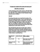
“Kill bill”
By looking at this poster, you can tell that the storyline of the movie will be based about action. There is a sword slicing down the middle of the poster, which connotes murder. The name of the film makes us think that there is a villain on the loose and it is ready to be grasped with weapons. However the poster is layed out in two different colours; yellow colour representing the good part of the film and also the achievements, black colour representing the horrific fraction Of the film.
Some clues about the action genre are that it used a couple of weapons which is effective for the reader because you can see swords being involved which obviously means that its going to involve a bit of action. It also gives us a hint by the way the title is layed out which is in shadowy and red colour,