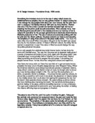
Now there are many artist out there that use their art to get someone known, probably the latest one is Graphic designer/street artist Shepard Fairey. When the American elections came along he produced posters of president obama, using vibrant colours and his distinct street art style, he brough what is known as a very boring subject straight to life. You can buy this everywhere, on t shirts, on posters, the list is endless…. I love how he has used the colours, its almost like a stencil but with much more detail, the placement of obama being in the middle shows that it is all about him (giving him presence) the fact that his head it tiled upwards shows strength. His eyes looking up almost shows that he is thinking about bettering the world. The red white and blue gives a patriotic feeling to the piece, which is incredibly important to most americans. The type used underneath is bold and in your face giving the defiante feeling that obama will bring hope and progress to America.
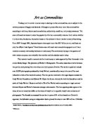
This piece is one of his first, and it is a print of andray the giant, Fairey just like warhole took someone that everyone knew in the past and made his face famous today. Again it isn’t the person that we know, but it is Fairey’s art that we now know. The simplicity of this piece works fantastically with a great use of negative space. The emphasis is completely about one thing which is the legendary wrestler, Fairey has simplified all of the looks but has still managed to capture who it is.
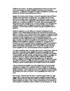
This piece is called rise above. The use of the black lines and the full symmetry of the piece really inspire my art/graphic design today. I love the way that the foreground at the background almost subconsciously meet together with the starburst going through the hand. This print really has a political art feel about it just like a new age world war two propaganda poster. The fist is extremely striking, your eyes automatically scan up the print looking from watch right up to the fist. The use of his logo in the watch is a nice added effect as it isn’t in your face and is subtle. The watch is the main feature in the piece, this is emphasized by the placement of the starbursts shooting out from it. I feel that this piece has great placement, right from the back ground to the foreground and has a great focal point. The thing that hit me first was the use of texture, behind most of Fairey’s prints he uses a pattern, this can be anything from old posters to ripped pieces of wallpaper.
I have always liked the work of gilbert and george. They have a huge emphasis with working with symmetry, they divide all their huge prints with black lines (often framed in huge grid structures). Some of their pieces can be a bit risky, showing rude images. The reason that they inspire me is their use of repetition in there prints, as you can see in this particular piece they have repeated six clear objects, but the thing that gives them the twist is that yes from a distance it all looks similar, but when you get close and look further you can see that each repetition is slightly different. There use of colours are bold and striking, they always make sure the background isn’t overpowering the foreground, normally making the background a plane brown or a black and white photo. The focal point in this image starts and the bottom flower then your eyes automatically look up at everything else in the print.
Im inspired by artists that use typography as a form of expressing themselves. Liam Gillick is a modern day artist that uses type, here he had a number of short texts hung from the ceiling, over time the text moves and different words were made. I like how he managed to take something 2d and make it an installation that becomes 3d. This really does question weather this piece is simply text or a sculpture. The black font is striking and bold making it stand out from the white ‘canvas’, this really is a g ood use of 3d negative space, giving the text full acknowledgement in the room.
Nicholas Alexander is an amazing typographical artist, his work is used in many magazines to create new and unique fonts. He inspires me with the amazing detail he uses, making all his fonts sharp and accurate to a point. As you can see on the right is one of his pieces, this is one of his fonts that he has made, he always makes sure to use the right colours in his fonts, here he has chosen an array of pinks and blues that really stand out. I believe that this was made for an album cover.
Robert gober is a sculpter that inspires lots of my graphical art, his objects are made to unsettle the viewer through strange combinations, absences or deformaties. This pieces is interesting, it appears to be the lower quarter of a mans leg, complete with trousers, shoes and even hair. The leg sits against a wall and we wonder wheteher the man has been crushed under a great weight or weather this part has been severed. What I like is the unusualness of this piece, its not every day that you see something like this that triggers your emotions in so many different ways. Robert wants the aspect of shock with this piece, leaving you to worry as it looks so realistic.
This piece of his is more what I am into, I like placing two objects together that don’t make sense, leaving the viewer confused. Again this sculpture combining a tap and a child’s legs.
This is takashi murakami, he is one of my biggest inspirations in graphic design. This piece of his is all about bringing graphics and mixing it with fine art, I love the use of bold colours, he has an effective use of negative space, making sure not to overcroud the print with too much going on. Most of his prints are printed large formant nearing 12ft by 24ft, this really makes a bold statement when you see his work first hand. This photo has no real clear focal point, my eyes first look at the middle with the most colour pattern and detail, then after you start to notice all the smaller pieces of detail shooting around the sky.