Types of Information
- This document does not use graphs
- The document uses text to get the message across to the receiver and tell them what the bill is for.
- This document does not use charts
- The document uses a table to present the information in. It uses a table in the payment slip with all of the payment details in.
- The document uses numbers in the dates, amount of money needed to be paid, account numbers, addresses and in the main information.
Presentation and Layout
- My sample of the document has no colour but I would imagine if it were printed of in colour the logo would be in colour . Also this bill has a background colour of light blue.
-
The bill is left aligned, but some of the prices and bills to be paid are right aligned. The rest of the information like the addresses is left aligned.
- The orientation of the paper is portrait.
- The size of the paper is A4.
- The document has no header, but it has a footer, which is a set of serial numbers.
- In the main set of information each bill that needs to be paid has a line spacing between it.
- The addresses and telephone numbers are positioned at the top of the bill. The main information is then positioned in the centre of the bill and then the payment slip is positioned at the bottom of the bill.
- There are two margins either sides of the bill.
- There are two headings in this phone bill. One is in the main information, which says 'Phone Bill', and the other is used in the payment slip which says ' total amount due '.
- There are no borders or shading used.
- There are two graphics used in this bill and they are the company logo, which are positioned at the top of the bill and on the payment slip.
- There are dividing lines to separate the telephone numbers from the main information. There are also dividing lines separating the main information from the payment slip.
- There is a lot of white space in this document. The most space is found above the main information and underneath the company telephone numbers.
- There are one set of bullet points used and they are used in the payment slip. These set of bullet tell the receiver what to do with the payment slip.
Analysing Manweb Bill
Content and purpose
- The purpose of this document is to inform a certain owner of a Manweb Electricity account about there monthly electricity bill.
- This bill is aimed at one person this is because there is only one name on the bill.
- The document contains a lot of important information. It contains the amount of money the person needs to pay and what it is getting paid for. It also shows the total charge of the bill excluding VAT. It also has the address and phone number of Manweb and the receiver, it also has the date the bill was sent. It contains all of the company's information so the receiver knows who it is of but also incase they have any problems they know who to contact and how. It also has information at the bottom of the bill were the abbreviations are kept and there is also some information for the reader about the company.
Style
- The document is supposed to be aimed at only person, which is Mr R J Edwards. Now the bill is addressed to one person that now allows them to put personal information on the bill like account numbers etc. The age group will be generally over 18, because you have to be 18 and over to own your own house and electricity account. Also it is aimed at this audience because the language is complex and a young person would find it difficult to understand what is being said in the bill.
- This document uses the same font throughout for the main information, even thought it uses bold. The font used in the company logo is different from the rest of the information so it looks unique. Some of the sub headings are made slightly bigger and bolder so it stands out to the reader and breaks the bill down a bit. The majority of the text is serif. Some of the text is bigger than others, the reason for this is that it stands out to the reader. I think the style of font is consistent throughout the bill it looks more professional. The information that is at the bottom of the bill has a slightly different style font used in the headings. It looks like a bold serif font with a colour of white, with a black background.
- The type of language that is used throughout this document is a complex style of language. The reason for this so the point gets across to the reader. The information tries to be simple to a certain extent, but is still complex. The reader will still understand the bill but may find it difficult. But the people who will be receiving this bill are used to getting bills so they will be able to understand the bill if they get bills every week. I would say that this bill looks the most complicated at of all the bills, the reason I say this is because it looks very boring and contains a lot of information.
Types of Information
- This document does not use graphs
- The document uses text to get the message across to the receiver and inform the reader what the bill is for and to set out the abbreviations at the bottom of the bill. Also text is used in the addresses on the bill and also to tell the receiver what they are getting charged for.
- This document does not use charts
- The document uses a table to present the information in. The information that will be contained in this table will be all of the bills that need to be paid and what they are getting paid for.
- The document uses numbers in the dates, amount of money needed to be paid, account numbers, addresses and in the main information. Numbers are not used as much as the text.
Presentation and Layout
- The document has no colour but I would imagine if it were printed of in colour that the logo would be in colour. It makes it look very professional if it is printed of in colour.
-
The bill is left aligned, but some of the prices and bills to be paid are right aligned. The rest of the information like the addresses are left aligned.
- The orientation of the paper is portrait.
- The size of the paper is A4.
- The document has a header, but it has no footer. The header is just simple and it is the number of the page and how many pages the document has. It is a good idea to have the abbreviations at the bottom of the bill because with out them the reader may become confused.
- In the main set of information there is a line spacing between each bill that needs to be paid. There is also a line spacing between each paragraph in the box of information, which is positioned at the top right hand corner.
- The addresses and telephone numbers are at the top of the bill. The main information is then positioned in the centre of the bill and then the information about the company at the bottom of the bill. Then there is a tiny box in the top right corner, which contain a lit information about the company and has a few contact numbers.
- There are margins either sides of the bill.
- There are two headings in this phone bill. One is in the main information, which says ' Electricity Statement', and the other is used at the bottom of the bill which says ' Current balance thank you'.
- There is one border found in this document. This border is found around the information in the top right hand corner of the bill. This border is a very thin line and it has a colour of black.
- There is one graphic. This graphic is of a diamond, which is contained in the logo, which is situated in the top left corner.
- There are dividing lines to separate the telephone numbers from the main information. There are also several lines separating the different bills that need to be paid.
- There is a lot of white space in this document. The most white space is found at the bottom of the bill. I think they should have an image here or space the information out a bit more. They could also have a payment slip here because this document contains no payment slips. Therefore the receiver will have no way of paying the bill.
- There are no bullet points used in this document.
Analysing British Gas Letter
Content and purpose
- This document is used to inform the owner of a British Gas account about their regular payment scheme and that £115.25 has been put back into their account.
- This document is aimed at one person only. I know this because the letter is addressed to Mrs M Edwards and her only.
- The document contains a lot of important information. It contains information about the persons gas account. It contains addresses of the receiver and the British Gas Company. It has several phone numbers, the date, a reference number and details about enquiries.
Style
- Now that the company knows that only one person will be seeing this letter, they are allowed to put personal details on the letter. Plus this letter is aimed at adults because only adults have a British Gas account. Another way that you can tell that it is aimed at adults is because of the style of language.
- The letter has a consistent use of font throughout the letter no make it look neat and professional, even though it uses bold. There is a slightly different font used for the company name and logo. The text is serif. Some of the text is bigger than others, the reason for this is that it stands out to the reader and it also breaks the bill down a bit more and makes it more interesting.
- There is a lot of basic language used throughout this document. The reason for this so the point gets across to the reader. The information tries to be simple and gets a little complex at certain places. Also the amount of information in the letter is very short so the reader will still understand all of the information in the letter. Also the subject of the letter is very simple so the language will therefore have to be simple.
Types of Information
- This document does not use graphs
- The document uses text to get the message across to the receiver and explains the information about the money that has went back into their account.
- This document does not use charts
- The document uses numbers in the dates, reference numbers, and amount of money being paid back, addresses, telephone numbers and in the main information.
Presentation and Layout
- The letter has no colour but I would imagine if it were printed of in colour that the logo would be in colour.
- The information in the letter is left aligned. There are also no indentations because line spacing separates the paragraphs of information.
- The orientation of the paper is portrait.
- The size of the paper is A4.
- The document has no header, but it has a footer which is the address of the British Gas Company.
- In the main set of information there is line spacing between each paragraph. This makes the letter look a lot better and more professional.
- The addresses and telephone numbers are positioned at the top of the letter and in the footer of the letter. The main information is then positioned to the right of the letter.
- There are two margins either sides of the letter.
- There is one heading in this letter and that is above the main information. The heading is ‘ Your Regular Payment Scheme’.
- There are no borders or shading used.
- There is one graphic used in this letter and that is the logo, which is situated in the top left-hand corner. The image is of a little flame.
- There are dividing lines to separate the telephone numbers from the main information. There are also dividing lines separating the main information from each other.
- There is a lot of white space in this document. The most space is found below the main information.
- There are no bullet points used in this document.
Analysing BT Letter
Content and purpose
- This document is used to inform the owner of a BT phone line about their new BT phone account. It also contains all of the necessary information about the new account.
- This document is aimed at one person only. I know this because the letter contains an address for one person .
- The letter has a lot of important information in it. It contains information about the phone account that the reader has opened. It contains the reference number, the account number, the new phone number, the phone book entry number and the price of the call level. It also has the company logo, the companies addressed and the receiver’s address.
Style
- The document is supposed to be aimed at only one person, which is Mr R Williams. This now allows BT to put personal information on the letter because only the receiver is meant to see the letter. Now the letter is aimed at one person the company is allowed to put account numbers, addresses and any other necessary information down in the letter. The age group will be generally over 18, because you have to be 18 and over to open an account with BT.
- This document has a consistent use of font through the main information, even though it uses bold and italic. There is a slightly different font used for the company name and logo and certain headings. The majority of the text is serif . Some of the text is bigger than others, the reason for this is that it stands out to the reader. Also the important details like reference numbers etc are all in bold.
- There is a lot of complex language used throughout this document. The reason for this so the point gets across to the reader. The information tries to be simple to a certain extent, but is still complex. The reader will still understand all of the information in the letter. Also the subject of the letter is very complex so the language will therefore have to be complex.
Types of Information
- This document has no graphs
- The document uses text to get the message across to the receiver and explains the information about their new account that they have opened.
- This document has no charts
- The document uses numbers in the dates, order numbers, the new phone number, account numbers, addresses and in the main information.
Presentation and Layout
- This letter has printed of in black and white so it has no colour but if it were printed of in colour the logo would be coloured.
- Most of the text in the letter is left aligned. There are also no indentations because the paragraphs of information are separated by a line spacing.
- The orientation of the paper is portrait.
- The size of the paper is A4.
- The document has no header, but it has a footer which is the address of the BT company.
- In the main set of information there is a line spacing between each paragraph. This has been done so it breaks the letter done and doesn’t look boring .
- The addresses and telephone numbers are positioned at the top of the letter and in the footer of the letter. The main information is then positioned to the left of the letter and then the BT order is to the right of the letter.
- There is a margin on the left of the bill.
- There are two headings in this phone bill. One is in the Bt order part, which says 'Your BT order', there are also several sub headings on the left side of the letter which are ‘About your call level’, ‘The other pages with this letter’ and ‘what to do now’.
- There are no borders or shading used.
- There is one graphic used in this letter and that is the logo which is situated in the top left hand corner.
- There is a lot of white space in this document. The most space is found above the main information and underneath the company details.
- There are no bullet points used in this document.
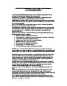
Analysing Manweb Letter
Content and purpose
- This document is used to inform the owner of a Manweb account about their annual energy assessment.
- This document is aimed at one person only.
- The letter contains a lot of important information. It contains information about the annual energy assessment the reader has. It contains the customers account number, customers address and the date.
Style
- The document is supposed to be aimed at only person, which is Mr RJ Williams. This means that Manweb is now allowed to put any type of information they want on the letter whether it is important or personal. The age group will be generally over 18, because you have to be 18 and over to have an account with Manweb.
- This document uses the same font through the main information. The style of font used for the logo and the company name is slightly different from the rest of the document. The text is in a sans serif style . All of the font is the same size, the reason for this is that it makes the letter look a lot neater. The layout and style of font looks very neat and professional in this document.
- The language used in this document is very complex. The reason for this so the point gets across to the reader. The information tries to be simple certain places, but is still complex. The reader will still understand all of the information in the letter. Also the length of the letter is very long because there is a lot of text and information contained in the letter, so the more information the harder it will be for the reader to take in the information.
Types of Information
- This document does not use graphs
- The document uses text to get the message across to the receiver and explains the information about the annual assessment.
- This document does not use charts
- The document uses numbers in the dates, account numbers, addresses and in the main information.
Presentation and Layout
- My sample of the document has no colour but I would imagine if it were printed of in colour the logo would be in colour.
- The information in the letter is left aligned. There are also no indentations because the paragraphs of information are separated by line spacing.
- The orientation of the paper is portrait.
- The size of the paper is A4.
- The document has no footer, but it has a header which is the number of the page.
- In the main set of information there is line spacing between each paragraph. This makes the letter look a lot better and more professional.
- The address of the customer is in the left hand corner.
- There are two margins either sides of the bill.
- There are no borders or shading used.
- There is one graphic used in this letter and that is the logo which is situated in the top left hand corner.
- There are no lines used in this letter.
- There is a lot of white space in this document. The most space is found below the main information.
- There are no bullet points used in this document.
Comparing 3 Bills Collectively
There are several good aspects shared between the three documents. One of the good aspects that all of the bill share, is that they all contain the company details in the top right hand corner. The details contain phone numbers, addresses and bill inquires. This is a good point because if the customer has any problems they know who to phone and who to address the letter too. Also all of the bills contain the necessary information. The information that they all share are the amount of money the customer needs to pay. Also the bills tell the customer what the money is being paid for. The bills share the good aspect of the information to being cramped, the information on each bill is evenly spaced and looks very neat and professional. Also all of the bills contain the company logo and is situated on each bill in the same place. The reason for this being a good aspect is because when the customer opens the bill they will know straight away who the bill is of.
There are not many bad points shared between these three bills, there shouldn’t be any bad points anyway because the company’s are well known and are in a high standard profession. One bad point that I have noticed between the three documents is that there is a lot of white space around the bills. This is a bad point because it makes the bills look unprofessional. Also I have noticed that there is very little colour used in the bills, this is a bad aspect because the customers hate bills anyway so they should liven the bill up with a little colour. One last bad point is that the bill contains a lot of personal information so if the bills get into the wrong hands someone could easily break into the customers account.
- Their Suitability of Purpose
All of the bills do their job properly. I can tell this because the message gets across to the reader and that is all the bill is set out to do. Also the bills contain all of the correct information therefore we know that the bills are doing their job. Also the bills contain all of the payment details so the customers have no excuses to why they never paid the bills.
These three bills have a lot in common. They all contain a company logo and it is situated in the same place for every bill, which is in the top left hand corner. Also all three bills contain the company’s details and the date that the letter was sent. This is also positioned in the same place for each bill, which is in the top right hand corner. Also all of the bills contain the same style of information which is how much money needs to be paid to that company. Also the last common element is that the bills contain the customers address in the same place on every bill which is on the left side of the bill.
There are only a few slight differences between the three bills. The only differences that I can spot are that two of the bills have footers and the other one doesn’t. Also one of the bills contains a header and the other two haven’t. The last difference is that one of the bills contain information about the future of the company and the other two don’t. Also all three bills contain different styles of font.
- Possible Reasons for these Differences
The only possible reason I can think of these differences occurring is that they are all three different companies therefore they will want to be different so when the customer sees the bill they will instantly know who the bill is of. Also because they are three totally different companies they may have different styles of advertising. Also the bills have been sent for three totally different purposes one bill is for gas, the other is for electricity and the last one is for a phone line.
- How They Could be Improved
The only two ways I think the three bills could be improved is by filling all of the white space up with more information or something similar. Also it could be improved by adding colour this will liven the bill up for the customer.
Comparing 3 Letters Collectively
There are many good points found in the three documents. One of the good points that all of the letters contain, is that they all contain the customers address on the left side of the letter. Also all of the letters go into detail about the subject they are talking about. The information that they all share are details about the company or the something is happening with the customers account. The letters also share the good aspect of the information being slightly complex, the information on each letter is evenly spaced and looks very neat and professional. Also each paragraph is separated by a line spacing which also makes the letter look professional. Also all of the letters contain the company logo and is situated on each letter in the same place. The reason for this being a good aspect is that the customer will know straight away who it is of.
There are only a few bad points that I can find in these three letters, there shouldn’t be any bad points anyway because these are very professional company’s. One bad point that I have noticed between the three documents is that there is a lot of white space around the letter so this space should be taken up because it makes the letter look very unprofessional. Also I have noticed that there is very little colour used in the letters, this is a bad aspect because it makes the letter look very boring and also unprofessional.
- Their Suitability of Purpose
Looking at the letters good points and bad points I would say that they do their jobs very well. The letters contain all of the correct information so this is an example of the letters doing thier job’s properly . Also the letters contain a lot of important information that every customer should be told. Also if the letter weren’t doing its job properly it would lose many customers to other rival companies.
I would say that the three letters have a lot in common. They all contain a company logo and it is situated in the same place for every letter. Also all three letters contain the date that the letter was sent. Also the last common element is that the letters contain the customers address in the same place on every letter which is on the left side of the letter.
There are only a few slight differences between the three letters. These differences are that two of the letters have footers and the other one doesn’t. Also one of the letters contains a header and the other two haven’t. Also all of the letters have a slightly different layout. The last difference is that all of the letters have been sent for different reasons.
- Possible Reasons for these Differences
The only possible reason I can think of these differences occurring is that they are all three different companies therefore they will want to be different so when the customer sees the letter they will instantly know who the letter is of. Also because they are three totally different companies they may have different styles of advertising. Also because they are different companies they will have different letter templates.
- How They Could be Improved
The only two ways I think the three letters could be improved is by filling all of the white space up with more information or have a few images which have something to do with the letter’s. Also it could be improved by adding colour this will liven the letter up for the customer. I also think that the letters should be a lot shorter so the people don’t get bored.
Comparing 2 BT Documents
Common Elements
- They both use the same style of font
- They both use bold font somewhere in the two documents.
- They both contain a barcode.
- They both have the customers address at the top.
- They both contain the companies addresses and details
- They both contain account numbers and reference numbers.
- Both documents are A4
- Both documents have a footer with no header.
- They both contain margins
- Both documents have a table.
Differences
- The letter has a totally different layout to the bill. The letter looks a lot more professional with its layout and the bills layout is very basic.
- The bill is used to inform the customer of bills that need to be paid and the letter is to inform the customer about their new account.
- The letter has a signing of signature from the customer relations manager, but the bill has no signature at all.
- The bill has two logos on the document and the letter has only one.
- The bills logo is smaller than the letters logo.
- There is a payment slip on the bill and the letter doesn’t have one.
- The bill contains a Bank Giro logo and the letter only has one logo which the BT one.
- The letter has more white space than the bill
Possible Reasons for these differences
- The biggest reason for these differences is because the Letter is a lot more formal and professional. The bill is just something to inform the customer how much money they owe to the company. Also Bills are a lot more serious so the letter is a lot more relaxed.
- The bill contains the Bank Giro Logo because that is were the money is getting paid into plus it is a form of advertising.
- The letter has a lot more white space because the letter uses smaller font and has less too say. Also the bill has to have a lot of information on it therefore there will be less white space.
Comparing 2 Manweb Documents
Common Elements
- They both use the same style of font
- They both use bold font somewhere in the two documents.
- They both have the customers address at the top.
- They both contain account numbers and reference numbers.
- Both documents are A4
- Both documents have a header with no footer.
- They both contain margins
- They both have the company logo
Differences
- The letter has a totally different layout to the bill. The letter looks a lot more professional with its layout and the bills layout is very basic.
- The bill is used to inform the customer of how much money they owe to the company and the letter is to inform the customer about the annual energy assessment.
- The letter has a signature from the call centre director at the bottom of the letter, but the bill has no signature at all.
- The bills logo is smaller than the letters logo.
- The bill has more white space than the letter.
- The bill uses shading.
- The bill uses boxes.
Possible Reasons for these differences
- I think the main reason for these difference is because the letter is used to attract people to the company so they are a lot more laid back, but the bill is used to get money from the client so it will be a lot more strict.
- The bill has a lot more white space because the letter uses smaller font and has less more too say. Also the bill’s information is compressed a lot more and isn’t very spacious.
- The Bill uses shading in the document to highlight the amount of money the customer needs to pay. It is highlighted so the customer does not miss. Also a letter would not need to highlight anything.
Comparing 2 BT Documents
Common Elements
- They both have the same style of font
- They both use bold font somewhere in the two documents.
- They both have the customer’s address at the top.
- They both contain the companies addresses and details
- They both contain account numbers and reference numbers.
- Both documents are A4
- Both documents have no footer with no header.
- They both contain margins
- They both share a logo.
- The logo is in the same place on both documents.
- Both documents don’t use shading.
Differences
- The letter has a different layout to the bill. The letter looks a lot more professional with its layout and the bill the looks like an ordinary bill.
- The bill is used to inform the customer of bills that need to be paid and the letter is to inform the customer about the customers call level.
- The letter has a signing off signature from the customer relations manager, but the bill has no signature at all this is because it is from the company not a person.
- The bills logo is smaller than the letters logo.
- The letter has more white space than the bill.
Possible Reasons for these differences
- The biggest reason for these differences is because the Letter is a lot more formal and professional. The bill is just something to inform the customer how much money they owe to the company. Also Bills are a lot more serious so the letter is a lot more relaxed.
- The letter has a lot more white space because the letter has less too say. Also the bill has to have a lot of information on it therefore there will be less white space.
Index
Analysing, 1, 2, 4, 6, 8, 10, 12
Bill, 1, 2, 3, 4, 5, 6, 19, 20
British Gas, 1, 2, 3, 8, 9
BT, 1, 4, 10, 11, 18, 20
Letter, 1, 8, 10, 12, 18, 19, 20
Manweb, 1, 6, 12, 19
Presentation and Layout, 3, 4, 7, 8, 10, 12
Style, 2, 4, 6, 8, 10, 12
Types of Information, 2, 4, 6, 8, 10, 12