I intended to design and make a holiday brochure for Florence in Italy.
What did I set out to do?
I intended to design and make a holiday brochure for Florence in Italy. The
Brochure was to be aimed at the age from 25-55 because there will be something suitable for everyone in their interest. The purpose of the brochure was to be used to give people information on cities, resorts and accommodation. The brochure was being designed to sell holidays. I said in my brief that I would include details of sports and entertainment. However, I did not include these topics in my brochure because it was not what my questionnaire illustrated. I did achieve to include in my brochure information about restaurants and accommodation. I said the brochure would be mass produced and I was also able to achieve this by using a photocopier. The design brief also mentioned to design a front cover of Florence that would grab people’s attention with colour. This is exactly the outcome of my design as they are the results from my testing. My brochure was also to include a map of Florence and therefore I made sure it was included.
The content information for my brochure in the specification said it should include Travel facts, Restaurants and cafes, Shopping, Accommodation and sight seeing. All of these requirements are in my brochure and as a result I also achieved this. The brochure should have been comfortable to hold for the user. The majority of people in my questionnaire found the brochure comfortable to hold so consequently I accomplished this. The format in my brochure was to be Lucinda calligraphy because it was the most popular format from my questionnaire. Therefore I used this style in the brochure and attained the customer’s desires.
In my specification, I had decided to make a stand for my brochure to be placed in. The stand was expected to look presentable and also be Italian looking for customers to take notice. The outcome of my stand appears presentable and has an Italian appearance, therefore I achieved this point. The sign on the front of the stand had to attract customers to picking up the brochure. The sign did draw customers’ attention as seen in my questionnaire. The shape of the stand was to be smart and eye catching. The customers in my questionnaire said they thought the stand design was eye catching, therefore I achieved this aim. My specification said that I was to use the wood Medium Density fibre board which I did achieve to use and therefore I used MDF primer paint as it was suitable for the wood.
When adding to my specification, I decided to make a business card to advertise the brochure that was to include a picture, address, email, website, fax and manager of the company. I made sure all these pieces of information were on my business card so I achieved this. I was also to use ink jet card to print the business card and it must include the colours red, blue, green and black. I did not use ink jet card because but as a substitute I used photo card. As a result I did not go along with what my specification said. However, the outcome of the card was very good quality. I did manage to the colours red, blue, green and black in the business card which was very vital as the customers requested this in the questionnaire.
How well does my product do what I set out to do?
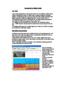
I tested my three products to see what the customers’ opinion was of the brochure, the stand and the business card. The majority said that their first impression of the stand was attractive. This was near enough to fit its intended impression as my specification said the stand must be attractive. If it is attractive, the customers are more likely to pick up the brochure. The title was meant to look very Italian looking and most people thought this when I asked for their opinion. Most people’s thoughts of the front cover of the brochure were ‘very attractive’ and I aimed to achieve this in my specification. Another important purpose of the brochure was that the pictures were to look very attractive as it is a holiday brochure. The majority thought again that they were very attractive which once again fits the intended purpose. When I aske their favourite section of the brochure the results were fairly equal on all options including shopping, restaurants, weather, accommodation and historic monuments.