A frequency distribution is used when there is a large set of data involved. It groups data into classes (intervals and categories). An example of this will be where ages of a sample will be broken down from single values into groups such as 15-20 and under and 20-25 and under. A frequency distribution will usually be constructed into a graph using a histogram (as it is continuous data).
For the graphs that I have shown from the data, I am going to calculate the following:
- The range – the difference between the largest and the smallest values in the data set.
- Mode average – the number which is the most frequent in the data set.
- Median average – after ranking the data set in an increasing order (from smallest to largest), the value that is in the middle.
-
Quartile ranges – these are summary measures that divide a ranked data set (smallest to largest) into four equal sections. The middle quartile is the median. The lower quartile is approximately 25% of the values in the ranked data and the upper quartile is 75%. The inter-quartile range is the upper quartile range minus the lower quartile range.
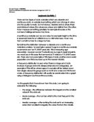
This is a Histogram showing the height of students (collected from first year students at Middlesex University:
A histogram is a summary graph which shows a count of data points in many ranges. It is an approximation of the frequency distribution of data. An example of the group/class of data that I have used for height is 110-120 and under, 120-130 and under. Essentially a histogram is similar to a bar chart but histograms have all the bars joined up as it is showing continuous data and represent frequency distributions. Also in a bar chart there all the widths are the same. However in a histogram they don’t necessarily have to be because it is the area of bars that are focused on a histogram.
One main advantage that a histogram has is that is shows the shape of the distribution for a large set of data so it is visually strong and easily understandable (as it is continuous); this is the reason why I chose to create a histogram graph of the data given to me. But the biggest disadvantage is that data can be lost because it is grouped. Another disadvantage is that it can be very difficult to compare two data sets.
This graph shows that most peoples heights are grouped around the 170 – 180 mark. There are very few people who are 200cm and also very few that are 130-140cm. the table is generally going up and then back down in a pyramid shape.
I chose height as my continuous variable. Height is a continuous variable as it can be measured precisely. Any value is possible for the height of an individual. A definition of a continuous variable is: “A variable that can assume any numerical value over a certain interval or intervals,” (Source: textbook ‘introductory statistics’ by Prem S Mann.)
The data collected had some unrealistic figures and to produce this graph it would not have been sufficient. As a result of this I deleted the unrealistic figures from the data. This included the heights which were 50cm, 53cm, 70cm and 84cm, 260cm and 360cm.
The range of this data is 100cm (200cm – maximum subtract 100cm - minimum)
The mode is: 170cm
The median is: 170cm
The mean average is: 168.7544 rounded to the nearest whole number is 169cm.
The lower quartile range is: 57.5cm
229 (number of data sets) + 1 = 230/4 = 57.5
The upper quartile range is: 115cm
229+1 = 230/2 = 115cm
The inter-quartile range is: 57cm
115-58 = 57cm
A discrete variable is where the data is countable and cannot usually be in more than one decimal point. Shoe size is a variable which can be a continuous variable as you can measure it to the exact centimetre. However you would not say that someone’s shoe size is size 8.1443; it would be 8. Therefore shoe size is a discrete variable.
A bar chart is used to highlight separate data quantities and shows the differences.
“It is a graph made of bars whose heights represent the frequencies of respective categories.” (Source: ‘introductory statistics’ by Prem S Mann, Fifth Edition)
The main advantages of a bar chart are that it is visually strong and understandable and it is excellent for data comparison. Also data is not lost as it is on a histogram and bar graphs clearly show error values on the data. many things to compare. There is also limited space for labelling on vertical graphs.
The disadvantages are it may sometimes become difficult to understand as it could be congested with too much information. There are two sets of data I found which were size 38 and there are two and 44. This may be people who responded to their shoe size by European size. So I simply converted this to U.K size.
This bar graph shows that the most common shoe size is 5 – where there are 41 people. There are very few half shoe sizes, this may be a results of the way the question was asked in the survey. Many people may have thought that they had to respond in a full size. The shoe size with the least value is size 3.5, 10 and 13.
Overall data that is shown can be sometimes misleading. However if it is presented in the correct graph and it is showing what it is meant to show then graphs can be very useful.
Range = 10
13-3 = 10
Mode = 5
Median = 7
Mean average = 7.09314 rounded down to 7.
Lower quartile range = rounded down to size 4
Upper quartile range = rounded up to 9
Interquartile range = 5
9-4 = 5
References:
Websites:
Textbooks:
‘introductory statistics’ by Prem S Mann, Fifth Edition)