Weaknesses of Draft 1
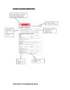
The placement of my contact details does not look professional, on the example questionnaire, the contact details are on the top, and this makes it look very professional. Another weakness is that since there is no background colour, the questionnaire looks very dull. Question 8 , “How did you find out about us”, is inappropriate as the questionnaire was made to find out what potential customers want in their website.
How I will refine Draft 1 to improve it
To improve my first draft of my questionnaire, I will firstly place my contact details in a more appropriate position, to make it stand it out and make the questionnaire look a lot more professional. Also I will add a background colour, to make it more presentable and eye-catching. Finally, I will consider adding more questions if I feel it is necessary. I will take out any inappropriate questions.
Draft 2
Strengths of Draft 2
The strengths of this draft is firstly there are no in-appropriate questions, therefore Websites Service Ltd will not get any answers which are not relevant. Also comparing it to the questionnaire which I analysed, they look similar. This shows this draft is presented in a high-quality professional standard. Another great point is that the questionnaire has little open questions. In addition, the small border clearly separates the title from the introduction; it also matches the colour of the border and looks attractive
Weaknesses of Draft 2
The font is too small, this could put the reader off, while they are improving it. Also the boxes are not in line with the option, this makes the questionnaire look unprofessional and not well presented.
How I would refine Draft 2 to improve it
I will make the font size larger than it is currently to make it clearer, and make is easier for the reader. Also instead of boxes, at the top, where I talk about the questionnaire, I will ask that respondents circle their answer. This will make the multiple choice options look a lot more presentable, hence increasing the professionalism of the questionnaire.
Draft 3
he
Strengths of Draft 3
The strengths of this draft are that firstly, the removal of tick boxes has made the questionnaire look a lot clearer. The multiple choice answers are well spaced out, and there is enough room for the respondent to circle their selected answer(s). The font size has also been increased, this make it a lot more understandable for the reader, and therefore increases that chance of the reader filling out the questionnaire. The instruction on the top, explains how to fill out multiple choice confusion, this way the reader will not be confused, on how to complete the questionnaire. If this was the case, this would case frustration, leading to the reader not filling out the questionnaire.
Weaknesses of Draft 3
I am confident to state that there any no weaknesses on this questionnaire. All the previous weaknesses have been amended. I am confident enough for this to be my final draft.
How I will refine Draft 3 to improve it
Since this is my final draft, there is no need for me to improve it.
Evaluation of own performance
It took me a very long time to think of questions to put on the questionnaire, this wasted valuable time. After a long while, it came to my attention I should find another website design questionnaire and analyse questions. Had I realised this earlier, I would have saved time.
Nevertheless, I feel I used my initiative very well, as in my draft 1 I stated since there is no background colour, it looks very dull, however after experimenting I thought adding a background colour would look very unprofessional and thus I did not add a background colour.
I annotated the example questionnaire very well and got a clear indication of the type of questions required and the lay-out of the questionnaire.
If I had a task like this in the future, I may use clearer examples of questionnaires; this is because the text is not very clear to see. Also I may add a background colour to make the questionnaire look more presentable and eye-catching. I would also use a consider using different software as I feel it took ma a very long time to create the tick boxes, and some of the boxes are not accurate, whereas another software might make it easier for me.
Bibliography
I used to find the example of a questionnaire which I annotated. This gave me a clear indication of what information goes in a questionnaire and the structure of it.
I used to analyse their questionnaire which have created as they are a similar company to Websites Services Ltd.
I went on which helped me choose the lay-out of my questionnaire and showed lots of example of questionnaires.
Parag Mehta 3118 Questionnaire Report