I could have used paint or photo shop.
Why I selected the software I did AO1K
Because it was easy to use and the logos were more accurate and professional than they would have been if I used paint.
Advantages and disadvantages of software chosen AO1N
Advantages:
- It’s quick
- It’s easy to use
- There are different designs to choose from
Disadvantages:
- No instructions on how to use the website
- The outcome of the logo does not look professional
- You cannot change the background colour, but you end up with grid lines instead.
What are the advantages and disadvantages of the alternative software AO1E, AO2D
Advantages for Photo Shop:
- Easy to use
- Help is there if needed
- Very good variety of designs, features
- Very good quality finish
Disadvantages of Photo Shop:
- Quite difficult to use if you don’t know what you are doing
- Can be quite slow to load and function
Advantages of Paint:
- Fun to use
- Easy to use
- It let’s you do what you want
- It can be found on any computer
Disadvantages of Paint:
- Unprofessional outcome
- Hard to draw accurately with
- Not enough tools
What hardware I used AO1B, AO1X
Sony VAIO laptop
2.0 Ghz
Processor – x86 Family 6 Model 13 Stepping 8 GenuineIntel ~1729 Mhz
What alternative hardware I could have used AO1D
Apple Mac pc or laptop
Advantages and disadvantages of alternative Hardware AO1E, AO1V, AO1W
Advantages:
- Reliable for a professional logo outcome
Disadvantages:
- Can react quite slowly
- Doesn’t communicate with other computers
- Don’t have Paint
Alternative means of outputting logos; benefits & drawbacks A01Y
Outputs:
Printers – Desk Jet, Ink Jet, Laser Jet, Bubble Jet, Dot Matrix
Benefits of using a Desk Jet printer:
- Printer and ink are quite cheap
- Printing quality is very good
Drawbacks of using a Desk Jet printer:
- Pictures can print out blurry and not to a good standard if they are enlarged too much
Benefits of using a Laser Jet printer:
- Excellent quality printing
- Very fast
- Easy to use
Drawbacks of using a Laser Jet printer:
- Ink and printer are very expensive
Payroll
Design specification
What the software does very briefly
Explain what your payroll can do
How it will help the user AO1T
Excel
Explain the simple functions used in the design of the payroll.
The Pay Clerk will use the payroll as an organised and easy way to see how much each person would earn depending on which job they have and how many hours they work etc.
It is easy to update the payroll because of all the different formulas used to work out the different wage amounts etc.
My data is coming from the Howard Health Centre (HHC) paper records.
My data will be inputted by:
Typing
Copy paste
Import file
I used these methods because copying and pasting information and data is a reliable way of transferring data from one place to another. It’s a really quick and easy to do and can copy and paste large amounts of data which is very useful.
Many different types of information are stored in my payroll. This includes Wage, Tax Rates and Posts.
This data needs to be stored on the HHD – Hard Disk Drive because this will keep the data safe and it would help to keep it more reliable. It would also be easier to update.
If the data wasn’t saved, then it would be a really difficult job to keep track of who gets paid what amount and who plays what part in HHC.
My data will be displayed in the form of an excel spreadsheet because it is a clearer way of presenting all the information. It makes everything easier to understand, and it is very easy to change the information or edit parts of data. If you make a mistake, it can be easily fixed on a spreadsheet, whereas if you were to do it manually, it would be so much harder because you would have to keep starting again. This saves time as well as money. Formatting the data in this way is less pressure and hassle because there is no need to worry about loosing certain parts of information because it is all put together in one spreadsheet.
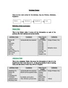
Payroll spreadsheet:
Data spreadsheet:
The calculations performed are:
Gross pay – the total amount of money that an employee earns each month, excluding deductions such as taxes, national insurance tax etc.
Salary – total amount of money each employee earns each year
In excel, I used the cell reference: =Data!G2/12
Wage – number of hours worked and number of weeks worked
the formula I used in excel was: =Data!E2*Data!F2*Data$!$2
Tax – the amount that is taken out of your salary which is given to the government to help provide essential services such as police, fire departments, hospitals, schools etc.
Net pay – the amount that an employee would earn at the end of the month after deductions such as tax etc
Formulae sheet:
It is important that no mistakes are made because if the data is wrong, then an employee may earn more or less money than they are supposed to. If it carried on, then in the long run, people may decide to leave the company because they are not getting paid what they should be, which ma cause employees to resign from their post.
The validation methods used in the data handling are:
- Mid
- Vlookup
- Data validation/list/=posts
Here are some of the payslips for each of the employees: