We need to do some comparisons in international to value the UK’s economic performance in terms of GDP per capita. We again look at growth of GDP of UK and her main competitors because of relative slow growth rate in population though it may make some error.
Comparison is between of UK and her main competitors for last 4 decades. UK has historical good record in the 1960s and 1950s compare to other decades. But since 1960’s UK’s performance has been inferior to main competitors. UK’s growth rate of GDP was 2.9% in the 1960s, which was lowest compare to other main competitors. Japan had highest growth rate in this period. From 1971 to1980, the growth rate of GDP in UK was still at bottom among the main industrial counties. Japan’s growth rate is again at top. Situation for the UK’s growth rate of GDP has got better since 1980s. In 1980s, the UK’s growth rate of GDP has been faster than Germany, France and Italy although US and Japan were still performing better than UK. In 1990s, the UK’s rank in growth rate of GDP is above most of competitors other than US. Overall, UK’s GDP has grown steadily and slowly. 10-years average growth rate is never above 3% and the average growth rate from 1960 to 2000 is about 2.5%. Obviously, difference in GDP generated per year between and other main competitors has been narrowing because of slower growth rate in UK for most of years. In the other hand, UK has kept stable growth rate in GDP from a relatively huge GDP base.
As you can see, UK’s rank in terms of level of GDP is behind US, Japan and Germany but higher than France and Italy. UK’s position is about in the middle. In contrast, us generated the highest-level GDP (9192), which is nearly as much as sum of GDP produced by rest of competitors. Japan has almost a half of GDP of us.
GDP only measures the economic welfare partially. It dose not take account of unmarketable goods (goods in hidden markets and black markets). In this case we should consider some other indicators of measuring economic welfare.
In following paragraph we will assess UK’s economic performance in terms of unemployment. We should look at both absolute value and employment rate. Especially when we compare changes of employment from economy to economy, the absolute number tends to be unreliable due to different size of population. The model for calculating the unemployment rate seems straightforward. (Unemployment rate = the unemployed/workforce) but difficulties come up with how to define the term ‘unemployed’ and ‘workforce’.
Claimant account and ILO account are two main approaches to unemployment in the UK. Both measures are not perfect. Claimant account method is base on the administration of unemployment. So the data is relatively easy to obtain and cost to calculate is very low. But the most obvious disadvantage is that eligibility can be changed by some political purpose. That makes Claimant account not reliable and not comparable internationally. ILO account uses ‘the survey method’. Namely, the data is taken from wider survey of unemployment. The downside is that it takes more time and money to acquire the sources. The advantage is that it allows international comparison.
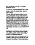
Claimant account graph
Figure shows the changes of unemployment in real number from 1950 to 1998. There were many insignificant fluctuations in employment before mid of the 1970s and the number rarely above 500,000. Employment rate for first 25 years is less than 2.5%. After 1975, the climate of unemployment worsens dramatically. The number of unemployment is never below 1 million. First peak is in the late 1970s.The number of unemployment reached just under 1500,000. The following jump in unemployment start from the early 1980s and peaked at about 3250,000. Final jump began in the early 1990s and the number nearly hit 3000,000. The trend is going down from the mid of 1990s.
Now we look at the unemployment rate in percentage between UK and her 5 main competitors since 1960.
All countries in figure have experienced relative low unemployment rate from 1960 to 1968. UK’s performance in terms of employment rate is in the middle position among the countries. UK was performing extremely bad from 1983 to 1997, the rate of unemployment reached 9.5%, which is nearly three times its level in 1960s and higher than most main competitors other than France. The general trend of unemployment has fell since then. By 2002, UK has 5.2% in unemployment rate while France, Germany and Italy are still experiencing fairly high unemployment rate .it is also the lowest number against all main competitors. ‘In the early period the UK’s performance in terms of unemployment was good but not exceptional internationally. In middle period the UK performed very badly in terms of unemployment. Since the mid 1990s the UK’s unemployment performance has been comparatively very good’
I also want to consider UK’s inflation performance because it often seems as an important criterion for judging living stands.
The RPI, the RPIX and GDP deflator is commonly applied for monitoring the inflation in UK. ‘The RPI the average change in the price of a basket of goods and services bought by the ‘average’ household in the UK. The RPIX is the RPI excluding mortgage interest payments. The RPIX is far more stable than the RPI. RPI shows a much larger cycle than the RPIX. GDP deflator is the widest measure of inflation because all the goods and services making up are included. It is calculated by diving GDP at current factor cost by GDP at constant factor cost.
GDP deflator graph
Before the early of 1970s the variation in GDP deflator is relatively insignificant and it is never over 10%. GDP deflator started to grow sharply in the 1970s. And IT reached the peak just above 25% in 1975. Since then the overall GDP deflator trend has been going down though further peaks appeared in the early 1980s and the early 1990s. GDP deflator has gone down to its level of the 1950s since last decade.
A comparison of inflation in international is also necessary. In order to compare the inflations in different countries we need a common index. HICP, which is launched in 1997, provides a comparable measure of inflation in Europe wide.
UK has second highest inflation 5.3% from 1984 to 1993. The rank for UK have not changed for the nearest 10 year although the percentage gone down by more than half. Inflation in the UK even went to the top during the late 1990s. The UK has performed quite badly relative to most main competitors for last two decades. But UK’s inflation performance is getting better in the most recent years.
A healthy economy tends to have relatively low inflation because a high rate of inflation will directly reduce the purchasing power of consumer. For instance, inflation is 50% this year. The same amount of money in this year will only be able to buy half amount of goods in last year. Also, high inflation will have negative impact on economic growth, which in turn slow down the growth rate of living standards. A low unemployment is also required in a strong economy. A high unemployment means that the economy hasn’t been operated in full capacity and living standards could be improved. Obviously living standard of the unemployed is poor. UK performed very well in both inflation and unemployment before the mid of 1970s. Afterwards, the UK’s economic performance in terms of inflation and unemployment is poor although the recent statistic shows some sign of getting better. Low Growth rate of GDP in UK is understandable partly due to the big base level. Some economists point out the poor economic performance in raising living standards is because of experience of three major recessions.
From the data you can see the UK citizen’s living standards have been improving but slowly relative to main competitors. But the data is I gained is still very crude. There many other criteria should be included such as distribution of income/welfare, productivity, pollution and so on.