The investigation will be carried out over different areas as the hypotheses all aim to prove how things change in different areas. To plan where I will be carrying it out I will interpret the burgess model into London to determine where different areas are. Along with this I will use the bus and train zones that London is broken up into.
A model is a simple plan of something which can be applied to what it represents in all cases. In this case the burgess model can be applied to all major cities which have been established for a long time, essentially before the Second World War.
Originally the burgess model was made in 1925 by Burgess. He presented a descriptive land use model, and it was built from observations of a number of American cities, especially Chicago. The model assumes a relationship between the socio-economic status (mainly income of households) and the distance from the CBD. The main point of it is that the further away from the CBD you are the better quality of housing there will be. However there will be a longer commuting distance, therefore higher commuting costs.
This is the original Burgess model:
This burgess model has been interpreted into a new model which is more representative of today’s cities. Most of what Burgess has said still remains; however the statement of higher commuting fares are not so strong but this has been replaced by higher commuting inconvenience to live on the outskirts of the city. This still has an influence due to congestion charges being enforced.
This is the Burgess model represented into today’s cities:
A: CBD: Most accessible to the larges amount of people, contains large shops, offices and banks. The land here is expensive, with high rise buildings. Land is sparse, with high levels of traffic and scarce greenery.
B: Old inner city: Made up of 19th century housing, constructed in grid iron patterns with no gardens. Industry is declining leading to high unemployment.
C: Counsel Estates: Semi-detached and terraced housing on large estates with gardens, less expensive private estates can be found here as well.
D: Suburbs: High class housing, bigger houses and detached buildings are found here as land is cheaper. Also knows as the commuter zone as it is expected that more affluent people would live furthest away from the city centre but still be able to afford to commute to the centre for services and employment.
E: Countryside: People wishing to escape the city but still live close to services and employment will live here. Land is cheap allowing very large houses to be built for low costs. Most property in the countryside will have a large amount of land surrounding the house.
Method
The
Sampling Techniques
For my sampling I decided on a reasonable number of samples to take which would be sufficient to represent as data that would be accurate but not too time consuming and vague. I thought that if I chose too many samples the area would increase and accuracy would be lost. Once I decided on my sample size for each data collection method I chose the samples at random.
A traffic count was carried out for hypothesis 1 to find out how many cars were using the road. I did this by counting every car that passed me going in both directions. I did it like this as I thought that counting the cars going in both directions would be too complicated and get confusing as I was counting on my own. It was carried out for 5 minutes at each point between the hours of 1 and 2 pm. It was done like this so that my results would be more accurate, because if I carried one count at 12 noon in one place and another at 6 pm at another place the results would not be fair as these times would clearly have different amounts of traffic. I gave the time margin of 1 to 2 as I could not do the count at the same time for each as I would have needed to do each on a different day and this would have been expensive to for travel to each of the points.
At each point I took note of the height of buildings for hypothesis 2. I took a sample of 20 buildings at each area and put down the building height under the appropriate header. I chose to do a sample of 20 as I think this is enough to get an accurate reading of the area. More then this would be excess information and would be a waste of time. The selection of buildings I chose to record was random.
A pedestrian count was carried out at each of the points for hypothesis 3. This was done in the same way as the traffic count. I stood at the points and counted the pedestrians that passed me on both sides of the street for 1 minute between the hours of 2 and 3pm. It was noted down on a tally. It was done like this because I felt that when I reached the busy streets it would get very complicated to count both sides of the street so to make it fair I did not count both sides of the less busy streets. I did it between those hours to make it a fair test, as the streets would obviously have more and less busy times.
To find out the house ages I estimated the houses age as I went along the transect. I also went to an estate agents’ web site to find out the ages of the houses they sold in those areas. This was for hypothesis 4. Doing this would give me more accurate findings rather then estimating the ages myself as the estate agent would have more accurate information.
Survey Area __________
Do you live within 1 mile of this area? Yes ❒ No ❒
Sex Male ❒ Female ❒
Age 18-25 ❒ 26-30 ❒ 31-35 ❒ 36-40 ❒ 41-45 ❒ 46-50 ❒ 51-60 ❒ 61+ ❒
Do you work full time? Yes ❒ No ❒
If yes what do you work as? ____________________________________
What is your salary? -15 ❒ 15-25 ❒ 26-35 ❒ 36-45 ❒ 46-55 ❒ 56-65 ❒ 66-75 ❒ 76+ ❒
Data Presentation
We can see from the graph that there is a weak negative correlation that shows that as you move towards the CBD the amount of pedestrians goes up.
Spearman’s rank
Rs = 1- 6 x ΣD²
n³ - n
Rs = 1 - 6 x 40
5³ - 5
Rs = 1 - 240
125-5
Rs = 1 - 2
Rs = 1
Null hypothesis: There is no relationship between the distance from the CBD and the amount of Pedestrians.
When Comparing Rs to Critical Values of Spearman’s Rank Correlation Coefficient we can say that the null hypothesis can be rejected to 99% accuracy.
We can see from the graph that there is a strong negative correlation that shows as you move towards the CBD the amount of cars will increase.
Spearman’s rank
Rs = 1- 6 x ΣD²
n³ - n
Rs = 1 - 6 x 40
5³ - 5
Rs = 1 - 240
125-5
Rs = 1 - 2
Rs = 1
Null hypothesis: There is no relationship between the distance from the CBD and the amount of cars.
When Comparing Rs to Critical Values of Spearman’s Rank Correlation Coefficient we can say that the null hypothesis can be rejected to 99% accuracy.
We can see from the graph that there is a strong negative correlation that shows as you move towards the CBD building height increases.
Spearman’s rank
Rs = 1- 6 x ΣD²
n³ - n
Rs = 1 - 6 x 40
5³ - 5
Rs = 1 - 240
125-5
Rs = 1 - 2
Rs = 1
Null hypothesis: There is no relationship between the distance from the CBD and the average building height.
When Comparing Rs to Critical Values of Spearman’s Rank Correlation Coefficient we can say that the null hypothesis can be rejected to 99% accuracy.
Data Analysis and Conclusion
Data analysis and conclusion
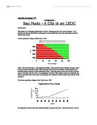
Figure A1 relates to the hypothesis ‘as you move towards the CBD the amount of pedestrians will increase’. Is shows that there are less pedestrians further away from the CBD then there are close to the CBD.
Figure A1 is a scatter graph showing the relationship between the amount of pedestrians and the distance from the CBD. It has a negative correlation showing that the further away from the CBD the fewer pedestrians there are. The equation for the line of best fit y=-2.33x+21.8 allows you to work out, according to the mean, the amount of pedestrians at any given distance.
Figure A2 relates to the hypothesis ‘as you move towards the CBD the amount of cars will increase’. It shows that there are fewer cars on the street further away from the CBD then there are close to the CBD.
Figure A2 is a scatter graph showing the relationship between the amount of cars on the street and the distance from the CBD. It has a strong negative correlation between the two which shows that the further way from the CBD the fewer cars there will be. The equation for the line of best fit y=-3.62x+42.3 allows you to work out, according to the mean, the amount of cars there will be at any given distance.
Figure A3 relates to the hypothesis ‘as you move towards the CBD the height of buildings will increase’. It shows that the buildings are higher closer to the CBD then they are further away from the CBD.
Figure A3 is a scatter graph showing the relationship between the distance from the CBD and the height of the buildings in that area. It has a negative correlation which means that as the distance from the CBD goes up the height of the buildings will go down. The equation for the line of best fit y=-0.31x+4.83 allows you to work out the average height of the buildings at any given distance.
Figures B1 through to B5 relate to the hypothesis ‘as you move towards the CBD building age will increase’. The combined graphs show that buildings are older the closer to the CBD you get.
Figure B1 shows that in the furthest place from the CBD the buildings are aged between 1860 and 1950. Figure B2 shows a slightly closer place to the CBD but still the ages are between 1910 and 1950. Figure B3 shows the same as figure B1 with the housing age between 1860 and 1950. There is not a clear difference between these three places; they all have fairly new buildings. This could be because the area from the fist place to the third place (Edgware to Mornington crescent) were built in relatively the same era. Figures B4 and B5, the closet places to the CBD, show that the buildings in this area are much older then the other places. These graphs show that the buildings built in these areas have been built pre 1800 to 1850. This is much older then all the other areas which means that there are older buildings closer to the CBD
Figures C1 through to C5 relates to the hypothesis ‘as you move towards the CBD socio economic groups will change’.
Figure C1 shows a high proportion (over three times as many as any other profession) of the population in Edgware to be in the ‘professional/managerial’ category. It also shows that there are hardly any people that fall into any other categories. Figure C2 shows most of the population of Golders Green to be in the ‘professional/managerial’ and ‘skilled manual’ categories, with no non manual workers. Figure C3 shows that Mornington crescent has a very high amount of unskilled workers, half of the population in Mornington crescent work in an unskilled job. Figure C4 shows the majority of the population of Warren Street to be in a skilled manual job. However there is a close number of people that fall into the ‘professional/managerial’ category. Figure C5 shows a large proportion of people in Embankment to be non manual; however there is an even number of people falling into the ‘professional/managerial’, ‘skilled manual’, and ‘semi skilled’ category.
My first hypothesis was ‘as you move closer to the CBD, traffic will increase’. This was correct and is proved on page 15 figure A2. The scatter graph shows that there is over four times as many cars on the road in the CBD as there is on the outskirts of a city. Even a few miles in from the outskirts of the city there is over twice as many cars. This can also be related to the land use close to the CBD. There is not much, if not any, housing in the CBD; therefore people who work in the CBD can only travel to work either by public transport or by car. So we would expect there to be more cars on the street.
My second hypothesis ‘as you move closer to the CBD, the height of buildings will increase’. This is proved to be correct on page 16 figure A3. The scatter graph shows that the buildings are at least twice as high in the CBD as they are on the outskirts of the city. However, in the areas around the CBD and up to two miles from the CBD, the buildings are all relatively the same height.
My third hypothesis ‘as you move close to the CBD the number of pedestrians will increase’. This was proved to be correct. Figure A1, the scatter graph on page 14 supports this. It shows that there are almost 20 times as many pedestrians on the street in the CBD as there are on the outskirts of the city. This can once again be related to the land use in the area. There is lots of residential land use on the outskirts of a city so people don’t need to travel far to work because they would live nearby. People working in the CBD will have to travel to get to work as they don’t live nearby.
My fourth hypothesis, ‘as you move closer to the CBD the houses will get older’, was proved to be correct. Figures B1 to B5 on page 17 supports this. They show that the houses are much newer on the outskirts of the city then they are in the CBD. The average age of houses over 1.4 miles from the CBD averaged between 1910 and 1950, whereas the housing within 1.4 miles from the CBD was pre 1800 to 1850.
My final hypothesis ‘as you move towards the CBD socio-economic groups change’. This was also proved to be correct. Figures C1 to C5 on page 18 show that there is a clear change halfway through the city towards the CBD from the outskirts. There is also a difference in the CBD from any other places. The socio economic groups in the outskirts of the city are almost opposite to the groups 2 miles from the CBD.
Evaluation
Evaluation
Bibliography
Maps and Arial photographs – streetmap.co.uk
Tube map – thetube.com
Jake Mennie. Hendon School. Geography. 11N.