As you can see from the screenshot above these are just some health promotions that are aimed at users for healthy eating. Jamie Oliver is a celebrity helping to get rid of unhealthy dinners in schools.
Looking at this promotion it gives some clear understanding in what I have to do for my project in order to make a realistic and interactive presentation.
To find other health promotion presentations, I used the ‘Google’ search index to find these health promotions. A number of searches came up relating to health promotions. I open a PowerPoint presentation for health promotion that someone has created as shown below:
Good and Bad Points:
There are 54 slides on this presentation; many have the above slides with just pictures and writing, although this is good for providing their target audience with information, I did find it boring as it went on which is a bad point. The down turn to this is that it is not interactive which I have to do.
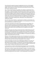
Initial design:
Design done in PowerPoint:
Good and Bad points:
This design is very basic and simple; I like the use of the layout by having graphic on the right and information on the left. But as you can see from it, it is very dull and plain which is not good for attracting a target audience and I intend to do a stylish header and more vibrant colours to make it eye catching.
Existing Logo’s:
Headings:
To make a good and eye catching product I feel a good header is needed and I will be doing different designs to ensure that I do the best one.
Example of styles I could do is listed below:
Health Promotion – Arial
Health Promotion - Algerian
Health Promotion – Lucida Handwriting
Health Promotion – Imprint MT Shadow
Health Promotion – Times New Roman
Health Promotion – Bauhaus 93
Health Promotion – Broadway
Health Promotion - Forte
Health Promotion – Kirsten ITC
As you can see I did a list of different text styles to see which one would look the best, so the one that I have chosen to develop is the ‘Forte style’ this one I feel is a nice stylish text that I think will work good with my presentation. I will further develop this by using Macromedia’s fireworks.
Heading Design:
Design 1
As you can see I have developed this design by adding colour and making it bigger in size, again this looks fairly plain and I want to add more effects to it so I can attract the target audience.
Design 2
For this design I kept the same style but used a different colour instead of just using red throughout the design. I also added an effect to this to create a shadow to make the health promotion design stand out. For me to do this effect I used a ‘motion trail’ which is a filter located in fireworks. I feel this one has a good effect to it and I may use this in the final version.
Design 3
This design I have done I added another effect to it which makes it look bold, to do this I used the ‘bevel boss’ which again is in fireworks and I started to adjust the different shades to the design and I came up with a shiny bold look which I quite like. One of the bad points is that it sort of looks like some has painted it which is a down fall I feel.
Design 4
In this design I have changed the layout of the heading by adding a ‘wave’ effect to it. This has a nice style to it; I also changed the colours just to see what it would look like. I made the heading have two capital headers; this will link in with my logo as I only use the letters ‘HP’. The colours I feel in this layout don’t really look good. The colours look too dark and I want to make it vibrant for my target audience.
Design 5
This is my third layout I have designed for my design. Again I kept the same front type but I changed the style and colour back to red and blue as the main primary colours. I created this style in order to see how distortion affects the way it looks and reads. As you can see it has a nice affect to it but it is hard to read the end of the ‘promotion’ part, which is a bad point towards this design.
Choosing a Final design:
The final design that I decided to have for my multimedia interactive product is ‘Design 4’ I chose this simply because I like style it has to it and has a professional creative look to it. I have decided to change the colour of it as it looked too dark and dull so I decided to use my original colours red and blue as shown below:
As you can see I added the red around the edges of the heading and blue for the actual letters. I feel this could have an impact on my target audience.
Logo:
Looking at the existing logo’s that I chose I will now attempt to create my own logo for my product. I will create 4 initial ideas and from there I will develop it into my final product.
Logo Design 1
This is my first logo design that I have done. I used Photoshop and fireworks to create this. I used fireworks to create a star like drawing. Again I kept the same style of text, I used Photoshop to do this and I put the text in front of the picture which makes it stand out. A good point to this design is that the background shape makes the text stand out on the logo which I think is good. A bad point to this would be the dark colours.
Logo Design 2
This is my second design I have done for my product. I experimented with different shapes till I found a good style that I liked. I used the colours red around the side’s of the shape and white in the middle, also I used the initial’s ‘HP’ which stands for health promotion. I like the use of having the initial’s in the logo which I think I might use in my final design.
Design 3
This is my third initial idea that I have done. Again I experimented with different shapes to see which one looks best and used different affects to create a style I used ‘motion tails’ to create a red shadow which I think is good. For the text I decided to but the ‘health’ on top and ‘promotion’ on bottom, also I used an ‘arch’ affect which looks good with the shape in the middle.
Interaction:
To make my multimedia product interactive I will be using a reality check that users could enter their data, in order to do this.