After performing this process for Year 7, the same will be done for each Year group to select the pupils.
I have now collected my sample, which is shown overleaf:
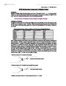
In order to test whether there is a relationship between the average amount of TV watched per week and the weight of a pupil, I will construct a scatter graph. Scatter graphs are effective in discovering whether there is a correlation between two sets of data, as one set of data is plotted on the x-axis and the other on the y-axis. A line of best fit can also be drawn and the r-value can be found using Excel to describe how strong the correlation is. For my scatter graph, the average hours of TV watched per week will be on the x-axis, as my hypothesis states that this will determine the weight of a pupil.
This scatter graph will test my hypothesis and is placed after my sample of 100 (which is immediately overleaf), so that I can analyse the findings.
Looking at the graph, there is a noticeable anomaly, as one point has been plotted so that a pupil has watched 170 hours of TV in an average week. I have circled the anomaly in black on the graph and have highlighted this pupil in yellow on the sheets showing the sample of 100. It is impossible that this Year 9 pupil watches so much television as there are only 168 hours in a week, so it must be a typing error.
Checking For Outliers
To further enforce that the value of 170 for the number of hours of TV watched is an outlier and to identify other less obvious outliers, I will construct a box and whisker diagram for the average amount of TV watched per week (in hours) for the sample of 100. The reason for doing this will soon become clear. To find the median, upper quartile, lower quartile and minimum and maximum values for the box and whisker diagram, I will use Excel formulae to calculate them on the worksheet.
Q1 = 11.5 – this was worked out by typing: =QUARTILE(I2:I101,1)
Q2 = 16 – “ “ =QUARTILE(I2:I101,2)
Q3 = 24 – “ “ =QUARTILE(I2:I101,3)
Max. value = 170 “ “ =MAX(I2:I101)
Min. value = 1 ” “ =MIN(I2:I101)
As a simple rule, points that lie more than 1.5 times the interquartile range above Q3 or below Q1 on a box plot are considered to be outliers.
IQR = Q3 - Q1
IQR = 24 – 11.5
IQR = 12.5
Lower boundary = Q1 – 1.5 x 12.5 = 11.5 – 18.75 = -7.25 – But in this case, the lowest possible value is 0
hours, as it is not possible to watch any less TV.
Upper boundary = Q3 + 1.5 x 12.5 = 24 + 18.75 = 42.75
Therefore, the whiskers are drawn down to 1 (smallest value) and up to 40 (highest value in the sample within the boundary). All values beyond the upper boundary are outliers.
From the box and whisker diagram, the value of 170 hours is obviously an outlier and will skew my results if kept in the sample. So as not to make my results unreliable, I will ignore this pupil and will instead take another pupil randomly (by using my calculator as before). However, because I have performed stratified sampling, I have to ensure that the pupil selected is also a Yr 9 male. To do this, I will go to the Year 9 Excel worksheet and will continue to select numbers from the random number generator until I find the first male student. Also apparent is that there are a few other outliers, which will have to be replaced so that they again do not skew the results and make any conclusions formed inaccurate. These anomalies have an asterisk by their rows on the sheets showing the sample, and are also circled in red in Fig 1. Due to stratified sampling, I will make sure that each pupil that replaces any anomalous person is the same gender and in the same Year group as the person they are replacing. They will also be picked using the calculator.
* * *
I have now taken other pupils that fit the criteria for stratified sampling and the slightly modified sample is overleaf. There was no point in finding the equation of the line of best fit or the r-value for Fig 1, as the outliers would have made these results inaccurate. Therefore, the graph has been repeated for the modified sample using Excel, so that these values can be recorded. Fig 2 is placed after the corrected sample of 100.
Results from Fig 2:
Equation of the line of best fit: -0.1173x + 53.325
r² value: 0.0088
r value: -0.09 (to 2 d.p.)
The correlation coefficient, r, is good for finding a correlation between two sets of data. Its values lie between –1 and +1. The nearer it is to 1, the stronger the positive correlation and the nearer it is to –1, the stronger the negative correlation.
Looking at the scatter graph, there seems to be a negative correlation, as the line of best fit has a negative gradient. Contrary to my hypothesis, it appears that the more TV a pupil watches, the less they weigh. The r value is only -0.09, which shows the correlation is weak.
So far, from looking at the sample of 100, it is apparent that the more TV you watch, the less you weigh…
This graph features data from all the people in the sample. Grouping the 100 pupils together might hide slight differences between certain groups, ie girls may generally watch more television than boys, or Year 7s might have a stronger correlation between the amount of TV watched and their weight than the Year 11s. It might even be that grouping the 100 pupils together hides the fact that for the Year 9s, there is a positive correlation between the average amount of TV watched and weight, whilst all the other years have a negative correlation. In order to investigate this, I will first test whether there is a difference in the relationship between the amount of television and weight for boys and then girls, by doing one scatter graph for the 51 boys (Fig 3) and another for the 49 girls (Fig 4). I will first create a separate worksheet for the boys and another for the girls, which will be printed off immediately overleaf.
Results from Fig 3: Results from Fig 4:
Equation of the line of best fit: -0.0581x + 53.696 Equation of the line of best fit: -0.1431x + 52.416
r² value: 0.0017 r² value: 0.0177
r value: -0.04 (to 2 d.p.) r value: -0.13 (to 2 d.p.)
Looking at Figs 3 and 4, it is apparent that grouping the one hundred pupils together for Fig 2 did hide differences between certain groups. Looking at a separate scatter graph for the males and another for the females means that these differences can now be identified.
Fig 3 is a scatter graph showing the relationship between the average amount of TV that boys watch and their weight. There is a very weak correlation, as the correlation coefficient, r, is only -0.04. Unlike my hypothesis which predicted that the more hours of television watched, the bigger the weight, five of the six boys who watch the largest amount of television in the sample, are below the average weight or just slightly over. Fig 4 shows a stronger negative correlation than Fig 3 (as the r value is -0.13) and the girls’ weights appear to be within a slightly narrower range. These results could imply that gender determines weight, rather than amount of television.
In order to explore this finding further, I need to compare the differences in the weight of the girls and boys. I also need to compare the differences in the amount of TV watched, to see whether this factor is influenced by gender.
To do this, I will:
- Construct box and whisker diagrams to study the weights of the girls in comparison to the weights of the boys. To find the median and interquartile ranges, Excel will be used.
- Analyse and compare the amount of TV girls and boys watch on average by doing box and whisker diagrams.
Box and Whisker Diagrams for the Boys’ weights and the Girls’ weight:
Formulae was used in the Excel worksheet for the 49 girls in the sample and the worksheet for the 51 boys to calculate the median, upper quartile, lower quartile and minimum and maximum values for the girls’ weights and the boys’ weights. The results of the calculations are below:
Weights of Boys: Weights of Girls:
Q1 = 41.5 – this was worked out by typing: =QUARTILE(L2:L52,1) Q1: 44 =QUARTILE(L2:L50,1)
Q2 = 50 – “ “ =QUARTILE(L2:L52,2) Q2: 48 =QUARTILE(L2:L50,2)
Q3 = 61 – “ “ =QUARTILE(L2:L52,3) Q3: 57 =QUARTILE(L2:L50,3)
Max. value = 82 “ “ =MAX(L2:L52) Max. value: 74 =MAX(L2:L50)
Min. value = 29 “ “ =MIN(I2:I101) Min. value: 35 =MIN(L2:L50)
Using this information I can construct box and whisker diagrams, which will effectively allow me to compare the boys’ weights and the girls’ weights.
Comparing the Box and Whisker Diagrams
- A ‘typical’ girl weighs less than a ‘typical’ boy.
- The boys’ weights are spread over a larger range than the girls’ weights.
Box and Whisker Diagrams for the Average Amount of TV watched per Week For Boys and Girls:
In the same method as before, the median, lower quartiles, upper quartiles and minimum and maximum values for the boys and girls were calculated using Excel formulae.
The Amount of TV Watched By Boys: The Amount of TV Watched By Girls:
Median (Q2): 14 Median (Q2): 19
Lower Quartile (Q1): 10 Lower Quartile (Q1): 12
Upper Quartile (Q3): 21 Upper Quartile (Q3): 23
Min. watched: 1.5 Min. watched: 1
Max. watched: 40 Max. watched: 40
I now have enough information to construct the box and whisker diagrams. This is an effective statistical method to use, as it will allow me to successfully compare the data for the average amount of TV watched per week for girls and boys.
Comparing the Box and Whisker Diagrams
- Girls, who on average weigh less than the boys, typically watch more television, further proving that my original hypothesis is incorrect in these circumstances.
- The range of amounts of television watched by girls and boys is almost identical.
-
The girls’ box (which shows the interquartile range) and the boys’ box are similar in size, showing that the middle 50% of girls are as spread out as the middle 50% of boys. However, the box and whisker diagram for the boys is positively skewed, whilst the box and whisker diagram for the girls is negatively skewed.
So far it is apparent that…
- When looking at the sample of 100, the more TV you watch, the less you weigh.
- Fig 2 hid the fact that there is a stronger correlation for this trend with the girls than with the boys.
- A ‘typical’ girl weighs less than a ‘typical’ boy, though watches more TV.
To further explore whether Fig 2 hides the slight differences that might occur between certain groups (I have just examined the differences between the males and the females), I will now look at the relationship between the amount of TV watched and weight by separating the sample into Year groups. The correlation for the 24 Year 7s in the sample will first be studied, followed by the relationship for the 23 Year 8s in the sample and then the 22 Year 9s in the sample and so on. This could be important, as it might for instance become apparent that one Year has a particularly weak negative correlation, whilst other Years have strong negative correlations, though this gets masked when the 100 pupils are grouped together, or it might be that the correlation for the Years are all very similar.
To examine the relationships between the average amount of TV watched per week and weight for each year, I will construct a series of scatter graphs, which will be overleaf.
Results from Figs 7, 8, 9, 10 and 11
Analysing the relationship between the amount of TV watched and weight year by year has given some surprising results.
Whilst when grouping the 100 pupils together in Fig 2 it appeared that the more TV a pupil watched, the less they weighed, by splitting the sample into Year groups, it has become apparent that:
- For the Year 7 pupils there is quite a strong positive correlation between the average amount of TV watched per week and weight.
- For Year 8s, it is also noticeable that the more TV a pupil watches, the more they weigh.
- However, for Years 9, 10 and 11 there is quite a strong negative correlation between the amount of TV watched and weight.
What this means is that even though each year has a different relationship between average amount of TV watched per week and weight, by grouping the 100 pupils together the positive correlations get masked by the negative ones, giving the impression that for all the pupils in the sample, the more you watch, the less you weigh.
Conclusion – Has my hypothesis been proved or disproved?
It has been proved to a certain extent. The Year 7s and Year 8s in the sample show that the more TV a pupil watches, the more he/she weighs. However, Years 9-11 show otherwise and when looking at the relationship between the amount of TV watched and weight for the sample of 100, it appears that the more TV pupils watch, the less they weigh. Gender has also proved to affect the relationship, with girls generally watching slightly more than boys but weighing less.
what do I want 2 do – analyse weight using mean + standard deviation
- analyse the amount of TV by doing a box and whisker diagram.. to find the median + the interquartile ranges, first will group the data into categories + will do cumulative frequency diagrams, one for the females + one for the males.
- Then do the years…
The graph shows….Grouping the 100 pupils together might hide differences between different groups, such as females and males. To discover whether there is a difference in correlation between the boys’ weight compared to the amount of TV watched and the girls’ weight and the amount of TV watched, separate scatter graphs will be plotted for the 51 boys and the 49 girls…
- note the differences in r-values
- also note that the girls generally watch far less tv – this will be interesting to analyse in a box + whisker + cumulative frequency diagram.
Fall back on this:
This graph features data from all the people in the sample of 100, so the results may hide slight differences between certain groups ie girls may generally watch more television than boys, or there might be a stronger correlation between amount of TV watched and weight for Year 7s than Year 11s. In order to investigate this, I will first test whether there is a difference in the relationship between the amount of television and weight for boys and then girls, by doing one scatter graph for the 51 boys and another for the 49 girls.