The magazine in my opinion perfectly suits my target audience perfectly and I am able to confirm this with the feedback attached to this. It is clear to me that my target audience (11-16) think that the distortion and use of colours add to the magazines overall effect. The stories used were also what my target audience were interested in so it was again successful. Although, the main point which I see needs improvement is the pictures taken as they offer some relevance but not a lot, the feedback received suggests thinking about trying to manipulate my pictures more. I think that the magazine is definitely suitable for my audience as theirs plenty of colour on the page, it’s different and original from other magazines which is exactly which they wanted. Therefore, this proves that my magazine was an overall success and does appeal to my target audience.
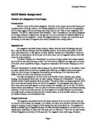
I used the codes and conventions of the genre to enable my product to please my target audience which it did. I can tell this from the feedback received. Anime is traditionally a Japanese heritage; I incorporated this into my magazine with the use of my text which indicated a traditional Japanese style. Also, because anime is a Japanese thing I incorporated this by using Japanese syllables next to the English text. This makes my magazine appealing to two audiences. Anime in general is usually fast paced with plenty of action within it. Therefore, I incorporated this into my magazine by adding a tilt to the pictures and text; this gives it a sense of distortion. Especially in Manga, the colours used are a mix of dark and light, I included this in my magazine my making the title a combination of overlapping black and red on top of a light red background. This made it look really effective and enhances the emphasis on the title. On manga novels the covers are traditionally very eye catching and I incorporated this by the text involved, the pictures and the colours used. In the contents page, I initially was going to set it out as a scroll to emphasise the Japanese background, but, this was difficult to create so I decided to follow the distortion look from the front cover which still looks very good. Japanese writing is made of signs, I incorporated this into my cover and contents by creating my very unusual text made of triangles overlapping each other. This works well because of how unusual it is, and the mixture of colours I used.
Overall there are several improvements which I think I could incorporate if I did this again. Firstly, the main flaw I found was the pictures taken lacked real relevance to my topic, to improve this next time I would maybe find more resources such as more comics, more videos or something like this. The background is another thing which I think could be improved mainly because a light red background doesn’t really stick out. Next time I may decide to use a darker background so that it will look appealing to people passing by. Because of the pictures, I had to mould by stories around what I took pictures of. This proved a problem but I think I managed to do this so they relate to my pictures. The contents page layout is another thing which I think needs improving, although the simplistic approach does look good, it doesn’t really have the fast paced look I wanted to achieve, maybe next time I could incorporate some pictures into the contents page so that it breaks up the list of text. Using the Japanese syllables on the front cover does other me two markets for my magazine. But it does make the cover look a bit cluttered, and therefore, next time I might use less of them or none of them at all.
Overall, I am pleased with how my magazine has turned out, in my opinion it offers what my target audience what and also like to see. There are a few improvements which could be made, but in general I am pleased with both the cover and the contents page, especially the cover.