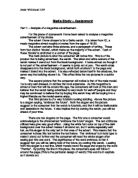
The third picture is of a very futuristic looking building. Above this picture is a slogan saying, “embrace the future”. Both the slogan and the picture suggest to the consumer that the watch is futuristic, and that it will be fashionable and desirable in the future. It also implies that by owning the watch, you will be ahead of your time.
There are two slogans on the page. The first one a consumer would acknowledge is the aforemented “embrace the future” slogan. The text attributes utilized here give very good effect. Using the white font color on top of the dark background over the advert makes it all stand out, but it works especially well her, as this slogan is the only text in that area of the advert. This means that the consumer notices this text before the text below. The ‘embrace’ is in bold type to make it stand out further and the consumer will read the whole slogan after seeing just this one word. The significance of the word embrace, is that it suggest that you will be taking hold of the future, by owning this watch. Leading from this slogan is a red line, which travels round the page and stops by the word ‘Premier’. By putting the line in this place, the consumers eyes will follow it around the page.(This is the particular design of watch) This word is in capitals so it stands out.
The second slogan reads, “forward thinking”. It is positioned below the Seiko logo. As it is positioned here, people will see this directly after realizing the highly credible brand name. The text for this slogan is slightly larger than the other text on the page, and the “thinking” type is in bold, again to make it stand out more.
The text on this advertisement is laid out in 3 paragraphs. It uses double line spacing, making it look easier to read, and more inviting to read, moreso than a large block of text would. In this text, pseudo science is used to maximize displaying the watches capabilities. The first paragraph is captivating, it reads, “Seiko’s forward thinking has created Premier Kinetic Auto Relay as the perfect marriage of design and function”. The paragraph is written so that consumers will want to read on and find out more about the watch after hearing that it is a “perfect marriage of design and function”.
The second paragraph follows up on the first by giving the specific details as to what the watch can actually do. The third paragraph follows on the second by telling you more about the watch. This paragraph ends in a question, “Who says opposites don’t attract?” This is a clever ending to the text, as the consumer is asked a question which they have to think about.
Below the text, the website address is clearly displayed, along with a telephone number helpline. These are centered to make them look separate to the text above. By giving the consumer two ways of contact, more people will be able to find out about the watch as the information is more accessible.
At the bottom of the page, in very small text, the specific model of the watch and the price are displayed. This gives consumers a reference when they are either on the website or helpline. I was surprised when I saw the price displayed, because the watch is very expensive it may put some consumers off purchasing it, as they cannot afford it.
In conclusion, I think that this advert is very well produced, using the three pictures which get the intended message across subtly. The text is very informative, there is enough to tell people about the watch and it’s details, yet not too much as for the consumers interest to wane whilst reading it. The layout of the advertisement is well thought out, with the pictures and text being anchored to the corners of the page.
Media Study – Assignment
Part 2 - Analysis of the advert I have designed.
I have designed an advert which advertises an imaginary website, ‘guitarsonline.com’.
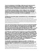
The layout of this advert is fairly simple – there are three frames. The two large frames, which take up the majority of the advert, show a before and after sequence. In the picture of the left, a boy is shown playing his old, poor quality guitar on stage alone, with a small audience. The audience is scoffing at his performance.
The picture on the right shows Muse, a popular rock band, performing to a large audience, who are reveling in the performance. The lead vocalist in this band, Matthew Bellamy, is playing his amazing looking guitar.
The two pictures are the total opposite to one another. The consumers would look at the advert and possibly see themselves in the picture on the left. They would then look at the picture on the right, and believe that by purchasing a guitar from guitarsonline.com, their performance would be elevated to that of Matthew Bellamy’s.
Matthew Bellamy is the main endorser of the website being advertised. He is renowned as an amazing guitarist, and many guitar players, as well as general fans of Muse, will see him as an idol. When consumers see that he endorses the product, they will think that it must be good, because their idol is endorsing it.
There is one slogan on the advert, primarily found at the top right of the advert. It is suitably situated below the website address. The slogan is a play on words, it says ‘strum’ instead of ‘come’, this fits in nicely with the guitar theme.
At the bottom of the advert, there is a block of text. This text immediately generates the consumer's interest by asking the question: “Don’t we all wish we could play guitar like Matthew Bellamy?” The answer to this question would almost certainly be ‘Yes!’ The use of a tactical question works well because it requires the consumer to think about an answer to it. After reading this first sentence, the consumer would carry on reading to find out how they can play as well as their idol. The text then continues by plugging the website. At the end of the text, the slogan is repeated, albeit changed slightly, to add emphasis to it. This slogan could be planted into the consumer’s subconscious and they would remember it and visit the website at sometime.
I believe that this advertisement should be placed in music magazines. The ideal type of magazine would be a guitar one, especially one that has emphasis on learning to play guitar. If the advertisement were placed opposite a feature on Matthew Bellamy, the consumer’s interest would already be generated after reading the feature.