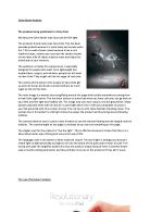
The camera distance used is quite a close distance to see the woman floating around happily and the bubbles. The camera angle on the page is unbiased so you can see everything on the page.
The slogan used for the product is “live the light”. This is effective because it shows that there is a alternative better way of living and a more fun way of life.
The language used in the advert is fairly small and simple. The word light is ambiguous because it meant light as light physically and light to tie into the brand of this particular version of coke. This would persuade the targeted audience to buy the product simply because there is another better way to live life smiling and better and they will also miss out on the products if they don’t buy it.
The new iPad advert analysis
The product being produced is a touch screen tablet pc with consumer friendly and intuitive icons.
The products brand name was iPad. This name was carefully chosen simply because it was made out of two words I and Pad. I because it is a tablet that you have and can customize and Pad if you can think about it being a pad in your hand that you use to note take it is the same idea that you use two hands to use the tablet. Also it uses a trochaic rhythm so you emphasize on the pad and it is very easy to remember so it is overall a good brand name.
The audience is for mainly everyone who consumes media like photos, web browsing and video watching/streaming. It also is for portable gamers who want the full on experience. It is also a like this for people who don’t want a heavy netbook and want something thin, lightweight and easy to carry around.
The motive of this advert is for people who like seeing detail on the screen at one time due to the title ‘Resolutionary’.
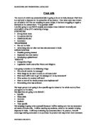
The main image of the advertisement is the tablet pc with someone performing multi-touch gestures to zoom in and show detail. This has been chosen to highlight the new ‘Retina Display’ on the iPad and just because you have a multimedia player it doesn’t mean you have to compromise on screen quality. The image uses a wide range of colour. This has been used to show more image contrast and saturation that the device has that the previous one didn’t. The images look like they want to burst out and too much colour too contain. Above the tablet pc you realise the familiar bold grey on white text with the word ‘iPad’.
The camera distance is zoomed in too see the increase in pixel density and resolution. It is also slightly tilted to show the viewing angles of the Apple iPad.
The slogan used for the product is ‘Resolutionary’. This is used because in previous year’s apple has always said their hardware and software is revolutionary and has added a pun slightly. It also shows how apple have cleverly changed and their number one innovation on this product in the Retina display. This is the thing they want to sell the iPad for.