However from what I've seen, it's mostly male and females between the ages of 15 and 25. I think both male and female like her equally. But her fans are in that age demographic of being an, “angst" teen and a "trendy" college aged person.
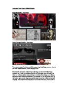
We know this from the website’s colour, the black theme with the use of red, shows that it could be stylish and appealing to her target audience and because of this it attracts them to the website even more so. Red also connotes a passion or attraction, which could like back to the anomalistic looks Lady Gaga is shown in on the website. The website was made in mind for the target audience’s likes, as well as going along with Lady Gaga’s style.
The website doesn’t have a genre, per se; however the images that are on there give a clear view on what kind of music Lady Gaga’s genre.
At first glance it appears to be quiet gothic with the black background and red text, (The red text connotes anger and passion), however even in the newly changed website, it’s still similar as she has a main theme that is recognised and appreciated by her target audience. The whole themes of the websites have been established to appeal to her audience.
The outlook and the way objects have been outlaid also tend to appeal to the audience as it gives the website more of a professional theme and the audience aren’t put off by the cluttered feel of a site. For example, in the updated website the images at the side aren’t overlapping, look to close together or look too far apart and this gives it a much more professional feel to the site as it is organised. Everything that needs to catch the audience’s attention stands out straight away, for example, ‘Register to vote’, ‘Events’, ‘Info’ and a few others are in bold, capitals they have a much larger font size than the rest of the text. This shows the audience what they should be looking at when they first come onto the site and what they should do.
Behind the website lot money was put into making it, most likely a powerful institution with money to make the site unique and appealing to Lady Gaga’s target audience. You can tell this when you look at the graphics used and the detail put into the site. The site presents information in an entertaining and engaging way by allowing the audience to watch her latest video, as it’s pointed out on the sites straight away.
They are also given the option to interact with Lady Gaga and her music more so. For example, ‘Buy the song/Buy the video’, and ‘Enter here’. This shows that the institution behind it is professional as they allow the audience to buy products and also have the chance to win something. This attracts the audience and makes them more interested in the site, than they would do from a lower moneymaking company, giving more of a chance of making the audience want to buy a product from the website or in a shop, of Lady Gaga.
Consistency in design and layout is important; it helps build awareness of Lady Gaga with her audience. The colour, text, logo and general design become familiar and recognizable to the audience.
The outlook and layout of the whole page appeals to the audience as it gives them something attractive to look at and something that’s important to the site stands out straight away and catches the audience’s attention, for example, in the newest website, ‘Lady Gaga’, and a picture of her stands out straight away so the audience know who this website is about and what they can expect out of this website if they are a fan of hers.
The font also follows the codes and conventions as it goes with the theme and makes Lady Gaga recognizable because each time the site is updated, the same font is used.
The website has engaging features and the audience can be taken to various places in the website and have various experiences. You can buy/book tickets for her concerts, you can get up to up to date information and follow what Lady Gaga is doing, and there are previews for her songs and much, much more.