Similar text analysis
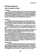
Image
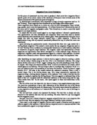
Regarding imagery, the Honda MSR has been placed in the centre of the cover page. The close up picture has been taken from the lower back of the car. The picture has been edited to give the angled effect adding sense of speed and power. The image covers most of the cover page. The image used is conventional form this magazine’s as it relates to the targeted audience range of 16-40 ages and mostly male. Lighting is used to make the car look new and to make it stand out as the background used is the same colour as the car. The pictures has been taken as it was drive this is show by the cars wheel as it is blurred and the dark golden background adds a sense of danger and power. The name magazine “MAX POWER” in white at the top of the cover page stands out. The image of a blue pick-up located at the top right corner of the cover page tends to be less important story in this issue of MAX POWER. Signifiers suck as the barcode with the price and the issue date of the magazine a very important aspect of magazine has been juxtaposed to denote and connote professionalism.