Business Report
.0 Terms Of reference
I have been asked to compile a report about the flyers that I researched. The report must be submitted to Mr. Whitehead for their perusal by 24th January 2002.
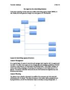
2.0 Procedures
In order to compile the report, I had to carry out the following tasks during my research:
2.1 I used my notes on style to find out about how the documents attract attention. (fig. 1.3)
2.2 I logged on to the Internet to research on layout and I focused on fonts to see how they helped the flyer set out the facts clearly. (fig. 1.3)
2.3 I used the Thomas Telford web site to give me information on the types of information that was used in the flyers. I concentrated on the text used in the documents. (fig 1 and 1.1 and 1.2)
2.4 I used the Thomas Telford web site to research on the presentation used. I focused on the graphics and colours in the flyers I researched. (fig. 1.4)
2.5 I used my notes on the standards used and I concentrated on the safety of the flyer and if it could be easily tampered with to promote a pirate product.
.0 Terms Of reference
I have been asked to compile a report about the flyers that I researched. The report must be submitted to Mr. Whitehead for their perusal by 24th January 2002.
2.0 Procedures
In order to compile the report, I had to carry out the following tasks during my research:
2.1 I used my notes on style to find out about how the documents attract attention. (fig. 1.3)
2.2 I logged on to the Internet to research on layout and I focused on fonts to see how they helped the flyer set out the facts clearly. (fig. 1.3)
2.3 I used the Thomas Telford web site to give me information on the types of information that was used in the flyers. I concentrated on the text used in the documents. (fig 1 and 1.1 and 1.2)
2.4 I used the Thomas Telford web site to research on the presentation used. I focused on the graphics and colours in the flyers I researched. (fig. 1.4)
2.5 I used my notes on the standards used and I concentrated on the safety of the flyer and if it could be easily tampered with to promote a pirate product.