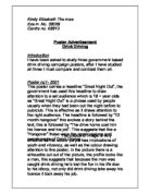
I think that this poster, because of its colour draws attention to this poster, but also I believe that this poster is highly effective because it relates to its audience and also makes the audience think of the consequences of Drink Driving.
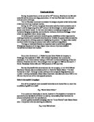
Poster no .2 –Year 1998
The notion of this poster is fixed like a television program, as it seems to be scheduled. This is effective as this succinct language is callus and makes the reader think of the seriousness of drink driving and also the consequences.
The poster is the image, in the content of this picture there is a police notice saying accident tonight, this is suggestive.
The tone of this poster serious, the fact that it involves the Police makes the public think about the seriousness of Drink Driving also it makes the public think of the consequences of drink driving, this is the effect the government wants it to have on the public.
This poster uses shock technique through the heartless words of “accident tonight”; this would stick in the minds of who-ever sees this poster.
The image has been cropped to focus on the “police notice” in the foreground and the road in the background; this is a connection between the drivers and the significance of this poster.
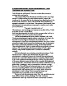
Poster no 3: - Year 1990
This poster ha been cropped to focus on the little girls face, this evokes sympathy. The fact that the image focuses on the face makes the reader think that the girl who represents vulnerability and innocence has been hurt emotionally or physically, as there is an awareness of loneliness in her eyes.
The design of the copy has a large picture at the top of the poster and a large text block at the bottom. This has been used to emphasise the picture more than the text.
In the text we learn of her father, being a drink driver knocked down a child and killed him, and how his daughter didn’t have any friends to play with as she was called a “murderer”, I think this is an important fact that should be addressed its point being that its not only the drivers life it wrecks, but the drivers family and also the victim and the victims family.
Comparing and Contrasting
I have used three different posters they all use different approaches and techniques to make their point. Poster no 1 uses a deception technique as it looks like a poster for an event, poster no 2 uses a laconic, cold-hearted approach as the set of the image is set like a scheduled accident, and picture no. 3 uses sympathy technique as this little girl seems upset and distressed.
Poster no 1 tries to deceive the reader into thinking this advertisement is a poster for an event, because it has the heading “great night out” plus it uses vibrant colours of purple, whereas poster no 3 uses a more serious and blunt approach to try and shock the reader into what they are trying to convey. “Accident tonight” is a form of shock technique. Poster no 2 has a different design to the rest as unlike the rest of the posters have text blocks and pictures, this poster is only an image contained inside this image is its meaning.
Poster no 1 has a more lighthearted approach, as “great night out” is associated with good times and not bad unlike poster no 2, poster no 2 has blunt approach “accident tonight”.
Poster no 3 has a totally different approach to both other posters as the technique is different, this poster uses the persuasive technique of sympathy through the little girls sad and lonely face. Also the design is different as the image in this poster is to be focussed on.
As you can see through the years the seriousness of these posters have become more emphasised as drink-driving accidents are increasing every year.