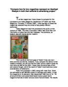
The colours used on the covers also say a lot about the lifestyle. The background of More magazine is white, this is because the cover is cluttered with sell lines, it has 35 separate lines of text on the front, but also this colour is appeals the to target audience because it is seen as young and fresh. GQ magazine is the opposite of this; it has a very regal gold cover that implies royalty, wealth but also the idea of winning the Rugby world cup. This issue of GQ magazine comes in a plastic bag on which all of the sell lines are printed in white text, the white shows sophistication. There is only one sell line on the actual cover, this is about Johnny Wilkinson and the reason why it is on its own is to show how important it is and to increase the ideal of being stylish and uncluttered to seem refined.
The sell lines say a lot about the ideology on the magazine as well. Most of the GQ sell lines are white to show minimalist sophistication and the name ‘Johnny Wilkinson’ is in black text on a printed white background to make it stand out and to show that it is most important. The use of serifs on the cover is in an aim to make the magazine look grown-up and classy.
The sell lines on the cover of More magazines are all different colours, they are mainly red and purple but there is also black, white and yellow. This shows that, unlike GQ magazine, More is for young people who aren’t so sophisticated and don’t want to be grown-up. GQ has all two columns of sell line and the most important one in the centre. The most important sell lines are on the left because we read from left to right, these are all left aligned and are in a font similar to ‘Ariel’. The less important sell lines are on the right, right aligned and are in a font similar to ‘Times New Roman’. The way that they are set out is very regimented, where as in More magazine the sell lines are in all different styles, colours, fonts and sizes, this is to create a feeling of busyness which appeals to More readers, they make a statement and scream out to people who look at it where as the GQ headlines are more subtle and understated.
The content of the sell lines tells us the most about the target audience. Some More magazines sell lines are about clothes, e.g. “Shoe frenzy! 100 sexy shoes from £20”, which implies that all More readers are interested in having fashionable shoes and clothes so they look good so they will feel happy. The same can be said with GQ magazine as on the front of their cover they have the sell line, “Fashion with Fangs. Razor sharp tailoring and tiger stripes to die for”. This shows that they are both primarily saying that the acquisition of goods makes you happy but GQ do it in a much subtler way; they don’t mention exact prices for example.
The both address the read in different ways, GQ talks to you in a very intellectual way mentioning names of authors of the articles and whether or not you feel the magazine is talking to you as an equal depends on whether or not you live the GQ lifestyle, the reader feels that they have to buy into the lifestyle if they want to be included. More magazine is much more inclusive, it talks to you as an equal like an older sister or more experienced friend, it talks to you in such a way that you feel that it has your best interests at heart so you buy in to the lifestyle because you feel that it would be the best thing for you to do.
The adverts are a way in which manufacturers use the ‘trust’ you have built up with the magazine tries to sell you a product in an attempt to get the lifestyle that the magazine promotes. The adverts in each magazine are put there because they appeal to the niche audience.
In GQ magazine they advertised for Burberry, a very expensive, classy designer label, all things that the GQ man values. In More magazines there is an advert for Rimmel make up, a budget label, which is in a More readers price bracket. The central image of this advert is of the super model Kate Moss where as the Burberry advert is of unknown models. The reason why Kate Moss is used is because every one knows her which a useful selling tool in a magazine that is obsessed with celebrity but also she is good looking, successful, glamorous, ‘real’ and rebellious. Both of the adverts use the concept of breaking the mould, though the way that the Burberry advert does this is much subtler than it is in More. The Burberry advert, at first glance shows a traditional, black and white, 1960’s family portrait of a woman, two men and a young child with brightly coloured flowers in colour around the outside, after further inspection it becomes clear that it is much more ambiguous than this, it is unclear whether the two men are actually holding hands and the one could be wearing a skirt. Both of these adverts don’t conform, Rimmel is saying that women should be strong and rebellious, using the sell line “break the rules” and the Burberry advert is trying to show in a much more refined way that men shouldn’t have to conform to the normal masculine roles and should be in touch with their feminine side but also that the company were breaking away from their traditional tartan designs and giving their conventional designs a modern twist.
Magazines promote an idealised lifestyle in their editorial too through what is known as ‘indirect advertising’.
In GQ magazine there are 127 pages of advertising, 63 of these are indirect uses. In More magazine there are pages 79 of advertising, of these 48 are indirect uses. These pages are used in several ways. One way is promotions; in GQ there is a promotion for Dolland and Aitchison that looks like an article but is written and paid for by the advertisers, the reason why advertisers do this is to use the rapport built up between the reader and the magazine. In More there is a promo for Mars chocolate that is disguised as a fashion shoot.
Another example of indirect advertising in both of the magazines is the fashion pages; both of the publications have fashions pages about different items of clothing. The kind of products they sell is very important in gauging the lifestyles they are trying to promote. The More magazine readers don’t have a huge amount of disposable income so the prices in More are always very visible, where as in GQ as they have more disposable income the prices are more hidden so not to spoil the picture and in some cases only the retailers name is put on. In GQ the indirect advertising is much more subtly done so they can be interspersed in an article. The products in GQ magazine are all designer because it is thought looking good in expensive clothes that GQ says you can be happy, the products in More are usually high-street names because although wearing nice clothes is important to More readers they don’t necessarily have to be designer to fit that criteria.
In both magazines the attitude towards the idea of celebrity can show what lifestyle they want to promote. Celebrities in GQ magazine are talked about as if they are equal because the ‘GQ man’ would have as much money as most celebrities so they are not pictured when they are mentioned, for example in the ‘Luxury’ section because that would put them on too much of a pedestal. More is the opposite of this, celebrities are talked about in an iconic way to show that living their life would be the ultimate and the way in which they are gauged is in the way they dress, for example in ‘Celebrity fashion thief’.
The competitions run in GQ and More are both very different. In GQ they are for ‘grown- up, masculine prizes such as trips abroad and interspersed in the editorial, this is to show that GQ lives away expensive things to go with the expensive lifestyle that its readers should be living. The competitions in More magazine are less sophisticated, the main one is for a modelling competition called ‘Miss More’. This shows that in the lifestyle of the typical reader you have to be obsessed with celebrity and being famous but also that it you were to be a model you would be happy and to become a model you have to be young, thin, beautiful, and have great style and so if your not those things naturally you have to buy more things to make you like that.
The articles in More and GQ magazine, promote the lifestyle the magazine is trying to sell, the ‘Footballers wives’ article in More magazine encapsulates every thing about the More lifestyle. There are many references to sex, which is an important part of the More lifestyle, and the television program it mentions is incorporates all of a More girls aspirations, to be rich, successful, famous, have an exciting life and have lots of sex with gorgeous men. In GQ magazine the interview with Freddie Ljungberg shows how lifestyles are advertised to the readers through editorial. Two thirds of the article is full page photos of Freddie wearing clothes made by Calvin Klein, this suggests to the reader that if they wear these clothes then they too can live to life of a famous footballer and have all of the things that goes with this, a great body, money, fame, sex and adoration.
The GQ articles are more sophisticated usually, talking about things that are in the reach of the GQ man but also there are some aspirations articles as well, such as the article about Gwyneth Paltrow. Both magazines have both image and text led articles but the longer articles have big striking images accompanying them to try and persuade readers to read them. The articles in GQ magazine are much longer than those in More, this suggests that GQ sees its self as being for the more intellectual reader who want to be challenged where as More see that the people in their target audience would prefer to read something which is easy and just for entertainment. More’s article are mostly easy to read and do not go out of the readers own experiences where as GQ are more prepared to go out of the readers original knowledge and teach them something such as in the news and current affairs, for example “Guantanamo Bay’s guilty secret”.
One article that seems to capture the essence of the GQ lifestyle is in the editor’s letter, the same can be said for in More magazine. GQ magazine talks to you as if you are a competitor in quite a boisterous manner and confides in the reader in quite a boasting way but does create familiarity so you don’t fell alienated. More talks to you as if you are a younger sister or a less experienced friend, it doesn’t talk down to the reader but it does tell you things in such a way that you feel that it is in your best interests to listens and do as they say. More speaks to you in a very inclusive way and the way that you are told about office scenarios makes you feel part of their friendship group. The letters both have different styles, GQ’s editors letter is written in quite formal English to imply intelligence and even goes as far as to include some French words. More is informal to set the relaxed style of the rest of the magazine. Both of them use colloquiums, GQ only does this occasionally and on words used in normal convocation, e.g. ‘cool’. More magazine uses colloquiums much more frequently to try and include the read by using their method of speech. Through out both of the letters there are constant references to consumerism or lifestyle, in More the way in which men are talked about means that they are heterosexual, want to/have a partner and want to/have varied sex lives, for example calling the new office boy ‘our bitch’. Also the constant reference to looking good, loosing weight and being stylish implies that you have to look good to be happy. All of the things in the ‘eds letter’ are made to seem normal to include us, the reader, e.g. ‘going to the pub’. GQ’s editors letter promotes a particular life style by talking about a ‘palatial hacienda’ abroad, having a busy hectic lifestyle, being a businesses man and making lots of money and the enjoyment of socialising and making friends.