Back-up/ Security
There will be many back-up/ security processes being used around these files. The first is the Firewall around Joe’s Computer to stop hackers and virus’s entering his system. If they do manage to get around this he will keep a version on floppy disc. Incase the floppy disc gets infected too he will have a printed version. In addition, I will hold a copy incase any of these files are accidentally deleted and he does not have the time to retype up the magazine.
Feedback
Once more i took my ideas back to Joe so he could decide upon weather they where worth doing. After looking thought them he told me they seemed in order and asked me to create a design for him to look before reporting back once more.
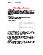
Design Section
The Magazine template
Rough sketches
- Here are some sample fonts. This is Times New Roman size 12.
- This is Tahoma size 12.
- This is Bookman Old Style size 12.
- This is Albertus Extra Bold size 12.
- This is AvantGarde Bk BT size 12.
- . This is Century Gothic size 12.
- This is Clarendon Condensed size 12.
- This is Arial Black size 12.
- This is Albertus Medium size 12.
- This is Comic Sans MS size 12.
For a formal pieces, I think the font should be clear and straight forward and I think Bookman Old Style is best ... distinctive and clear.
Here are a sample of the possible font sizes, using that font.
- Here are some sample fonts sizes using Bookman Old Style size 14
- Here are some sample fonts sizes using Bookman Old Style size 12.
- Here are some sample fonts sizes using Bookman Old Stylesize 10
For the fun sections it does not really matter as long as people can read it. It needs to be effective and eye catching so people will recognise it and read it.
- Here are some sample fonts. This is Brush script MT size 12.
- This is Stencil size 12.
- This is Chiller size 12.
-
This is Impact size 12.
- This is Vladimir script size 12.
- . This is HarlowSolid Italic size 12.
- This is Snap ICT size 12.
- This is Arial Black size 12.
- This is Gigi size 12
.
Out of these i think that the Brooklyn Kid font is the best but is very hard to use so i shall use many other dditions to it.
Top Down Diagram
This is a First design for the magazine.
After looking at this Design Joe agreed with this and believed it to be a good layout for the magazine. He asked me to combine the pictures 1,2 and 3 to create one big picture and gave me some information on the first front-page article.
Test Plan
Criteria to test:
Does it contain Pictures?
Does it Contain Headlines?
Does it contain articles?
Does it Contain colours?
Does Each Page Go On an A4 size paper?
Can it be stapled together?
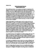
Implementation Section
Here is my first attempt at a letter
My Second Attempt
My Third and Final Attempt
I did three Attempts at the Magazine each 1 attempting a new page. These three are pictured above and each of them I have altered slightly to go on to the next. In the End I decided that I would use all three and put them together as they all seem to show what I used.
The First Attempt
The first attempt was the original Magazine that I Created in the preliminary project. I used the design from this and bulked up the content along with the addition of some background affects to make it look better to the eye. This one seemed to catch the eye more and so I used it as the front page.
The Second Attempt
This attempt was created after a little bit of playing around. I liked the look of it so went on to test out some things on it and added overlapping text and pictures. Although this was starting to look quiet good and was meeting the parameters set I thought I could do better and so I carried on editing.
The Third Attempt
This is the final attempt. It was the same as the Second attempt except I added allot more text. This made the magazine look boring. I then played with the text until I had the effect I wanted.
Joe’s Decision
Joe decided that all three met his original ideas but only if they where used together. I looked at them and agreed that it may be possible to merge them into 1 big piece. After doing this I sent it back to him once more and he was happier with this piece. He urged me to add different information to the magazine and add my own review section to it.
The Template
The Template I created was not too difficult to make. There where quiet a few differences between it and the final file. It had to be saved differently. It had to be put into a certain folder before it could be used. Also it had to be made separately.
The Logo
One of my objectives was to create a logo for this magazine. For this I used a website called “Flaming Text” they had easy headers to be made but I did not like these. By uploading a font of my own and using a design based around that I managed to create my logo.
The Site
The ‘choose your design’ page
The waiting page
The Final Design
Evaluation Section
The Final Piece was sent to Joe. He seemed to like the extras i had added and told me they gave a nice effect to the magazine. He thought that the content was worthy of being in the first issue. I believed the magazine to be good but i consider Joe’s suggestions.
The rest of the magazine seemed to be fine. He commented that the background layer I had added in “Was slightly amateur but still showed eye-catching qualities and gave a very good look to the magazine.” The fact that it was amateur may have been my determination to overdo it and try to make it perfect but slipping slowly from what I was supposed to do.
I believe the magazine was quiet good but I had tried to overdo the articles too much. I need to work on the content I put into things like this, as I am not too good at making up things like that and keeping them together I seem to separate them.
If I did the magazine again I would change quiet a few things. The first would be to try out some other things on the design. I would also go for a more Professional look instead of fun looking. Also I would include more information and other such things in there.
Did I Meet The Objectives I set?
The original Objectives I set where:
♣ To create an easy read publicised Mini- Magazine
♥Create a logo for the Magazine
Have I reached these? Well the first one, to create a magazine, has been the main focus of this piece and I believe I have made this objective perfectly.
“To create a logo.” This objective I decided not to cover in as much detail as I could. I thought it would be better as a sub-section to itself as it is not really a big piece of the coursework.
I believe this piece was very successful as I covered the Objective well but the other one may have had a mention earlier about why they where not covered.