- Q magazine
- Classic rock
- Nme
They’re similar because they all have bands classed as popular for the target audience. The magazine ‘kerrang’ uses the same format as the other teen music magazines. I am focusing on the rock genre magazines. The magazine appeals more to male audience.
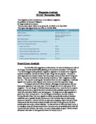
I have used the same format for my chosen magazine by looking at the back issues and seeing the basic format and layout, which is, used every time for the magazine. There is main image of a celebrity or band this is supported by a main headline. There is always a secondary image in the top right hand corner of the cover. And another secondary image, which alternates between, left and right. As I made my front cover on the computer I went of the kerrang website for the logo. I then used the simple drawing tools in paint to try and recreate the magazine.
The editorial tone in the magazine is a laidback informal approach uses nicknames of bands assuming you know what you’re talking about. For example I have named the band tenacious d “the d”. As the target audience of the magazine is teens the text comes across as informal and somewhat
Laidback approach.
I used a large image In the middle of the of page for my contents page and below it columns with text and page numbers. Using anchorage in the contents page is a common convention used. For example implying that someone has said some would be a way of using anchorage. In my contents page I created I have used a close up image of a band called feeder followed by the contents of the magazine. I used similar headings in my contents page as the page has a regular’s features subtitle I simply kept the same headings but changed the story below.
The contents page is well thought though by the editors. The language of the contents page is used well as the target audience is teens the language is laidback along with this the layout of the contents page is very simply using the same font style and color as the front cover.
The advertising of the magazine can depend on the issues covered.
The advertising can be a major income to the magazines successful for example if the magazine has big names on that isn’t advertised it might not entice not regular readers. The magazine can be also advertised though its TV channel kerrang it has adverts telling you what story it has weekly. Also its radio station has advertisements telling about the magazine.
I feel I created my front cover and contents page as good possible I am pleased with it. I used a number of conventions to create it. I started off by getting the kerrang logo off the website then getting a main image of the band ‘tenacious d” I cropped this image and placed it upon the page. Then generated various headlines across the sides. Sampling different types of font styles trying to find the closest to the magazines. Then I placed my secondary image at the top of the right hand corner with a secondary headline below it. The problems with my front cover as the image itself is stretched to reach a4 size therefore losing some of its quality also spelling legends wrong but I could not change it as the file was an image format. I think my front cover and contents page fit the age range required. I think that my that the success of my contents page was good and the format was copied well.