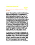
The leaflet is folded; it has six sections including the front and back pages. The whole of the leaflet has been designed with three colours; white, black and a dull green. Even though these colours can be limiting as there are no changes in tone and also they aren't very eye-catching. It still draws your attention as the graphic design has been carefully structured with different words and fontsOn the front of the leaflet there is a slogan 'if you can't imagine what it's like to be tortures let's bring it closer to home.' This caption can be described as a double entrendre as it is has a hidden meaning. The first impression that it gives you is that the leaflet can inform you about torture that has happened around the world and what the organisation is about. The second meaning is that the torture is already happening at 'home', so you don't have to bring it home; it happens all the time and you can be completely oblivious to it. The front of this caption gives a message in its own way. It is important to pick the correct font when alerting knowledge about any organisations especially on the topics of human rights and extreme issues that Amnesty are involved with. For example if the font were in bubble writing, it would seem less serious and less formal too. The fact that the font has vertical and horizontal lines on the edges of the letters almost shows the striking brutality of the torture that is happening.
When you think of a colour that you would associate with torture you'd probably think of black or red. Amnesty international have used green but because the colour is so murky, depressing and sickening your attention is drawn to it. The slogan has also got many different font sizes with key words like 'imagine' and 'tortured' in much bigger sizes so it looks like they are coming off the page at you. Also the slogan has 'you' in it. This makes it more personal so you could sympathise to it and want to be a part of this worthy organisation.
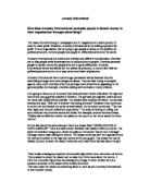
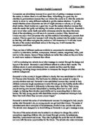
In the top corner there is a household iron on the table, this section is entirely black and white. The background behind the iron is black and there is a ghostly white glow around the iron. You may think that the light around the iron could symbolise hope. But in this case I think that it shows the darkness enclosing around the iron as if there is no hope.
At the bottom of the leaflet there is a block of green colour with the name, logo and website address of Amnesty International. The logo of the candle with the barbed wire around it is renowned worldwide. Peter Benenson the fonder of Amnesty International was inspired by the Chinese proverb 'It is better to light a candle than to curse darkness.' This is symbolised by the logo, which promotes to the world that there is hope and there are people willing to help too. You open the leaflet onto two sections and your attention is immediately drawn to the right section, which has the same striking writing as the front cover and the use of the household iron as on the font cover. Accept this time the writing reads 'now imagine this was your face.' This is quite a shocking statement, which makes you sit up and pay attention. Again the key words like 'imagine' and 'face' have bigger font sizes. The word 'imagine' has been carried through to show that if this makes you stop and think, can you really imagine what it would be like to be tortured. The iron is the only image shown throughout this leaflet but it is powerful enough to have an affect on the reader by making them aware of a horrifying image before they have even read any informative sections in the leaflet. The iron again looks ghostly as its angle is portrayed to show it coming down at a great force.
On the left side the page is occupied completely by writing. It starts off with a numerical fact to justify a reason for why they are supporting this cause. However this time the font has changed to be less striking and more informative. Along the left hand side you have a column of words in bold type with slightly bigger font sizes reading, "we've", "you", "as", "take", "or", "at", "we", "by", "our", and "join". These words alone can show how Amnesty International are trying to emphasize the harshness of the cases that they help, how you can help them, and how you can help the organization. They are very bold, forceful words that catch the eye. Amnesty International is keen to show real case studies, which are shown in this section. The case study of Nang Mai ad Yassine Simozrag are used in this leaflet, they are particularly disturbing and are just some of the atrocities that Amnesty and the victims have to deal with daily. They give everyday examples of everyday happenings like 'we've all burnt our fingers on a hot iron or pan', and then use it to show the torture that is happening. They also try to sympathise with the reader knowing that this subject is quite horrifying and people may choose to turn a blind eye by tugging on heartstrings. Then the tactics are changed to support for Amnesty by applying pressure to governments and asking for donations and finally wanting you to join by filling in the application form overleaf. At the bottom the font changes to that of the opposite page. It reads 'Please join today.' I have said that this font can show brutality; so maybe in this context it could show a plea or cry for help.
If you fully open the leaflet there is a donation form covering two sections of the leaflet, this can show that it is vitally important to Amnesty International's campaign. There is a positive sentence at the top 'yes, I want to support Amnesty International.' This could infer that the supporters can stand proud and freely say that they can support Amnesty International. After all freedom of speech is a human right, that they campaign about. There is some small print underneath about why amnesty needs donations and a bold part reading 'your support is vital'. The form has a sub standard information box to fill in with your name, address etc. You have a chance to make a regular installment by Direct Debit. Or a set donation of £250, £100, £50, £25 or other. It is interesting that instead of starting with the smaller amount the largest amount of £250 is the first box that you can tick. This could be because they need to get donations to carry out their work. You can also send it by freepost, which is always attractive to a reader and could encourage them to fill the form in. You must make sure that you read the small print at the bottom and keep it, as it is your only form of guarantee. On the back of the leaflet there is some general information about Amnesty International; including facts on cases, the organisation and what they campaign for. Again they choose to enlarge words like 'you', 'stop torture', 'amnesty' and 'campaigns', to emphasise the most important factors.
Throughout the leaflet the tactic of what 'you' can do to help is used to try and involve the reader. I think that it is a good thing that they use real case studies in their leaflets. There is a lot of information, so even if you have never heard of the group you will be fully informed. It is a good that they do not use pictures of the cases that they have helped as that would be unnecessary as the description of the cases is enough to show you the horror. Also the use of the iron graphic at the start of the leaflet keeps the reader interested so in turn they read on, this is one way in which a pressure group can use propaganda to gain support, by drawing the attention of the reader. The back of the leaflet has a quick and easy summary of campaign issues of Amnesty International, this can be useful for those who may not have enough time to read the whole leaflet but want to get involved.
.
However the format of the leaflet has been kept the same style with colour, font and text. This can make the leaflet seem flat, bland and a bit tedious by the time you get to the end of the leaflet. Also the donation form is very big, even though it gives you various methods of payments, it does look a bit desperate as if they have focussed the attention more on the donations after giving you examples of case studies. Moreover the leaflet is very formal so it would seem that it would be suitable to an older age group. It also it is written so the language is more formal, this suggests that it would be read by an educated person