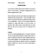
At the bottom of the page almost as a footnote there is a reference to the model’s lipstick colour and mascara, this is done in a size 8 font, as it is simultaneously advertising another product: the mascara. They are being understated and discreet, not wanting to very obviously advertise two products at once. The word ‘New’ is printed in a size 22 font at the top of the second page, in a purple colour, it is important to emphasise this word and make it stand out to the reader, as their love for anything novel and innovative is an integral component of advertisements.
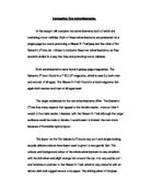
There is an image of a pool of water at the bottom of the page, linking into the whole idea of water imagery which I will mention in the lexis section.
All of these effective graphological features are used to capture the attention of the reader.
Phonology
In the particular advertisement I have chosen, there is an interesting phonological structure. One of the most obvious features is the use of sibilance in the repetition of the /s/ sounds. The advertisement is littered with words such as, ‘shimmering’, ‘sparking’ ‘shades’ and ‘shine’. These are very illustrious phonemes which are appealing to the reader. The /s/ sounds are fricatives, meaning they have friction effect when pronounced.
In the company logo, ‘Maybe she’s born with it. Maybe its Maybelline’ we see an interesting repetition of the nasal /m/ sounds. This is very orally effective and certainly sells the product. Alliteration of the letter ‘M’ is also evident. In the first line of the main body of text there are two semi-vowel phonemes placed side by side, ‘new wet’ this is an interesting structure and quite unusual. The repetition of ‘Maybe’ is used for emphasis and helps lodge the brand name in the customer’s mind.
Lexis
The lexical features of the text are used in such a format that the reader feels at ease with the product, not forced into buying it, and confident of its success if they choose to buy it.
The language is very glamorous and stimulating, as well as being informative of what the product actually is. The tone is neither formal nor informal; instead it is somewhere in between, striking a balance; serious yet fun. The language could almost be described in places as mildly scientific, but definitely not giving way to jargon, words such as, ‘particles’, ‘enriched’ and ‘reflect’ are used which indicate this. This helps to persuade the reader that the product will work. The latter two words are verbs which indicate what the lipstick actually does that sets it apart from the rest.
Lexical cohesion has been maintained throughout the text. The words used are in general from the same semantic field. Most of the words in the passage are free morphemes, e.g. ‘new’, ‘create’, ‘look’, ‘shine’ etc. All the rest tend to be inflectional morphemes e.g., ‘shimmering’, ‘enriched’, ‘sparkling’ and ‘diamonds’. These inflectional morphemes simply indicate tense and mark it for plural. This greatly simplifies the structure of the text and makes it easy for almost any reader to grasp.
The words ‘create’ and ‘new’ indicate something innovative and never seen before, the reader is lured into a feeling of the unexpected and that anything is possible with this lipstick. Again the actual company name, ‘Maybelline’ is very interesting as it is composed of two different, overlapping words. ‘Maybe’ is an adjective meaning perhaps or possibly and ‘belle’ is a French adjective giving an English noun meaning the most beautiful woman especially at a function or event. This brings instantly to mind the cliché, ‘she is the belle of the ball’, which is every woman’s ultimate wish. Therefore when analysed the word means perhaps the most beautiful woman. In other words it is not promising anything but simply suggesting the power of beauty which the product holds.
The word ‘diamond’ has many connotations and associations, which make its use very powerful. It reminds the reader of glamour, money, love (engagement rings) and has much allure for women yet in reality diamonds are exceptionally hard stones, contrasting to the softness and ‘moisturising’ effect of the lipstick. The repeated use of the word diamond reminds us of the idiom ‘a diamond is a girl’s best friend’ this is intended by the advertiser, they are saying no girl should be without a best friend, diamonds or this new diamond shine lipstick. It might also suggest that if he looks good enough she’ll get a man and therefore o diamond.
There is quite a lot of water imagery used within the advertisement, most significantly the name of the product is. ‘Water shine diamonds’, ‘wet look effect’ and on the opposite page the phrase, ‘Shower your lips in diamonds’. The notion of water links back to the earlier theme of something new, it gives off the idea of life, birth and purity. The advertiser, encouraging the notion of originality on the part of ‘Maybelline’, develops the whole concept that a pristine product has been born suggesting that it is natural not artificial.
The use of vivid and vibrant words marks the advertisement and product as something creative and fun in thrilling way; the verbs ‘dazzle’ ’shine’, ‘shimmering’ and the adjective ‘sparkling’ all convey this idea. On a separate line there is a rhetorical question printed in pink, which is asking the reader ‘Are you ready to dazzle?’ They are therefore indicating that the product will make you dazzle and stand out, and asking the reader whether she is ready for such excitement. This is a clever ploy as it is engaging the reader’s attention and making her think about seriously buying the product. The website address of ‘Maybelline’ is printed below the main body of the text in a final bid for the reader to firstly buy the product and then secondly look at all the other wonderful products available to them. This also suggests the company is up to date enough to have a website.
Below the company name is ‘NEW YORK’ this not only gives details of the company’s origin and headquarters but also sets them to the forefront of the fashion and beauty industry. Our society’s obsession with everything American, being bigger and better has made them very competitive and to add ‘New York’ to any product increases its authenticity as something beautiful with a hint of Hollywood glamour.
Grammar
The grammatical features in this text are designed to entice the reader and, although very carefully and cleverly constructed, are quite simple for the reader to comprehend.
The sentence length of the main body of text is in general of quite a standard length. The first sentence is comprised of ten words, the second is thirteen words long and the last is fifteen words long.
The words are rather detached and don’t mention very many personal pronouns. On the first page the pronouns, ‘your’ and ‘she’s’ are used. They are not directly referring to specific people or groups, rather they are aiming for a wider audience.
The present tense has been used in the advertisement. By using the present tense the product can be described more vividly. It refers to what is happening now and encourages the reader to go out and buy the product now. The reader therefore will begin to believe that the product is fashionable and indispensable and also immediate and new.
There are no aphorisms or interjections, keeping the tone succinct and to the point. The clause patterns are however rather unusual and complicated yet all quite similar. In the first sentence the pattern is verb (‘create’), complement (‘wet look effect with shimmering’) and then the subject (‘diamond shine’). The second sentence again begins with a verb in the passive voice (‘enriched’) followed by the object (‘tiny sparkling particles’) and lastly the complement (‘reflect light like a sea of diamonds’) The final sentence again begins with a verb, (‘smooth, moisturising and non-sticky’) and then the object (‘sparkling lipstick’) and lastly the complement (’14 precious diamond shine shades’).
The punctuation is very traditional with full stops, one comma and one exclamation mark throughout the two-page advertisement making it seem rational and logical.
These interesting grammatical features all add to the advertisement’s success in captivating the reader and stimulating her to read on
Conclusion
I feel that this advertisement captures all of the various language frameworks we have studied, which is why I only chose only this advertisement to analyse. The layout of the advertisement is very clever and meticulously constructed. The language is extremely well utilised to sell the product and its interpretation and associations all add to its original style. There is no doubt that the advertisement on the double page spread is extremely catching and unforgettable.
1850