Section 3 – My Own advert analysis
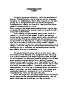
For my own advert I have chosen to use an advert for Rolex watches. This Advert really caught my eye. The advert really holds the readers attention. The advert shows a large, shiny gold Rolex watch on the right of the page. I assume the watch shown is a Rolex’s finest. Which draws the reader’s attention even more. It is on a black textured ground to contrast with the bright and attractive colours of the watch. The page that the watch is on is white, this makes you draw all you attention to the watch. The photography of the watch is very sharp, and clear.
To the left of the page, there is a picture showing Nascar’s at Daytona driving around the track. The photo shown covers the rest of the page, and also another page. The photo covers the two pages to attract readers. The images are also there to base the theme of the whole advert on. The photograph is very cloudy, with little detail. But it is clear enough to be able to distinguish what the photography is showing. This was done because the creator’s didn’t want the reader to be distracted by the large image. Around the photograph, there are quite large borders. This was done so the area with the Photo of the Rolex watch will not look out of place, and fit with the large image of the Nascars.