Development/Modifications
Logo:
User’s Comments: I feel that the grass in the background of the logo and the wavy grass design under the football have been used effectively to the extent that it shows a lot of activities to be available at the leisure centre.
As can be seen from this image I have edited the logo using the graphic software: ‘Macromedia Fireworks’ and ‘Adobe Photoshop’. From the previous design I have replaced the wavy blue design with a wavy grass design directly under the ball. This is because it helps to represent the grass image effectively, so it helps to convey that a wide variety of activities are available. This is because grass is associated with sporting activities so this image idea is immediately thought of by the user. Also this helps to make it more relevant to the leisure centre, so I have also added grass to the background of this logo for these very two purposes. Also the main part of the logo has been modified using the graphics software. For example I have added an inner bevel as well as a shadow to make it look more realistic and stand out more. Also I have modified it to add an orange glow around the main part of the logo. This is because orange is a complimentary colour of blue so by using the blue and the orange next to each other they work very well together and as a result will help to attract more attention to the logo itself.
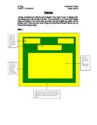
Leaflet Holder:
User’s Comments: I feel that the use of thermochromatic ink is a great addition which will help to attract a lot of attention, especially children.
As suggested by the user’s comments the use of thermochromatic inks was especially designed to suit the needs of children. This is because the holder already looks very professional, which means that it already appealed to adults and needed a way to appeal more to children. This is the reason why I have decided to add this modification of thermochromatic inks to my leaflet holder, which I had not previously intended to do. The red ink used in the thermochromic ink would not appear when heat is applied such as touching the initials, so it would just leave the blue background underneath. This would help to appeal to children especially, as they will find it very interesting and attractive that the inks are able to change colour (appear invisible when touched). Also I have airbrushed the thermochromatic inks to the holder. This is because airbrushing is a commonly used technique in industry, so it would help to make my leaflet holder look more professional, helping it to appeal to adults more. Again I have used graphic software in order to make the leaflet holder stand out more. I have included an inner bevel to the background of the holder, so now the blue background looks 3D and seems more realistic. I have added shadows to all of the images to help them to stand out more, and I have even added a shadow to the thermochromatic inks. This was designed on computer, but the colour of the text matched the colour of the background so the actual text of ‘C.L.L.C’ is not visible under the thermochromatic inks.