Here is the logo for the biggest international sports company in the world, Nike. The Nike logo is a simple tick. Their slogan is “Just Do It”. The tick reinforces the slogan but it is very simple. It is traditional and simple, and makes the point “You can do it”. The tick is traditional and has been the logo for Nike since the start of the company.
This is the logo for the sports company Adidas. Adidas sells all sports equipment. The logo is very simple and does not show that the club is a sports company. It doesn’t appeal to any particular audience.
The logos for the companies that I have researched are all very simple and do not convey any particular message or appeal to any particular audience. However, these companies are already recognised companies that have been around for years. They don not need any special logos because their names are known internationally.
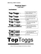
The first logo that I designed is a simple logo with the name of my company and a football next to it.
It tells a person that my company is a football company because not only is the name of my company on the logo but there is a football. I created the logo on Adobe PhotoShop. It is a new program to me, as I haven’t used it before. It was fairly easy to pick up however. I typed the two words separately so that I could move them easily to where I wanted them to be. Then I went to clip art gallery in word, and copied the picture into PhotoShop. I could now move the words and the picture of the ball wherever I wanted. It was a very easy logo to make. I decided that the first logo that I designed did not need to be very colourful or intricate and hard to make. This was because, after looking at the logos of other companies I did not think that extravagance was necessary.
The second logo that I designed was also simple, and easy to make. I have used the same football that I used in the previous logo. Football Nation is written on the front of the ball in red letters.
Once again I have opted for a logo that tells people the name of my company. After using PhotoShop for my first idea I felt that it would be suitable to use it to design my second logo. Also, after designing the first logo I felt confident that I could use PhotoShop to good effect. To make this logo I had to copy and paste the football from the clip art gallery into PhotoShop. Once the football was placed into PhotoShop, the image had to be resized because it was too small. Afterwards I had to create the words. I typed the words together this time, not as two separate word designs. In the word design box I had to change the size of the font as it was too small. I felt that black lettering, on a black and white football would not stand out very much. Hence, the reason for using red text. Red is a fiery and angry colour. Football can sometimes be that way, especially in the Premier League.
The third and final logo that I designed, is more exciting and colourful then the other logos.
As you can see, the logo is black with many other colours on it and the name in the middle of the ball. This logo is basically an edited version of the previous logo. To make this logo, I took the previous logo and changed the picture by using tools such as render and inverse outlines. I did this until I found a logo the edited version that I liked. For this logo I used inverse outlines. Basically, changed the colours of the previous design and made it more colourful and exciting.
Once I had designed all three of my logos, I decided that in order to select a suitable logo, I would need a questionnaire. The questionnaire would help me decide which logo the public and clients (e.g. suppliers and delivery companies) would prefer, and which is the most effective logo.
Attached are five examples of how people reacted to the logos that I designed.
The first question from the questionnaire asked, "Which logo best represents the company and what it does?"
As you can see 60% of the people that were asked said that logo two was the logo that would best represent the company and what it does. Logo one was also a popular logo. Logo three, however, was not very popular at all. I feel that this is because the ball is not very clear in the logo. The name of the company is shown in the logo but it is not very clear.
The second question asked, "Which logo is the most eye catching?"
Obviously, the most eye-catching logo, is number three. This is because it is quite colourful, even though most of it is black, there is still colour, and it stands out from the rest of them. Logos one and two shared 15% of the peoples votes, and are obviously thought to be quite boring.
There were other questions in the questionnaire but the most important question of all asked, "Out of the 3 logos that I have designed, which do you prefer?"
As you can see, logo two is the most preferred logo. I also feel that logo two is the best logo for representing the company. Logos one and three shared 40% of the votes whereas logo two took 60%.
I have looked at logos for other companies and I have designed my own logos. I have produced a questionnaire and have analysed my results. After collecting the results of the questionnaire I believe that logo two, should be the logo that will represent my company. Now after choosing the logo to represent my company, I must use this in letterheads and I must use this in advertisement.