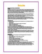
The card is only one sided and this was something that was said could be improved. This isn’t necessary, but could be done quite easily, if the company decided to invest more time and money into it. I have created a user guide that has been successfully tested, so other cards of different styles could be created. There isn’t really a need for this however as I feel that the design I have created is successful and doesn’t need altering.
The card I created is much more interesting than any of the other cards I have looked at, and it meets all the requirements in my design specification. Realistically it may be too expensive to produce but this would depend on how wealthy the company was, and whether it wished to spend a lot of money publicising its image.
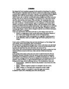
The Letterhead
The letterhead meets all the requirements set by the design specification. This means that it
- Contains the logo
- Uses the company colours of yellow, purple, green and red
- Is simple but effective
- Contains the company’s name, address, postcode etc.
- Can be easily adapted to alternative designs
- Is suitable for containing any letter, whatever the subject
- Is not so big that it overshadows the letter, or so small that it isn’t obvious
- Gives the company a professional image
The letterhead was much easier to create than the logo, business card and leaflet. All I had to do was to move the logo into Word and add a header and border. It looks professional and meets all the requirements that I wanted it to, so it is a success. After asking some of the possible employees of Daisy chain and making some improvements, I found a way that let me fit the whole logo onto a page.
The employees that I asked all were pleased with the finished paper so this was also successful.
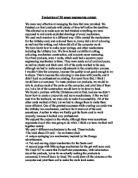
The Folder
The folder also meets all the requirements laid out by the design specification. This means that it
- Contains the logo as well as a background devised from the logo
- Is big enough to hold the whole package but fits through a letter box
- Has an interesting way of holding the business card and leaflet
- Can easily be adapted to alternative designs
- Contain the name of the company
I was especially pleased with the swirl pattern on the back of the folder. I didn’t expect the detail to be so good, and I was surprised at how easy it was to change the settings to create different swirls. Unfortunately the front of the folder didn’t print quite as well as the back and has some lines across it. I believe this is just a printing error, and shouldn’t happen again, because the back cover was printed immediately after this and was perfectly fine.
“gloosy attractive modern unusual
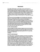
The Leaflet
The leaflet took a lot of time to create because of all the information that I wanted to go in it. However, it does meet all the requirements of the design specification and can be edited easily. This means that it
- Has the logo and phone number on the front page
- Has the phone number on every page
- Provides information on what the company does and why you should use the company
- Contains a list of the kinds of things that the company sells and a price list
- Contains some original pictures (and some from Adobe)
- Every page has the logo (or part of it) on it
- Every page has the heading ‘Daisy Chain’ in the same font that it is on the logo, and highlighted in the same colour as it is on the letterheaded paper.
- The font is in the company colours and occasionally blue to make it even more vibrant
- The whole leaflet looks bright and professional
Some of the positive comments I received on it were-
“A nice balance of pictures and text”
“Bright and eye- catching”
“Attractively presented”
“Contains all the information you need”
“I like the multicoloured panels”
“The different colours of font make the important information stand out.”
“I like the ‘ideas’ page.”
I received considerably fewer negative comments and these were on the lines of
“...A bit too long: but that’s being picky…”
“What if I don’t have a credit card or a phone?”
From these and many others I can conclude that the leaflet is successful, but could perhaps have been more concise and included an order form. Apart from the 2 problems, the leaflet meets all the requirements and I feel that is suitable for use.
The system
This is a card that a person who has never used Adobe before managed to create, while I was testing the system. It took 20 minutes, and this is quite reasonable as it was done by a completely inexperienced person and only really needs to be updated if a new person is employed and wants a business card. This proves that the system is easy to use.
The system is designed for employees and so for the template for the letter document I kept the writing that Word automatically puts in. This includes some small links giving help and further options. I have saved the template so it can be used by any of the employees. I have also included a user-guide telling employees how to import the logo into word and use borders and headers to complete the paper. The information written on the paper can easily be replaced and as with the letter-headed paper it only needs to be created once, and then updated occasionally.
Comments from some possible employees on making business cards using the Adobe were-
On the user-guide…
“The user-guide instructions were precise and I could follow them easily even though I have little IT experience.”
“…Clear and concise…”
“The help provided in the user- guide pointed out some things that didn’t appear on clue cards and helped me when I was adding text. Without them I would have struggled.”
…On Adobe
“ The clue cards on Adobe complemented the User Guide.”
“All the special effects processes could be done at the click of a button and could be easily undone afterwards.”
“Although Adobe isn’t a graphics program, it had almost unlimited special effects options which could be used together or on their own.”
“I was very impressed with the quality of the finished card I produced.”
Conclusion
I am pleased with the results of this project and surprised at how good Adobe was. I was spoilt for choice of special effects and the clue cards helped me when I was learning to use the program. I was surprised at how much I could do to a picture after only a short period of time. My presentation package meets all the requirements of my specification even if the logo has changed significantly since the first design. I think that the logo could realistically be used, but a simplified version would probably have to be made, as it would be too expensive to use a photo for a logo on everything.