The logo for the British Heart Foundation uses only two colours, black and red. The red highlights the word 'Heart' and is used for the very clever graphic depicting what looks very much like the lines on an E.E.G running in the shape of a hear...

Authors Avatar

The logo for the British Heart Foundation uses only two colours, black and red. The red highlights the word ‘Heart’ and is used for the very clever graphic depicting what looks very much like the lines on an E.E.G running in the shape of a heart. The choice of the colour red is obviously because of blood. This stands out from the rest of the logo as it is the very core of what the charity is about. The choice of black for the remaining two words surrounding the red heart and the use of strong bold lettering  emphasises the seriousness of the work that the British Heart Foundation does at the same time as drawing attention to how grave the consequences of heart disease can be.

Join now!

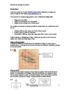
The logo advertising MECCA Bingo immiediatley looks like fun. This has been achieved by the use of different bold colours for the capital letters and the smaller wavy lettering used in the word Bingo. The blocks around the capital letters remind you of the tiles used in some bingo games or the squares on the bingo card. The use of stars and the circle orbiting the word depicts great heights and the possibility of a big win! The white cloud behind the word bingo makes it look lighter and so makes bingo look like fun.

...

This is a preview of the whole essay