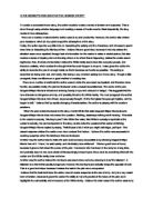
The small girl also looks helplessly into the car where the door is left wide open to imply someone is inviting her into the vehicle. The angle of the picture is on a slight tilt, indicating that the car is luring the little child over and dominates over her. More defenceless and vulnerability is created, again making the viewers more attached as well as worried for her well being. The car has been cropped intentionally so there is no visual image of somebody in the vehicle, consequently creating the image to seem more ominous and threatening. It allows the viewers to use there imagination which can generate anxious feelings as the fear of the unknown can be daunting. It then raises questions, knowing that they don’t know what’s going to happen to her, and drives them to find out more.
The women in the background of the advertisement are standing evenly far apart on two different sides of the street, scantily dressed for the evening, portrayed in the image and standing on an angle in a provocative way signifying that they are engaging men to look at them. Like prostitution. It demonstrates how unpleasant a job resembling that would be like if you had to stand in the damp, dark, deserted streets and also relates to the way the girl is standing and dressed. The viewer would relate the women in the distance to the young girl in the front and start to see the story the advertisement is revealing. Lighting and settings also improves the effectiveness of the advertisement. The darkness of the night creates a fearsome effect, whilst the red and purple glow in the image indicates a sense of threatening danger and violence. The building poles suggest a sort of entrapment and being caged in. The area is also very abandoned and derelict this constructs a more chilling atmosphere as there is no one around to help if danger occurs.
Audiences looking at the advertisement would react negatively to this image because people do not like to young children in harm. The image depicts an awfully depressing issue which some would not like to address but nevertheless needs to be voiced out to people. They would be extremely astounded at how forceful the message of this campaign comes across through the imagery therefore urging them to want to gain more information about what the image is with reference to. The shock factor of the image was a clever way in helping create effectiveness for the Barnardo’s campaign.
Another strong key point that created an effective advertisement is the use of text. Instead of leaving the child unknown and nameless, the caption ‘Kim Vale age 24’ adds big impact. this is because giving a name to something helps create an identity and meaning. It becomes more personal for the viewer since they now know her name and feel more emotionally involved with the life of the child. In contrast the name can also develop confusion. The age does not correspond with the picture and some may find that difficult to understand nevertheless makes the readers work even harder to understand what message the advert is trying to get across. Coloured in a clear white colour against the images dark blue and black, the caption is easily spotted therefore catches the audience’s eyes moderately abruptly so is effectively seen and is not missed out when looking at the image as a whole.
The four paragraphs of copy are placed in the bottom corner of the advertisement in a small font size so that it doesn’t deduct from the very important imaging. This is cleverly effective because it gives the audience a chance to assemble the message presented by the image first, which is the largest and most important piece, then supporting their judgement they would check the text for reference which is significantly smaller than the image .Like the caption the text is coloured in white to distinguish it from the dark shaded image allowing the viewers to see it more clearly an efficiently. Also the advertisers used a reasonable small amount of text so that it doesn’t put readers off reading the text. However the size of the text may be somewhat too small to comprehend or see.
In comparison to the appearance of the text, the subject matter and language style of these four paragraphs are fundamental in influencing the reader to support the charity cause. Paragraph one has a very negative vibe towards the girls situation. The first word used ‘Neglected’ is powerfully emotive, it creates sympathy and gilt when reading in view of the fact that it is a word associated with being unloved and unwanted. She is then described as an ‘easy victim’ which then adds to the sympathy. On the other hand the second paragraph brings a more optimistic approach by bringing in ‘Barnardo’s help’ the quotation ‘an unhappy childhood need not mean an empty future’ counter balances; giving a bad point and overlapping it with a good point. This shows the readers that there is still a chance for these children and they are worth helping. The third paragraph kick starts with a personal pronoun ‘We’ to include readers and make them feel welcome and ends with an encouraging rule of three ‘home, school and the local community.’ to describe where they will be helping. Giving the audience an insight into what there donation would be spent on will persuade them into giving. To end off the text pleads the reader to donate and give useful information to do so.