We decided (as a group) that to collect the information for the housing density hypothesis, we would count the number of houses we passed every 100 metres. We would keep to a consistent 100 metres by measuring on the map every hundred metres and then walk that distance while counting the houses. However, there is a problem with this type of data collection. This is because the number of houses in an area may vary. One area could have many houses in yet another area might not have any houses in at all. As we were only walking a small area of Hebburn and collecting the data following a line, the data might not give us a representation of what Hebburn’s housing density is actually like. That is why we decided that different groups would walk different transects, so we would obtain a better representation of Hebburn’s housing density.
Another method of collecting data we discussed was to count all of the houses in 1km square from the outskirts of town to the CBD however I rejected this idea on the grounds that it was too time consuming. Instead, I decided that I would identify four different areas of housing on my large map and draw one dimension in each area of housing. I would then count the number of houses in each square and multiply this by 25. This would give me the number of houses in a square kilometre.
Data Collection – Housing Quality
The second hypothesis that I am going to look at is does the housing quality improve as you move towards the suburbs?
For my housing quality hypothesis, I needed to decide on the criteria that I could use to judge the quality on. I decided to assess the housing quality on factors such as the condition of the paint work, the roofing etc. factors were in, I used a scale to make it easier for me to identify what type of condition the houses were in. The scale was on a 0 – 10 basis where 0 was excellent and 10 meant in very bad condition.
When we began to collect our data we ensured that the group’s data was the same by discussing what points we thought a particular house should be awarded. We picked houses to analyse every 100m, so we measured 100 metres on the map, walked the distance, and then stopped and analysed the house that was nearest to us. We continued this process until we reached the town centre of Hebburn.
We also collected our data in the form of photographs, which were taken at the places we stopped. The reason that we had taken the photographs was so that we could further analyse the housing quality. We marked the places that the photographs had been taken onto our large-scale maps.
Data Collection - Environment Quality
The third hypothesis that I am going to look at is does the environment quality decrease as you get towards the CBD of Hebburn?
For my environment quality hypothesis I used the same method to collect my data, as the one I used to ascertain the housing quality. I decided what criteria to judge the quality of the environment on, for example air quality, litter, graffiti etc. Again, I decided that it would be easier to identify what condition the environment was in by using a scale. The scale was on a 0-10 basis, were o was excellent and 10-meant that the environment quality was not good. When collecting the data, we made sure that everyone was agreed on what points should be awarded. This ensured that everyone in the group had the same data, which was the consensus of opinion.
We stopped every 100m to analyse the environment quality. We also collected our data in the form of photographs, which were taken at the places we stopped. The reason that we had taken the photographs was so that we could further analyse the environment quality in more detail on our return. We marked the places that the photographs had been taken.
Data Collection – Housing Age and Price
The fourth and fifth hypothesis that I am going to look at is whether or not the price and age of housing decrease as you move towards the town centre?
For my housing age and price hypothesis I gathered information from the local newspapers for houses that were for sale in Hebburn. When I had collected information on 50 houses I was allowed to look at the other data collected by the other groups. This is a good idea because it ensured that we obtained a wider and larger sample of data.
For each house I had to find out its address, age, type of house, price and distance from the town centre. To obtain this data I used the information obtained from the newspaper adverts and photographic evidence.
I located the address using the A-Z of Hebburn and marked the street on the map, as I didn’t have the house number for most of the houses, I marked a middle house in the street. I identified the type, age and price of housing by information provided in the advertisements and also from photographs. I divided the ages of housing into four categories Pre 1914, interwar, post to 1970 and modern housing.
To establish the distance of the house from the town center I marked each house with a different colour dot for each category, Pre 1914 areas on my map were colored in red, inter war housing was colored green, Post War to 1970 housing was coloured orange and modern housing was coloured yellow. Once I had marked a number of houses I could see a pattern, and I used this, along with my own knowledge of Hebburn to color in whole areas of the map and completed a colour key on the reverse of the map to identify the age of the housing.
Data Collection – Industry
The last two hypotheses that I am going to look at are ‘ Is traditional heavy industry found along rivers and railways’? and is Modern light industry found where there is good access by road on the edge of the settlement?
To obtain information to help me complete my industry hypothesis, my teacher and my group photographed the main industrial sites in Hebburn. These sites I marked and identified on my map. I copied these onto my large-scale map, on which I had already plotted and coloured my different areas of housing. On this map I added the main areas of industry in Hebburn, which I coloured purple. I discovered that some of the photographs of modern light industry sites were in areas, which were outside the concentric circles, I recorded this information in my photographic evidence.
Data Processing and Presentation
In order to obtain answers to my hypothesis’s I processed and presented my data in forms of pie charts graphs, scatter diagrams and information plotted on the map.
Data Processing and Presentation - Housing Density
My data was pooled with the data collected by the groups who walked the other three transects. We entered the number of houses per each sample point onto a spreadsheet and used this to compile a bar chart for each transects housing count, using different colours for each transect.
By drawing four centimetre squares (200m according to scale) for the four housing areas and counting the number of houses which I multiplied by 25 to provide the number of houses in a square kilometre and recording the numbers in he boxes on the map I could see which areas contained the highest density of housing.
I located where the photographs had been taken and put the street name onto my photographic annotations, which enabled me, to ascertain which type of housing certain areas consisted of.
Data Processing and Presentation - Housing and Environment Quality.
The type of graphs I drew to show my housing qualities were bar graphs. Before I drew my bar graphs I used Microsoft excel to work out the total of my penalty points. The bar graphs were colour co-ordinated to match the transect that was walked. The colours were green, blue, yellow and pink. The graphs showed the x – axis as the 100m intervals walked along the transect and the Y – axis showed the points awarded for each sample number.
From the photographs that were taken to show the quality of the housing and environment I noted the location of the area on my map by using the A – Z for the street names.
Data Processing and Presentation- Housing Age and Price
To show the relationship between the price of housing in Hebburn and the distance the house is from the town centre, I drew a scatter graph on Microsoft excel. I drew this type of graph as I have used this in Math’s so I knew that if there were any type of match with the relationship between the housing price and the distance, the scatter graph would show this. If there were any type of match the points on my scatter diagram would be going upwards in a diagonal line. This is known as positive correlation.
I also used Microsoft excel to produce the pie charts for housing age by using a feature called Pivot Table Reports. These tables are used to count the number of houses in each age group. To create my pie charts, I first selected the housing age and distance data from the computer and saved it into a separate file. I then used the pivot table report command to count the number of houses in each group for the whole town. This is an essential starting point as the first pie chart (See Pie Chart 1) will show only the break down of the ages of the houses in Hebburn and the following pie charts will show the ages of houses within different distance zones of the CBD in Hebburn. (See Pie Charts 2- 8)
I then sorted the distance from the town centre and separated the data after each 200meters. I then sorted these 200 metre zones by age and did a pivot table report for each. The pivot table reports showed the number of houses in each of the four age ranges, for each separate 200m zone. Each of these zones being 200 metres further from the town centre than the previous one. I then used Microsoft excel to draw the pie charts.
Data Processing and Presentation - Industry
I annotated my photographs showing heavy and modern industry in Hebburn. I then used these photographs to colour large areas of industry onto my map.
Conclusions
Does Housing Density Increases as you move Towards the Town Centre?
The bar charts that I compiled for my housing densities transect (Green) did not show that the housing density was highest or increased towards the CBD. As you can see, at the first sample point we looked at on the Green Left transect, you can see that we counted 10 houses, however the last sample point which we obtained data from, shows that we counted only 6 houses. This clearly disproves my hypothesis. I also looked at the bar graphs from each of the other transects and these showed that there was no density increase as you moved towards the CBD.
I think the data that I collected was satisfactory however, if more transects had been walked more data could have been collected, this would have provided me with a more accurate picture.
I then looked at the number of houses per square kilometre in the four different housing areas on the map. In the first square I found that there was 3’150 houses per square kilometre, this was the square is situated closest to the CBD. In the next square, I counted only 1800 houses per square kilometre. The number of houses continued to decrease as I moved towards the outskirts, with the third square containing 1150 houses per square kilometre, and the last square containing only 875 houses per square kilometre. This clearly proves my hypothesis, because you can see that the numbers of houses per square kilometre decrease as you move towards the outskirts of town.
Looking at the photographic evidence it appears that the type of housing nearest to the CBD has the highest density i.e. back to back terraced housing, multi story flats with no gardens and garages.
From looking at the pie charts, they show the majority of housing within 200 metres of the CBD in Hebburn are pre 1914 housing which are high density, small houses without gardens or garages.
The information gathered neither proves nor disproves my hypothesis, there may be several reasons for this, early housing was built as close as possible to industry and the CBD to allow workers to walk to work, this housing consisted of back to back terraced housing, with the decline of old heavy industry and the improvement of the economic climate, road links and better housing, there was a spread outwards of newer housing with better facilities i.e., garages and gardens. The decline of heavy industry has seen redevelopment of land in the CBD, which is known, as urban renewal. To see the areas of urban renewal, see the areas coloured yellow and orange on my large- scale map.
Does The Environment Quality Decline As You Move Towards The Town Centre?
The majority of my bar graphs that I compiled for my environment quality hypothesis showed a clear trend – that the environment quality was decreasing as we moved closer towards the CBD. If you look at my bar graphs for the yellow right transect, you can see that at the very outskirts of Hebburn, only 14 penalty points were awarded. However, if you look at the last sample point, you can see that 47 penalty points were awarded. The clearly proves my hypothesis, the factors being a shopping and take away food centre, areas of rubbish and waste derelict land, empty buildings, noise, pollution and poor quality housing reduce the quality of the environment around the CBD.
Does The Housing Quality Decline as You Move Towards The Town Centre?
Again, the majority of my graphs that I compiled for my housing quality hypothesis showed a clear trend – that the housing quality was decreasing as we moved closer towards the CBD. For example, if you look at the graph for the pink, right transect, you can see that at the outskirts of town, only 5 penalty points were awarded to the first sample. On the contrary, 34 penalty points were awarded to the last sample. This proves my hypothesis, the reasons being that the houses surrounding the CBD are old houses with little or no amenities e.g., gardens and garages, high rise flats, close to main roads which increases noise and pollution, a metro station, shops, offices, empty buildings and factories. The pie charts confirm that pre 1914 housing accounts for the majority of housing within the areas nearest to the CBD in Hebburn.
Does Housing age increase as you move towards the town centre?
Does The price of housing decrease as you move towards the town centre?
From looking at the scatter graph, which I compiled for my two hypotheses, you can clearly see a trend between housing distance and price – the trend being that there is positive correlation. I drew a line of best fit onto my graph; this is the line that best fits all the points that are scattered on the graph.
This means that my hypotheses are true, as the price of housing towards the CBD decreases as the type of housing here is older and smaller, have fewer amenities such as gardens and garages and are closer to factories and shops.
Even though my pie charts are not a true reflection they provide an idea as to whether my hypothesis is correct. According to my pie charts pre 1914 housing types count for the majority of housing in the first 400metres of Hebburn (see Pie Charts 2 to 3)
This agrees with my hypothesis, that the housing age increases as you move towards the town centre and that the highest percentages of modern houses are on the outskirts of Hebburn (See Pie Chart 8)
The pie charts do agree with my hypothesis however it should be noted that I only took into account the types of houses that were on sale and this does not count for the majority of housing in Hebburn.
Can traditional heavy industry be found along rivers and railways?
Can Modern light industry be found where there is good access by road on the edge of the settlement?
From looking at my map, which shows me the large areas of traditional heavy industry, and my photographs I can see that my hypothesis is correct. On my map you can clearly see that the large areas of purple, which depict heavy industry are situated close to the river and railway lines. My photographs also show this (See Photographic Records) For example, you can see that I have taken a photograph of Hawthorn Leslie, which is a traditional ship building industry and situated close to the river Tyne.
From looking at my photographs I can see that my second industry hypothesis is also true. You can see that all of the modern industry has been built near to good road and rail links (See Photographic Record) I have not marked my modern industry onto my map because in most cases it cannot be shown on the map as proving my hypothesis true modern light industry is found outside the CBD on the outskirts of Hebburn.
Final Conclusion
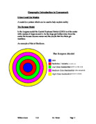
In answer to the question Do the land use patterns in Hebburn correspond with the Urban Models of Burgess and Hoyt? My study has shown that Hebburn exhibits one or more characteristics of the models, however is not an exact fit.