Finding Web Sites
When you are trying to find a certain selection of websites you know exactly what you want, you don’t mess around looking at other sites. This can be done in a manor of ways. Search engines are one way of locating sites. Depending on the search terms you may not get any responses you want, it properly won’t come up with the site you are looking for. Search engines show sites found in the order of most visited. This makes it practically impossible to find a new site. This means businesses need to get lots of visitors before there business appears on a search engine.
You can try using business directories to find business websites.
Sites such as thomweb.co.uk search for businesses using their location and type of. These are generally more effective and successful than most search engines, especially if you do not know the name of the company.
Another way of getting hold of addresses is by word of mouth. Someone may tell you a good site that they have visited recently.
If you already know the web address it would be easy to visit the site, it also could be found in the history section on your web browser this can be accessed even when being offline, you might find a web address that you want here.
Advertising can be done externally to the internet. This is things like billboards, flyers, brochures etc. This is how awareness of a website can be spread without the use of the internet.
Another way of finding sites is from links off other websites. This can be done by paying a company like
Euro Disney to display links to a few coach companies which would include a link to UTours€uro.
Search terms are vitally important when looking for sites. It is hard to find things like small businesses. Words like; AND, OR, NOT are frequently used when looking for sites, as they determine what words the search will come up with.
To successfully find a sites that you need the input to be exact, this is the search terms you use. These terms are Boolean search terms. These interpret Boolean logic, referring to the logical relationship between search terms. Boolean logic consists of 3 logical search terms. These are ‘and’ ‘or’ and ‘not’. These can be represented by symbols. A space represents ‘or’. You can also use + for ‘and’. For not you can use -. For example
Query: I need information about cats.
Boolean logic: OR
Search: cats felines
Query: I'm interested in dyslexia in adults.
Boolean logic: AND
Search: +dyslexia +adults
Query: I'm interested in radiation, but not nuclear radiation.
Boolean logic: NOT
Search: radiation -nuclear
The alternate way is being extremely specific and you know what site you are looking for. If you where wanting to find the web site for UTours€uro coach tours and couldn’t find or didn’t know the address you would type in “UTours€uro coach tours”. The speech marks indicate you want pages containing only the phrase “UTours€uro coach tours” not “UTours€uro” on its own or “coach” on its own or “tours” on its own. This does not include the Boolean effect on the spaces.
For example if you type “monkey nuts” into any search engine the results will only contain pages showing only monkey and nuts together, not monkey on one side of the page and nuts on the other. The downside is many of these pages are in other languages but this can be stopped by setting the search to English sites only.
Selecting Web Sites
Selecting websites is usually the most difficult part of finding the right web site. This is because lots of the sites display unwanted information or do not contain any useful information that the user wishes to obtain. On the search engines, the web sites are often ranked top. However as people click on them more frequently, because they are at the top, they create a vicious circle. Some are the sponsored links, theses are displayed on the side of the pages.
The description text is extremely important to attract as many visitors as possible. If a search engine has been used to find the site they want, the sites at the top of the rankings are ignored by the users if the description text is poor. However some users click on the first link that they discover. if it is not right for what they are looking for then they will use different search terms and search again.
Description meta tags is another way search engines find sites, as these are on the source of the page. These sites include key words; this means that the site will be picked up from theses as well as the page. If the search is relevant to the key words in these meta tags, the search engine will present it as a result.
First impressions are very important, as the user will not stay to investigate the site if it looks dull. It should be colourful, but not over the top and look immature. It is crucial to choose the correct font , nothing too difficult to read and it must be the correct size. Too small and it is difficult to read, too large and it will be too big to fit on the screen. The site should be correctly designed to encourage the user to stay and investigate further. The background is equally important and can also affect whether the user stays on the site or not. If it is boring it will seem useless and unprofessional. The user will be attracted further to the site, if the background is designed carefully and is not too bright and garish.
It is extremely important to consider the layout of the site. A website is with the text in the middle, links to other pages on the left and adverts on the right is the most popular and probably most successful layout. Many websites use this layout anything too different or not very good then the user is unlikely to continue browsing. The speed of loading is probably the an important factor. Users will leave the site if it takes too long to load, so the speed of loading is probably the most important factor. An example of a well laid out page, is attractive, has a good layout and has the most appropriate font.
It is very important to ensure the content of a web page is laid out correctly. If there is too little information or too much it is likely that the user will search for another site. If the page contains too much information, the user may have the impression that the site is too complicated and may take up too much time to use. If the web page contains too little information the user may believe it looks unprofessional. The user may also feel it gives the impression of the company being too small for their needs. If the first page is too complicated or contains flashy animations and scrolling marquees this may discourage the user from continuing browsing. However the home page should contain more information than click to enter’.
Navigating through a website should be easy and straight forward for the browser. It is very unlikely for the user to find what they are looking for on the home page. Users are quite happy to search a few pages but, are unlikely to want to spend hours searching all the pages to find the material they are looking for. The user would expect the website to be set out in a logical way. The user will be confused if the links are complicated and may become lost. This problem can be easily solved by having a link bar at the top of every page showing which page the user is on and links to all the other pages. This will help the user navigate the page and not get lost.
Having a text only link at the top of the page, or a site which has been designed so that it can be read easily using a textual browser will help those who are visually impaired. Some users have a reader browser which reads out the page as you hover the mouse over it. There may be problems however especially when the website has not been designed for these browsers. If possible sites should consider accessibility for visually impaired users.
The site contains a professional looking home page, which is exactly what you would expect to find if you used a search engine and typed in “coach tour companies“.
These sites are professional looking company pages however Several of the sites discovered were immature. This is the meta tag with the keywords for the “Travel Scope website:
<meta name="keywords" content="Travel scope, Holidays“, Cruises, Flight, Coaches,
Escorted Holidays, River, Vacation, Travel sphere, Cruising, Ocean," />
Whenever any of the words above are typed into any search engine, this page will be produced .
The “Travel Scope “ page contains an image of children, which encourages users to take a look beyond the first page. There are several different types of holidays. This seems to suggest that the site is able to satisfy a great number of people. The large white margins on either side, makes the page look very unprofessional. The central image changes periodically, which reassures customers that the pages are up to date, and that the site is checked and changed. There also seems to be a long list lot of links, which are located at the side on the left and a big muddle of them in the centre of the page. The layout with the links which can be confusing. The site also contains various pictures, in fact the this site would be particularly difficult to navigate.
The “Universal Coaches” site is very impressive and professional as there is an image of some of the coaches and the page fills the screen. There is also an image of content and happy holiday makers and the bar at the top of the page gives a comment from satisfied customers. There is a brief introduction to the company, and a welcome message on the home page. It is short and precise and does not contain any unnecessary information. It is easy to read and find the information the user requires quickly and efficiently. There are suitable links to other information too.
The “Evan Evans” site is excellent, because it has a professional home page with an image of one of the coaches in the centre. The company is mainly concerned with tours of London, and has a suitable background to illustrate this point. The links bar contains links only to coach tour related pages illustrating that the company provides no other sort of holidays. The large white margins on either side, makes the page look very unprofessional. This site is easy to navigate the links are clear not muddled like those on the Travel Scope page. There also seems to be large areas which are blank. Perhaps extra adverts, other links are maybe customer comments could be placed here.
Selecting websites is usually the most difficult part of finding the right web site. This is because lots of the sites display unwanted information or do not contain any useful information that the user wishes to obtain. When a website is located, which has been created with the appropriate information, ease of navigation, superb links and a well laid out format, then the browser will be able to find the information that they require and the company will be well rewarded.
Collecting Information
After exploring the internet you will find websites that you will want to save. You may also want to keep the location of the information you have found so that you are able to go back to it. A common way of doing this is to bookmark or to add to favorites. This is something your ISP should give you this can be a favourites menu, or a bookmarks menu. This allows easy access finding and returning to a site you have visited previously. Another way you can do this is by going through your history menu. This is a quite unreliable substitute and once you have a certain number of websites in there it starts removing the ones chronologically at the bottom of the list. Either of these options prevent you having to search for the site again.
A alternative way is to print the web page straight of the internet, this is extremely easy except it doesn’t always work. This is because the average web page margins are wider than a piece of A4 paper. This can be overcome by web site designers creating easy print versions also known as printer friendly versions, these as well as having smaller margins to fit A4 paper also have less colour to save ink. It is also possible to change the web page to fit to A4 page dimensions, but this can be a bit of trouble when you come to print. You can also select part of the page and print it separately. Lots of ISP‘s let people download a web pages these are usually available in word documents or PDF versions. PDF files are larger but are more detail but rely upon Adobe acrobat or Adobe reader. Both versions contain the same information, though word documents only contain pictures and text but not styling so file size is considerably smaller. It is useful to have downloaded both versions if possible because if one doesn’t work the other might. If pushed for space on your computer you would download the word file.
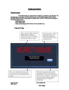
The last resort is saving the web page locally. This is done by clicking file…save as. This is probably the least successful way, as internet explorer produces a strange page source, and so the page could not be replicated exactly as it was on the internet. Firefox and the other servers do it a little better but still miss out some of the images and files.
Web Site Design Conclusions
In conclusion, much of the information discussed will be needed to be incorporated into the design of the proposed site for UTours€uro.
On the Home Page there will need to be enough information for the user to be sufficiently interested in the site to navigate and continue looking. It would be ideal if there were no margins, so that it would always fill the page. There should be a links bar down the left hand side, containing four links – Concerts page, Disneyland resort Paris page, Contact page, and a link back to the home page. Also on the home page there should be links to special offers that the company is running, and information about the company. There should not be too many links, as on the travelscope page, as this will make the site too difficult to navigate. There could also be a picture of one of the coaches, to make the site seem more professional.
On the concerts page there should be information updated regularly about concerts coming up soon. There should also be information on recent successful trips to concerts, showing the popularity of such trips. This area of the site is likely only to be viewed by adults, and should therefore have a style to suit. This means not flashy and full of cartoons. The site should maintain its professional feel throughout. This area should also contain pictures taken from concerts. Again these should be updated regularly.
The Disneyland Resort Paris page will probably have an audience of young children and teenagers, and should have a style to suit. This still should not include cartoons or scrolling marquees. It should encourage children to want to go, and on leaving the site use pester power to persuade their parents that they should go on UTours€uro coaches. It is therefore paramount that the site is easy to navigate as it needs to be suitable for a child to use.
The last page is the contacts page. This should contain all ways of contacting the company, including a link to email, address of booking office, telephone number etc. It should also be possible to book via this page. This means there should be a link to a booking form that automatically sends when completed. This site does not have to be so professional looking, but should maintain the style used throughout the site.
The whole site should be designed to adapt to text only browsers so that those with visual impairments will still be able to view the site. There should also be word and PDF versions of each page so that they can be kept and/or referred back to. The design should also include a text only version of all pages. Also taking into account those users who have software enabling them to have the computer read the page out to them when they hover the mouse over it, we must not design and make the page using tables.