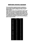
I will start by plotting a scatter graph of the height of the pupils against their weight.
The graph shows that there is positive correlation. It tells us that as the taller the pupil the heavier he or she is but there are a few exceptions. The line of best fit tells us that a person who is 1.6 meters weighs about 51 kilograms. I can also work out how strong the correlation is, 0 being the weakest correlation and 1 being the strongest correlation.
I have found out that the generally the taller a person is the heavier he or she is and this is what predicted would be the case. I am now going to take a sample of boys and girls and see if there is the same relationship between the height and weight where there is a weak positive correlation. I will take the samples by pressing the random button on the calculator.
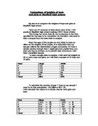
I will now draw a scatter graph of height and weight for the girls and for the boys.
The graph shows that there is a positive correlation. The graph shows that the taller the girl the more she weighs but there is a few exceptions. I will now work out the how good the correlation is. I will now draw a scatter graph for the boys and compare the strength of the correlation with that of the girls to see if it is better or worse.
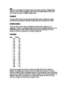
The graph also shows that as the height of the boys increases their weight also increases with a few exceptions.
I will now draw a histogram of the height of the boys and girls and compare them to see which of the two genders is taller and how the range of their heights. I predict that the boys will generally be taller than the girls and that the range of heights will be larger for boys than that of the girls. The table below is a summary of the boy’s data.
Conclusion
I finally conclude that boys are taller than girls. I have the evidence to prove it. Also that it is true that the heavier you are the taller you are. There are some strands of data to go against that. My assignment has been a success. The weight and height graph supports my original hypothesis as it shows positive correlation. I used a scatter graph to display this information because the data was very spread out and most suitable for a scatter graph.