e.g
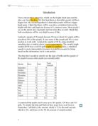
Hypothesis 1, taller people have bigger feet.
This scatter diagram has a positive correlation because the line of best fit has a positive gradient. We know that this diagram is only moderately strong because the points are not close together. They are not reasonably close to the line of best fit but this shows that taller people have bigger feet.
Hypothesis 2, taller people have bigger hand spans.
This scatter diagram has a positive correlation. This diagram has a stronger correlation because the points are more bunched up. They are using the same scale so it would be easy to compare. They are quite close to the line of best fit etc. This shows that taller people have bigger hands.
Spearman’s Rank
To compare the strength of the correlation accurately, we have to use Spearman’s Rank.
Spearman’s Rank is written as r and it is a measure of the agreement between two sets of data. It is the more precise way of saying how strong the correlation is. The scale of Spearman’s Rank is from –1 to 1.
-1 indicates perfect negative correlation. This is sometimes called disagreement. This rarely happens.
0 indicates no correlation. This is sometimes described as neither agreeing nor disagreeing.
+1indicates perfect positive correlation. This is sometimes called agreement. This rarely happens.
Each data value is given a rank depending on its size within the data set. r is based on the difference (d), between corresponding ranks. Spearman’s rank correlation coefficient,
d is the difference between corresponding ranks (it does not matter if the difference is negative as you have to square it)
n is the number of data pairs
If two or more data values are the same, they have tied ranking. E.g if two values have tied ranks at 3rd and 4th, use the mean. 3+4=7, 7/2=3.5, so use 3.5 for both.
Hypothesis 1, taller people have bigger feet
I rank the height of the pupils in order from 1-50. I did the same again for the shoe-size, ranking them from 1-50. I calculated their differences in ranks and squared the difference for all of them.
The answer was 3356.5 when I added them all up. I substituted the answer into the formula.
The answer 0.84 is very close to 1 so it has a very strong correlation. This suggests that taller people have bigger feet.
Hypothesis 2, taller people have bigger hand spans.
I rank the height of the pupils in order from 1-50. I did the same again for the hand-span, ranking them from 1-50. I calculated their differences in ranks and squared the difference for all of them.
The answer was 5694 when I added them all up. I substituted the answer into the formula.
The answer 0.73 is close to 1 so it has a strong correlation. This suggests that taller people have bigger hand spans but this correlation is not as strong as the other correlation. For hypothesis 1, the answer was 0.16 from perfect positive correlation. For hypothesis 2, the answer was 0.27 from perfect positive correlation.
So Hypothesis 1 has a stronger correlation. A taller person is more likely to have bigger feet than a large hand span.
Just for the Height
I will the treat boys and girls separately because the results may differ. I wonder if there is any significant difference between the ways the heights of boys and girls are distributed because a small difference could make the whole result different. I will use standard deviation and spearman’s rank later to prove this.
My hypothesis is that the boys will have a higher dispersion.
Mean, Mode and Median
I have also decided to calculate three averages, Mean, Mode and Median.
The Mean
The mean is the average, Total of items / Number of items. You add up all the values and divide the amount of values. This is a useful average to use as it uses all the data. The disadvantage is that it could be affected by extreme values.
I added up all the height of the boys and it came up to 4363cm. There were 25 values so it was 4363/25. The answer was 174.5cm. The average height of the boys was 174.5cm.
I added up all the height of the girls and it came up to 4062cm. There were 25 values so it was 4062/25. The answer was 162.5cm. The average height of the girls was 162.5cm.
The Mode
The mode is the most common value of data. This is easy to find but it does not utilise all the data.
The mode for boys is 170cm.
The mode for girls is 160cm.
The Median
The midpoint in a series of numbers; half the data values are above the median, and half are below. For example, in the odd series 1, 4, 9, 12 and 33, 9 is the median. In the even series 1, 4, 10, 12, 33 and 88, 11 is the median (halfway between 10 and 12). The median is not necessarily the same as the mean. For example, the median of 2, 6, 10, 22 and 40 is 10 but the average is 18. I will find the median by using a cumulative frequency curve. This is useful but it does not use all the data.
I will also look at the spread and the range. This is calculated by taking away the smallest value from the biggest. I will calculate the inter quartile range using the cumulative frequency curve. It gives the spread of the middle 50% of the data and is less affected by extreme values than the range.
Standard Deviation
Standard Deviation is the square root of the average of the squares of deviations about the mean of a set of data. Standard deviation is a statistical measure of spread or variability, a statistic that measures the dispersion of a sample. This is the formula:
X is the value n is the number of values
X is the mean
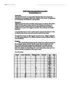
I listed all the heights of the boys. Then I took away the mean, average (175 to nearest whole number) from each height. I squared the differences and added them up.
The answer was 2022 and I substituted it into the formula.
In the end, the answer was 8.99, 9 to nearest whole number.
I listed all the heights of the girls. Then I took away the mean, average (163 to nearest whole number) from each height. I squared the differences and added them up.
The answer was 1703 and I substituted it into the formula.
In the end, the answer was 8.25, 8 to nearest whole number.
Cumulative Frequency Diagrams (On graph paper)
Box Plots (On graph paper)
In the end, my results prove that I am right with my hypothesis. There is a 0.74 difference (1 to nearest whole number). This proves my hypothesis.
I think there are significantly enough differences between the modes, medians and means in the distribution of boys’ and girls’ heights to treat them separately.
Scatter Diagrams for males and females for Hypothesis 1
The results will be different for the boys and for the girls. So the correlation for boys and girls will be different. I will have to investigate further on to prove this. I will show this by creating 2 scatter diagrams, 1 for boys and 1 for girls. I will do them separately by sorting them into males and females.
The scatter diagrams proved that boys tend to be taller and have bigger feet. However, girls have a stronger correlation by looking at the diagrams. They seem closer to the line of best fit. To prove this, I had to use Spearman’s Rank again.
Spearman’s Rank for Hypothesis 1
I will have to do the same as before. I rank the height of the boys in order from 1-25. I did the same again for the shoe-size, ranking them from 1-25. I calculated their differences in ranks and squared the difference for all of them.
The answer was 695.5 when I added them all up. I substituted the answer into the formula.
The answer 0.73 is close to 1 so it has a strong correlation. This suggests that taller boys have bigger feet.
I rank the height of the girls in order from 1-25. I did the same again for the shoe-size, ranking them from 1-25. I calculated their differences in ranks and squared the difference for all of them.
The answer was 967 when I added them all up. I substituted the answer into the formula.
The answer 0.63 is not too close to 1 so it has a moderate correlation. This suggests that taller boys are more likely than girls to have bigger feet.
Conclusion
In the end, I think that Spearman’s Rank was the best because it gave a very accurate answer. It was difficult to work out all the answers but in the end, tall people have bigger feet and hand spans. But the data were only from year 10s in Salendine Nook High School so it only really proves that tall people in year 10 attending Salendine Nook High School have bigger feet and hand spans. However it could mean that all pupils in year 10 in different schools have bigger feet and hand spans. We don’t and we won’t know though as there are many other factors such as cultural background that we need to know to prove our results right. The data is also flawed as lots of information was missing and pupils imputed their data in differently.
I think that I chose the right groups to prove my hypothesis. To improve this and make my results better, I could get other schools’ data or maybe different years in my school. People like shoe or glove makers can use this data and design more shoes in region of the average size. In the end, I think I proved that my hypothesis is correct.