Do girls have a higher IQ than boys?
The graph I am going to use to show this piece of data is the frequency polygon. In order to do this I will need to construct 2 tally charts to represent boys and girls.
To
Boys
Girls
Here is my graph
Result: from the graph I can conclude that the boys and girls have the same IQ so the group is average.
Q. What is the most popular subject in yr 7?
Here is a tally chart to show the frequency and angle of the different subjects.
The chart I am going to use is a pie chart
Here is a pie chart to show my results.
Result; from this graph it shows clearly that P.E is the most popular subject in yr7
Do girls have a higher IQ than boys?
To show this data I used random sampling to get 30 numbers when I did this I then used excel to locate yr 10 and 11 pupils from this data I used the sort function and put in ascending order when the computer finished the data was sorted into numerical order I then chose 30 yr 10 pupils from the numbers I got in random sampling this was my result so far;
Then I used those same numbers for yr 11 pupils
When I was thinking for a good graph to show the hypotheses I thought about a box plot. But before I can make the box plot I have to construct a stem and leaf chart
This one is to represent the year 10 IQ
Then I arrange the yr 10 data numerically
76,87,87,90,91,94,94, /95,96,98,99,100.100,100,100, /100,101,102,102, 102,102,103, /104,105,106,107,107,110,103,122
LQ= 94
UQ=103
Median= 100
I repeated this process for the yr11 data
78,86,90,91,91,97,98, /98,99,100,100,100,100,100,103, /103,103,103,104,104,106,107, / 108, 108,110,110,113,117,124,127
LQ=98
UQ=107
Median=103
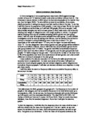
Here is my box plot;
- Which is the most popular mean of travel
For this piece of data I am using the 30 pupils chosen by random sampling
Here is a frequency diagram showing the data
Here is a bar chart to show this data