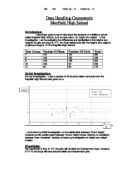
number of students / 452 x 200
After using stratified sampling, I was left with decimal integers, for instance, the stratified sample for boys in year 11 was 37.2, to 3 significant figures. But it is impossible to collect .2 pieces of data. I therefore had to round these numbers to integers. I then checked to see if my sample numbers added up to 200. This method allowed me to have accurate, proportional amounts of data to collect.
I then need to use random sampling in each stratum, to specify which pieces of data I will use. To do so, I will use the Ran# number on my calculator, which is for generating random numbers: Ran# x (sample size + 1). Using this method, I will obtain an unbiased sample of pupils, from each stratum.
The data I collect must be relevant to my study. I will use only the variables that relate to this investigation, and delete all those which are irrelevant. For instance, a student’s hair colour has no effect on his/her height or weight. Therefore, I would delete this field.
Plan:
My intention for this investigation is to prove that my hypotheses are correct or incorrect. Throughout the investigation, I intend to follow a similar, general method, which will vary slightly with each hypothesis.
- Take a random sample of children from the appropriate strata. After collecting this data, put it into tables according to the strata.
- Present and illustrate the data using a variety of charts, including cumulative frequency diagrams, frequency polygons, scatter graphs, stem and leaf diagrams and box plots.
- Analyse the data using the charts and work out the mean, median standard deviation and inter-quartile range.
- Draw conclusions from analysis and the investigation.
Common terms:
Box plot: A diagram plotting the distribution of a set of data by using the median, quartiles, and the extremes of the set of data. The box shows the middle 50% of the data; the longer the box, the greater the spread of the data. Also known as a cat and whisker diagram.
Cumulative frequency diagram: A graph where each plot is the sum of the frequency in a given class plus the frequencies in all the lower classes. This method shows how the data increases as a total.
Inter-quartile Range: This is the central portion of distribution, which is the difference between the upper quartile and the lower quartile. This range consists of approximately 50% of the data in a set, leaving one-quarter of the data on each side. It determines how much of the data is distributed around the median. If the inter-quartile range is large then the data is not strongly concentrated around the median.
Median: This is the middle number in a set of ordered data. It is the number that divides the distribution into halves; half of the numbers are above the median and half are below it when the data are arranged in an ascending or descending order. The median location of n numbers can be found by the formula (n + 1) / 2.
Mean: This shows the average of a set of values. It is obtained by dividing the sum of all the quantities by the number of these quantities. It is useful because it shows the central average.
Scatter Diagram: A graph in which each dot represents paired values for two continuous variables, with the x-axis representing one variable and the y-axis representing the other; used to display the relationship between the two variables.
Standard Deviation: This is a measure of the spread of a set of values from the mean value. The standard deviation is the square root of the variance (the sum of squared differences between the average value and all observed values). It is a measure of dispersion. This value will provide the boundaries of the variable in which the majority of the pupils will also lie.
Lower bound = Mean – Standard deviation value
Upper bound = Mean + Standard deviation value
Data Processing & Interpreting
1. Most Girls are Taller than Boys in Year 7
For my first hypothesis, I used only half of my sample. This hypothesis involved two strata, girls in year 7 and boys in year 7. To prove my hypothesis, I had to present the data I collected in a way which would enable me to compare the heights of the girls and the boys in year 7. I therefore think the best way in displaying my data in order to make a comparison is by creating a frequency polygon.
I began by working out the intervals in which I would group my data. I then manually sorted all my data from my random sample, by doing a tally chart of the frequency of boys and girls in each interval. After counting up my frequencies, had to work out the mid-point of each interval in order to plot my graph, as in frequency polygons, it’s the mid-point which represents all the points in that interval. To work out the mid-point, the following formula is used:
Mid-point = lower boundary + upper boundary
2
The table below shows the frequencies and mid-points for the heights of girls and boys in year 7.
The totals of the frequencies are the same numbers as the stratified sample totals as shown in the table on page 5.
Averages:
The frequency polygon shows frequencies of heights; it compares the heights of boys and girls in year 7. There are a few boys and girls in year 7 who, in terms of height, are between [110cm and 140cm], which are the lowest heights, and [170cm and 190cm], which are the highest heights. The majority of people in year 7 lie between the values of 140cm and 170cm. This means that height in year 7 generally follows normal distribution. The line for the girls in year 7 peaks at the same height as boys in year 7, although the line for boys peaks through two intervals. The frequency for the modal class interval for girls is lower than frequency for the modal class interval for boys; when 150cm ≤ h < 160cm, there are 21 girls and 22 boys, and when 160cm ≤ h < 170cm, there are only 12 girls but 22 boys.
The graph shows that generally, boys in year 7 are taller than girls in the same age group. This can be seen because the pink line for girls runs below the blue line for boys. This means that the frequency at each class interval is less for girls than for boys. The minimum height for both girls and boys is the same: 119cm. However, the maximum height is higher for girls: 180cm. This is unusual, seeing as all the other data shows that boys are taller than girls. The mean, median and modal heights are higher for boys. However, these results may not be 100% reliable, because there is one important limitation of this data: the sample sizes for the boys and the girls in year 7 are different. The sample that was taken for boys is bigger than the sample taken for girls. This means that the boys’ study was done in more detail because there were more samples, and therefore the frequencies are higher. If the girls had more samples, the frequencies for the girls may have been higher.
The averages for boys are higher than for girls. Using standard deviation, I am going to work out the spread of the data.
Standard Deviation:
Table displaying data of girls in year 7
Table displaying data of boys in year 7
Standard deviation is a measure of spread; it can tell you how spread out the data in a set are from its mean. The standard deviation is the square root of the variance, where µ represents the mean of the data and N represents the number of samples. Before the standard deviation is worked out, it is necessary to know the frequencies, mid-points, and products of them both, of all the sets of data. The following formula is used to work out standard deviation:
0² = ∑ (x - µ) ²
N
Standard deviation for girls= 11.62 (2dp)
Lower Bound=142.38
Upper Bound=165.62
Standard deviation for boys= 14.17 (2dp)
Lower bound = 140.83
Upper bound = 169.17
My results told me that the standard deviation for boys is higher than the standard deviation for girls. Standard deviation is the dispersion of a set of data from its mean. The higher the number of standard deviation is, the larger the spread of the data. Therefore my results tell me that the data for the boys is more spread out than the data for the girls. The lower bound is lower for boys than for girls, and the upper bound is higher. This tells me that the majority of the boys lie in a wider spread of data, whereas the girls are concentrated in a smaller spread.
Conclusion:
My graphs and results tell me that my hypothesis is incorrect. I predicted that girls would be taller than boys in year 7; however my results proved the opposite. I did not expect this to happen, as I had initially stated this hypothesis after doing some background research on the heights of girls and boys as they grow up. The unforeseen outcomes my have been a result of inaccurate sampling or data. Furthermore, the limitations of this investigation could have had an effect on it, such as the different sample sizes (mentioned previously, page 13).
2. Most Boys are Taller than Girls in Year 11
For my second hypothesis, I used the other half of my sample from the other two strata, girls in year 11 and boys in year 11. To prove my hypothesis, I had to present the data in the same way as for my first one, to compare the heights of the girls and the boys in year 11. I therefore, created a frequency polygon.
I used the same method as I did for my first hypothesis, working out the intervals, sorting the data and plotting the graph. The table below shows the frequencies and mid-points for the heights of girls and boys in year 7.
Averages:
The frequency polygon shows frequencies of heights; it compares the heights of boys and girls in year 11. The minimum values for both girls and boys are very similar; they both fall in the class interval of 130 ≤ h < 140. Both lines on the graph peak at the same class interval of 160 ≤ h < 170. This is the modal class interval. The frequency of girls at this interval is much higher than the frequency of boys. This is due to the fact that all the girls’ heights are concentrated within a small set of values- 140cm and 180cm- whereas the boys’ heights lie over a much wider spread, (this is discussed further on page 18- box plots).
There is one boy whose height falls below 150cm; this height is 132cm. this is considerably below the rest of the heights for boys, and therefore does not ft into the same pattern. Therefore this result is an anomaly, and may have an effect on the averages and spread of the data. The majority of boys’ heights are between 150cm and 200cm; this range is significantly higher and larger than the modal range for girls. Approximately half of the boys in my sample data are between 150cm and 170cm tall, and the other half are between 170cm and 210cm. This shows us that the frequency does not decrease dramatically at higher heights, and many boys are tall in year 11.
The graph shows that generally, boys in year 11 are taller than girls in the same age group. This can be seen because there are no girls who are taller than 180cm, whereas 30% of the boys are taller than 180cm. Even though the pink line for girls run higher in the centre than the blue line for boys, the blue line carries on running through the higher heights even after the pink line hits zero. This tells us that the frequency is higher in some places for girls compared to boys, but boys are taller than girls. The minimum height for both girls and boys is similar- 137cm for girls and 132cm for boys. However the maximum height is higher for boys- 203cm. This is 13.3% higher than the maximum height for girls- 176cm. The modal class interval is the same for both genders but the mean and median are higher for boys.
These results should be quite reliable because there is one important because, unlike in the first hypothesis, the sample sizes taken for both genders were very similar. This means that both studies were carried out fairly, with equal detail and attention for each.
Box Plots:
The following box plots show the comparisons of the spread of data between girls in year 11 and boys in year 11. I obtained the information for my box plots using the quartile function on the spreadsheet programme.
Box Plot showing heights of boys and girls in year 11
The box plots show that the data for the boys in year 11 is spread on a wider scale than the girls in year 11. For girls, the interquartile range is almost 2.5cm less than for boys. The lowest values for both genders are in the 130s (boys- 132cm, girls- 137cm).The highest value for girls was 176cm. However the highest value for boys was 203cm. Also, the values for the lower quartile, upper quartile and median are all higher for boys. This proves that boys are generally taller than girls in year 11.
Skewness:
Skewness is a measure of symmetry, or more accurately, the lack of symmetry. The skewness for a symmetrical box plot is 0. Negative values for skewness show that the data is skewed left and positive values show that the data is skewed right. Skewed left means that the left side is heavier than the right side. In the same way, skewed right means that the right side is heavier than the left side.
Skewness of height for boys in year 11= 0.105716
The box plot for boys is skewed very slightly to the right, but not at a very significant value, as the value is very close to zero.
Skewness of height for girls in year 11= -0.88226
The box plot for girls is skewed left; this means that the tail is heaver on the left side; therefore there is a wider range of values below the interquartile range. However, when I looked at my data, I realised that the reason the girls box plot is skewed so far to the left is because there is an outlier, which is the minimum height. An outlier is a piece of data which doesn’t fit into the general pattern of the data, and is more than 3 standard deviations from the mean. If this outlier is removed, the box plot will look like this:
Box plot showing heights of girls in year 11, with the outlier removed
The new skewness of height for girls in year 11= -0.13239.
Removing the outlier would change the values of the median, lower and upper quartile, as shown in the new box plot, and also the mean value.
Conclusion:
My studies, graphs and box plots show me that my hypothesis is correct- boys in year 11 are taller than girls in year 11. My frequency polygon shows the frequencies of boys and girls at different heights; it shows that there are many boys who are taller than girls. The box plots show the spread of the data, telling me that the heights of boys lie within a wider range than girls.
3. The taller the student, the heavier they are
For my third hypothesis, I used all the data from my sample. This hypothesis did not involve using the strata. To prove my hypothesis, I needed to collect heights and weights of as many students as possible, the more students’ data I collected, the more efficient my results would be. Therefore, I included all my sampled students. I then needed to display the data in order to find the relationship between height and weight. I think the best way to present this data is my creating a scatter diagram. Scatter graphs are used when relating two variables to each other. This would enable me to draw a line of best fit and work out the correlation and patterns in the relationship between my two variables.
I began by copying all my sampled students’ heights and weights into a new spreadsheet table. I then created the graph.
My graph gives the basic idea that my hypothesis is true. The graph shows that height and weight have a proportional relationship. There is a strong, positive correlation between height and weight. This suggests that as height increases, weight increases and proves that height and weight are related. It also proves my hypothesis true.
Using the computer and the spreadsheet programme, I calculated the mean value (158.7, 48.5). I then calculated the gradient at which the line of best fit should be drawn (0.579315) and the y intercept (-43.451). This told me that my line of best fit should be drawn to the equation of y = 0.58x + - 43.45. However, when the computer calculates these values, it takes all the data into account, not being able to realise that some of the data is anomalous. I therefore decided to draw my line of best fit by hand, according to where I think it lies and excluding the anomalies.
Body Mass Index:
The graph showed a number of anomalous results, which didn’t fit around the line of best fit. These are circled on the graph. If I had taken these values into account when drawing my line of best fit, it would have been positioned differently. The most anomalous result was (180,110). This shows a student who is 180cm tall and weighs 110kg. According to my line of best fit, a student with the height of 180cm should weigh approximately 75kg. This anomalous value could be the result of this particular student not being a healthy eater. I calculated the body mass index of this result. Body mass index is weight I kilograms divided by the square of height in metres. The BMI was 33.95. Using a BMI chart I can tell that this student is overweight/obese. I calculated the BMI for another anomalous result on the graph (178, 37). The result was 11.68. According to a BMI chart, this means that this student is underweight.
Product-Moment Correlation Coefficient:
A scatter graph is useful because it clearly shows each piece of data and it shows the relationship with its correlation. To find the degree of the relationship between height and weight, I can find out the product-moment correlation coefficient (PMCC). It ranges from +1 to -1. A positive value determines that there is a positive correlation and a negative value shows that there is a negative correlation. The nearer this value is to either +1/-1, there better the relationship is between the variables. For instance, a PMCC of 1 means that there is a perfect positive linear, directly proportional relationship. The following formula is used to work out the PMCC.
∑ (x i – x) (y i – ỹ)
√ (∑ (x i – x) ²) √ (∑(y i – ỹ) ²)
The result for the PMCC of my graph is 0.646756. This number is quite a high number, and is closer to 1 than it is to 0. Therefore, I can say that taller people do weigh more.
Conclusion:
My hypothesis is correct, the taller the student is, the heavier they are. There re some exceptions to this statement, but that depends on each individual student. Some people may be over weight or underweight, everyone’s body mass indices are different therefore there are anomalous results. However, generally, there is a proportional relationship between height and weight.
4. The height and weight of all pupils follow normal distribution
Normal distribution represents a frequency distribution of measurements. The normal distribution curve is a bell-shaped, frequency curve. When data is normally distributed, the mean, median and modal values are all the same (µ).
For my fourth hypothesis, I again used all the data from my sample. I copied and pasted all the heights and weights of the 200 students from my sample into a new spreadsheet document. I then sorted my data into class intervals, grouping height and weight in separate tables. I worked out the mid-points for both tables. Sorting heights was very easy because I was able to use my data tables from my first two hypotheses. I decided to display my data using a frequency curve. This is similar to a frequency polygon, but the points are not visible and are joined up using a smooth curve as oppose to joining the dots. I used this method because I know that this is how normal distribution curves are constructed.
The table below shows the frequencies and mid-points for the heights of all the students in my sample (a population).
Averages:
The frequency curve shows that generally, the heights of pupils in the school are normally distributed. The frequencies for the lower heights are very close to 0, and then rise up to reach a peak point. After this peak point, the frequencies decrease until they get to approximately 0 again. The graph has turned out to be a smooth bell shaped curve, very similar to an original normal distribution curve. One difference is that when the frequency rises on a normal distribution curve it increases quite gradually and therefore the gradient of the line is not too high, it is fairly gentle. However, on my frequency curve, the gradient of the line is quite steep.
I used skewness to see how symmetrical my frequency curve is. A normal distribution curve has a perfect line of symmetry. Skewness will tell me how close my graph is to a normal distribution graph. I worked out using the spreadsheet function.
Skewness for heights = 0.430621
This tells me the graph is close to symmetrical, if it was 100% symmetrical, the skewness would have been 0.
For normal distribution, the mean, median and mode must all be the same. In my graph, the median and mean values were almost the same; if the mean was rounded to three significant figures, the values would be the same. However, both of these values do not fall in the modal class interval. This could be due to the inaccuracy and limitations of the data.
The table below shows the frequencies and mid-points for the weights of all the students in my sample (a population).
Averages:
This graph has also turned out to be a smooth bell shaped curve, very similar to an original normal distribution curve. The frequency curve shows that generally, the weights of pupils in the school are normally distributed. The frequencies for the lower heights are very close to 0, and then rise up to reach a peak point. After this peak point, the frequencies decrease until they reach about 10. From this point onwards, the graph does not follow the same pattern, because the frequency decreases much slower. The gradients are steep for the side of the curve, but the gradient decreases rapidly when the weight reaches approximately 70kg.
I used skewness to will tell me how symmetrical my graph is compared to a normal distribution graph. I worked out using the spreadsheet function.
Skewness for heights = 1.65903
If the graph was 100% symmetrical, the skewness would have been 0. However, the skewness of this graph is relatively high. This data in graph is skewed right. This is because of the outliers in the data, which change the shape of the graph, and make it follow an irregular pattern. If these outliers were to be removed, the graph would follow a much more regular pattern, and the skewness would most probably decrease. Below is the frequency curve for weights, with the outliers removed.
Skewness of weights (without outliers) = 0.782448
The averages for weight were much more reliable than those for height. I know this because all three averages, mean median and mode, are all very similar. The median value is 47kg, and the mean is 48.5kg. Both of these values lie in the modal class interval of 40kg ≤ w < 50kg.
Conclusion:
From this hypothesis, I can come to the conclusion that height and weight both follow the pattern normal distribution. This means that my hypothesis is true, height and weight of all pupils follow normal distribution. My frequency curves look fairly reliable, as they are both similar to normal distribution curves. However, there were limitations to this test. My samples which I took at the beginning of the investigation were of year 7 and year 11 only. This means that the frequency curves could have been affected because there may not have been enough values or data.
Evaluation
Conclusion:
After creating hypotheses and sampling data from a database using stratified, random sampling, I analysed the data in order to prove whether my hypotheses are correct or incorrect and to draw up conclusions from my investigation. In general, I realised that the taller the student the heavier they are. I also realised that age and gender has an effect o height and weight. This is not always true, as there are often anomalous results and outliers for every test or set of data.
My first hypothesis stated that most girls are taller than boys in year 7. I had come up with this statement after researching about height and weight at this age, so I was quite sure that my hypothesis would be true. However, I my results showed me that my prediction was incorrect. My graph showed that boys are in fact taller than girls in year 7. I think this was due to limitations of my data and my sample. The main factor that would have caused this result was that m sample sizes for girls and boys were different; I had more data for boys than for girls. This meant that I was studying the data for boys in more depth because I had a larger sample. I used a frequency polygon to display my data. I would have liked to do a further and more in dept study of this hypothesis, to understand why my results turned out ho they did, perhaps by taking another sample and analysing a new set of data. I used standard deviation as a technique to analyse the spread of the data. This helped me to see how reliable my data was.
My second hypothesis stated that most boys are taller than girls in year 11. There was no difficulty with this test, the results turned out exactly as I had predicted. To analyse the spread of data, I drew up box plots and tested the skewness of the heights. The skewness helped me determine the problem of outliers in the data, which I then removed. This enabled me to draw a new box plot, where the data was more reliable.
My third hypothesis stated that the taller the student is, the heavier they are. I drew a scatter graph to portray the relationship between height and weight. I used my entire sample of 200 students. There were limitations in this hypothesis (see limitations) but luckily, I was able to identify all the anomalies and explain them using theories I had researched, such as body mass index. I worked out the product-moment correlation coefficient to find the degree of the relationship between height and weight. This drew together a final conclusion for this hypothesis, proving that it is true.
My fourth hypothesis sates that the height and weight of all pupils follows normal distribution. My aim of this hypothesis was to draw frequency curves for both height and weight of my entire sample, ad then compare them both to a normal distribution curve. This test was successful and the results were reliable because my hypothesis maws proven to be true. I looked at the mean, median and mode and compared them to each other. I then used skewness to see how symmetrical my curves are. This enabled me to find anomalies, remove them and then redraw the curve.
My investigation was generally successful, as I found my hypotheses were mostly correct. To improve my investigation, I could have used a wider range of samples, as a larger amount of data makes analysis more reliable. Using more samples means my data will be more representative of the results and therefore more accurate.
Limitations:
The main limitation of my investigation was my methods, sizes and results of my sampling. At times, when I was making comparisons between two strata, I found that the sample sizes for each were different. This made it difficult to make comparisons, as I knew the processes data and graphs were not 100% reliable, as the samples were bias. Additionally, I found that I had only sampled two out of five year groups in the whole school. Therefore, when I was making comments about the entire population, I knew my comments would be based on bias data, because I only have values from two year groups.
Anomalous results were another limiting factor for my investigation. I tried to pick out and remove any anomalies or outliers from my data. However, this was no always possible and therefore, these values could have had an effect on the patterns that the graphs and data showed. Mistypes in the database provided anomalous results. These were human errors which caused the limitations. I got around this problem by re-sampling if obtained a sample which had an error.
Obviously, not each and every student will fit the pattern, each individual will vary. Height and weight is affected by a number of different variables, not only age and gender. For instance, other variables which may affect height and weight are hours spent watching television, or means of transport to school. These variables affect height and weight indirectly because they are more to do with lifestyle. Therefore, we can not definitely get to the bottom of each anomaly.