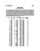
My task for this coursework is to statistically analyse the data given to me regarding Gary’s used car sales. I shall begin with looking at the data. The following data was given to me.
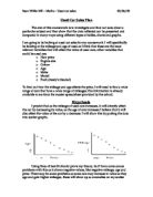
The first question, which occurred to me, was, is there any correlation between the difference between the price when new and the age. I expected there to be a positive correlation if there was one, showing that as the age went up, the drop in price from when the car is new and when it is re-sold increases. Below is a table of the Price differences and the age.

If you look at graph 1, you will see that I was wrong. There was no correlation between the price difference and the age. After seeing this, I thought that if I found what percentage of the original price the price difference is I could plot that in a scatter diagram to find the correlation between the depreciation percentage and the age. I found the depreciation with the equation
D=100-((o-p)*100)
Where D= Depreciation, o= the original price and p= price when used
Looking at graph 2, which shows the scatter diagram ...
This is a preview of the whole essay
If you look at graph 1, you will see that I was wrong. There was no correlation between the price difference and the age. After seeing this, I thought that if I found what percentage of the original price the price difference is I could plot that in a scatter diagram to find the correlation between the depreciation percentage and the age. I found the depreciation with the equation
D=100-((o-p)*100)
Where D= Depreciation, o= the original price and p= price when used
Looking at graph 2, which shows the scatter diagram of the depreciation versus the age, you can definitely see a strong positive correlation where graph#1 did not. This is because the price difference is subject to the original price. If the original price is high, the price difference may be large in comparison to the others, but showing that price difference as a percentage of the original price, it puts all the results as a part of one constant rather than part of a number applicable only to itself. A line of best fit on graph #2 can allow us to estimate the depreciation of a car. Finding the equation of the line can also be used to find an estimate.
The equation of a line takes the form ‘y=mx+c’.
m=gradient
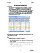
The next thing I tried was to look at the prices on their own. I split the prices into ranges of 1000, going from 0<x≤1000 to 10000<x≤11000, and made a cumulative frequency table, which is below.
I found the standard deviation of the prices using the formula:
As the working out is considerably long, I shall just give the answer, which is
£2440.20
I used the standard deviation in conjunction with the mean price, which was £4556.39, to find an estimate for the inter-quartile range. I calculated the mean plus and minus 1 standard deviation, which gave me a range close to the inter- quartile range I was going to obtain from a cumulative frequency graph.
Range = (4556.39-2440.2) to (4556.39+2440.2) = 2116.19 to 6996.59
Looking at the first table, you can see that exactly ⅔ of the prices are within this data field. Therefore, we can use the remaining 12 cars (car numbers 6, 7, 9, 10, 16, 17, 18, 26, 28, 34, 35, and 36) to look at the factor which most determines unusually high or low prices, as the remaining cars will probably contain extremes of at least one of the factors of age, mileage, engine size, or price when new. We can see if there is a large frequency of values for one factor outside the majority, then this could have had a bearing on the price, making it go outside the majority. We can call the range set by the mean and the standard deviation the majority. I shall be using the range as dictated by the method involving the standard deviation as opposed to the interquartile range. Below is a table of the majority ranges of the different factors.
Of the twelve extraordinary prices,
¨ 75% were outside the majority age,
¨ 75% were outside the majority mileage,
¨ 33% were outside the majority engine size,
¨ and 33% are outside the majority price when new.
One of the cars, car 25, was reliant on the engine size to make it an unusually priced car, having values for mileage and age close to the mean values for both. The size of the engine gave it an unusually high depreciation.
All the above data prove that the age and the mileage are the two most important deciding factors of the price and depreciation of a car, with the size of the engine entering into the equation if there is nothing out of the ordinary about the age and mileage.
In conclusion, I have discovered the following facts about the data provided:
· I found that there is no correlation between the price difference and the age, using a scatter diagram.
· I found that there is a strong positive correlation between the depreciation and the age, using another scatter diagram.
· I found a way to predict a percentage loss using a line of best fit and the lines equation.
· I found that a car decreases in value more in its first three years than at any other time using a scatter diagram.
· I found the main contributing factors and one backup factor to the price using the standard deviation, mean, inter-quartile range and majority range for the prices.
By Jamie Barnes