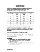
Year 9:
Year 10:
Year 11:
This is the number of samples of people I will take from the generator:
I am now going to put my samples into scatter graphs. I am going to be looking for a link between heights and weights. I will work out the correlation coefficient. The correlation coefficient will tell me how strong the link is. I will look for any outliers. These are results that do not fit the pattern. I must then decide if these outliers are mistakes, of just very big or small students.
I have drawn a line of best fit. Here we see the more the weight the taller they are. The correlation co-efficient for this graph is 0.36254. The coefficient shows that the correlation is positive and shows a good correlation.
Here I have also drawn on a line of best fit. The line shows that the heavier they are the taller they are. The correlation co-efficient for this graph is 0.827073. Here there is strong positive correlation between the heights and weights of boys. The correlation is high
I have put in the line of best fit and the line of best fit shows positive correlation. The more they weigh the taller they are. The correlation co- efficient for this graph is 0.183311.There is a lot of results around my line of best fit. The correlation is quite low for these results and a scattered correlation.
This chart shows a positive correlation. The correlation co- efficient for this graph is 0.407866. This graph contains an odd result. The results look to be scattered. The correlation is good but shows a scattered correlation
This chart shows a positive correlation. The correlation co-efficient for this graph is 0.168134. These results show the smaller the student the more heavily. The results are scattered. Not as I hypothesised even though the line of best fit shows the taller the girl the more they weigh. There are some odd results.
This chart shows a positive correlation. The correlation co-efficient for this graph is 0.029926. These results are evenly spread showing that the correlation is poor and there are some boys who have grown quicker than others. This shows no link to my hypothesis as all the results are all scattered as shown by the line of best fit.
This chart shows a positive correlation. The correlation co-efficient for this graph is 0.00899. The coefficient is very low. The results show taller the taller the student the more the weight. This was as I hypothesised the taller the student the more they will weigh.
This chart shows a positive correlation. The correlation co-efficient for this graph is 0.449898. This graph shows as the boys gets taller they also get heavier. The line of best fit shows exactly as I hypothesised. The taller the student the more they weigh.
This chart shows a positive correlation. The correlation co-efficient for this graph is 0.369314. As the height is increasing the weight also increases gradually. This was not as I hypothesised there are a number of students who weigh around 60kg and are the height is around 1.15. I hypothesised that more the students the weigh the taller they are.
This chart shows positive correlation. The correlation co-efficient for this graph is 0.379445. As the height increases, they start to weigh more. The correlation is good even though the there are a couple of boys outstanding in the line graph, who weigh less and are smaller than others. The chart shows that I hypothesised rightly because the taller the student the more they will weigh although there are a couple of odd results.
KS3 and KS4
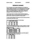
I am going to group the Year 7, 8 and 9 pupils and group the next year 10 and 11’s which would then show average weights and heights of KS3 and KS4, boys and girls. In doing this, I will be much be a lot easier to compare the differences. I gathered all the boys and girls heights and weights from KS3 and used Excel to work out the average. I did the same to find out the averages the KS4. Here are the charts I created after working the averages out, rounded to 2 decimal points.
These averages show that the taller the boy or girl the heavier they are, as I hypothesised. I also hypothesised that the older the student the taller and heavier they are.
All four averages show just as I expected, the older the students the
I will draw cumulative frequency graphs to allow me to see the lower quartile, the upper quartile and the median; I can also see the interquartile range. To analyse these further, I will produce box and whisker diagrams, which I can use to analyse my hypothesis.
If I produce box plots from each of these I will be able to make comparisons about the spread of data about the median. I will be able to make a comparison between each gender and KS and see if there is a relationship between each of these. Also I will be able to compare each of the range, the inter-quartile range and the median of each group.
Cumulative Frequency Graphs and Box Plots:
KS3 Boys Heights
KS3 Girls Heights
KS4 Boys Heights
KS4 Girls Heights
KS3 Boys Weights
KS3 Girls Weights
KS4 Boys Weights
KS4 Girls Weights
Box Plot of Weights (Grouped Data)
Box Plots of Heights (Grouped Data)
From this diagram it is clear that the KS4 Boys are the heaviest in general and that the Boy’s are heavier overall. Judging by the median of each group, the lightest of all groups are the KS3 Girl’s. Furthermore the lower bound value for the KS3 Girl’s is considerably lower than the minimum KS4 Girl’s weight. Again I think the rate of puberty has an effect on this.
Moreover it is clear that the median of each group varies and in general boys are heavier then girls. It is clear that there is a relationship between age and weight however it appears there is only a weak relationship.
Again using these graphs to make a comparison I can interpret that the range of the KS4 Girl’s is much closer together than that of the other groups. I think is because they have all gone through puberty now and have fully grown. Furthermore this is emphasized as there is wide range in the KS3 boy’s and this could be because they are currently going through puberty.
Box Plots of Heights (Grouped Data)
Using the box and whisker diagrams above, I can now analyse and compare the results. In accordance to the medians, boys are generally taller than girls and Key Stage 4 pupils are taller than Key Stage 3 pupils. There is a big difference in the interquartile range between each group as the KS4 Boys have a very big range. As you can see, the tallest student in most groups fall into the same data set however, Key Stage 3 tallest boy falls into the category of 1.95 to 2.1 and therefore the group appears to be taller.
From these box and whisker plots you can see that there is not a wide variation in heights and the range of each group is very similar except for the KS4 boys’ heights which are outstanding. Most whiskers start or stop at the same place, this indicates that as I have grouped the data, there is at least one person in this category.
You can see that the range of heights in KS3 Boy’s is almost identical to that of the KS4 Girls. However the inter quartile range and the median value is slightly different. Due to the inter quartile range it shows that KS4 Girl’s are generally taller than KS3 Boys.
However, making this comparison seems inappropriate; it is obvious that the KS4 Girl’s will be taller as they are – in youth years, considerably older.
As a result puberty would have a strong effect Also this graph shows that again KS4 Boy’s are the largest and have a higher minimum range than the other groups and the highest median height.
Box Plots of Heights (Raw Data)
Box Plots of Weights (Raw Data)
I now want to compare the dispersion of the data and to do this I will have to create histograms on the data.
Histograms for heights KS3 Boys
From this histogram you can infer that the data is slightly skewed to the right of the mean – 1.614. In my opinion I feel this is because at this age the boys are constantly growing and are therefore expected to have several people above the average depend on what age they reach puberty.
Histograms for heights KS3 Girls
Again using this histogram to analyze the data I can infer that the data is in general is fairly equal however a minute amount of people are in a lower group, however these could be just under the group barrier however I cannot tell. Nonetheless I feel this data is fairly equal however ever so slightly the majority of boys are in the larger group.
Histogram for heights KS4 Boys
Once more, from analyzing this data I can infer that this group of data is slightly skewed to the right, indicating that the KS4 boys in general are taller and also quite varied. Again this could be because of puberty.
Histogram for heights KS4 Girls
Histogram for weights KS3 Boys
This grouped data is widely varied and doesn’t follow a strong correlation, the groups with the most people in are varied and don’t show a relationship. Between the weight of 30 and 70 they appear to have a good correlation except for the others which are low consistently.
Histogram for weights KS3 Girls Weights
Again the histogram shows that the weights are equally linked in two regions between 30 and 70. When analyzing this data I can infer the data is slightly skewed to the right, indicating that the best part of this sample is heavier than the calculated to the mean of the data.
Histogram for weights KS4 Boys
As you can see in this data there are groups in the table that don’t contain any students, however there are groups either side with data in. This indicates the data in this group is widely varied. Furthermore using the calculated mean of 63.75, the data is largely skewed and doesn’t show a relation; therefore it is almost impossible to predict a weight for that age category.
Histogram for weights KS4 Girls
This data is fairly equal and shows a strong relationship, it is collated together and shows a strong relationship in the weight of KS4 girls’ weights. Also compared to the mean of 54.73 it is clear that the data is equally balanced and shows a correlation. You would be able to make a general prediction of this groups’ weights by their age.
Using these Histograms I am able to compare each group using their frequency density. Within the program Autograph, where the data is, I selected to create a histogram. I did this by selected each data group and selecting the appropriate button. I then selected to draw these histogram’s calculating the frequency density of each group – autograph calculated this. To calculate the frequency density is:
As you can see, in these graphs the data is widely ranged on the Y axis. The numbers are varied because of the frequency density for each group is so different; it has been scaled to an appropriate number for each group. Each graph shows varied results, but nevertheless they all have a similar correlation.
Furthermore I am able to make a comparison through analysing the distribution of the data in the above graphs. From glancing at them you are able to distinguish each class width and the whole range of data. As you can see, in the KS3 Boy’s I have added a midpoint and from this I am able to interpret that the data is slightly skewed to the right. In my opinion I believe this is because KS3 boys vary massively in their size and weight due their age and their bodies beginning to change. Each male may hit puberty at a different age and it can affect them differently therefore I believe that as my data is slightly skewed to the right that the majority of KS3 boys have started puberty.
In addition comparing this graph to that of KS4, it again shows the data is slightly skewed to the right. This therefore indicates that for boys overall there is a weak positive correlation, indicating that there is a strong relationship between height and weight.
Conclusion
Now I have a basic idea of the relationship between height and weight of adolescents attending secondary school.
From these results you can infer that the relationship between KS3 Boy’s has a positive correlation as it is 0.5, therefore this proves that the relationship in KS3 Boy’s is fairly strong.
Also when looking at the results I have analyzed the KS3 Girl’s results and this shows that the relationship in their height and weight is a positive correlation however very weak.
The KS4 Boy’s relationship shows a fairly strong positive relationship, with it being 0.6. This proves that for this gender and age there is a positive, strong relationship between height and weight.
As you can see the KS4 Girl’s shows a weak negative relationship, indicating that there is little correlation for the students in this category.
Overall in this coursework I have established that there is relationship between people’s heights and their weights. This relationship however is much stronger in boys overall in both age groups. This is emphasised as KS4 Girl’s show a negative relationship between the two factors. The correlation of KS4 girl’s is negative therefore this shows that as height increases weight decreases.
My initial prediction was that as height increases weight also increases; I saw this in three of my four data sets; the only one this did not follow for was the KS4 girls. I also predicted that the relationship would be stronger in boys than in girls. My results show me that this was true in both cases. From these results I can make statements that:
“Boys heights and weights are very closely related”
This is proven in the scatter graphs I inserted above when I inserted the line of best fit as it follows a similar proportional ratio – as height increased weight also does.
“Girls heights and weight show very little correlation”
Again referring to the scatter graphs inserted when I collated the two factors together, the KS3 Girls shows a very weak positive correlation and the KS4 Girls show a negative correlation.
“The age can also affect these results especially in girls”
As shown above again in the scatter graph the ks3 Girls show a very weak positive correlation, however the KS4 Girls show a negative relationship. Furthermore comparing these results to the boys this emphasises this point.
Evaluation
In this piece of coursework, I have learnt that predictions are not always right and that to make sure that I follow up every thing that I predict to make sure it is correct. I feel if I was to do the coursework again, I will definitely improve my hypothesis and try to make every thing accurate as possible.
Overall, I enjoyed doing this coursework and learnt a lot of valuable skills in doing so and I have established that there is relationship between people’s heights and their weights. My knowledge of Microsoft Excel has increased, and I have learnt how to use the Scatter Graph software.
I completed the scatter graphs, histograms and charts in quick succession and then followed them up with a explanation of the charts and what they showed.
To conclude, I feel I have completed this coursework to the best of my ability, without the help of anyone apart from my maths teacher.