(Where and are the means of the x and y values respectively)
The value of ‘r’ determines correlation. It is always between –1 and 1.
The scatter graph should show that there is some correlation between the height and weight of the students. Furthermore, the software Autograph worked out the correlation coefficient for me and also the equation of the line of best fit. The graphs below will give you an idea of what the types of correlation look like.
-1 = Perfect Negative Correlation1 1 = Perfect Positive Correlation -0.8 = Good Negative Correlation 0.8 = Good Positive Correlation
-0.5 = Some Negative Correlation 0.5 = Some Positive Correlation
0 = No Correlation
The data box above would give me an idea of the correlation, whether it being negative or positive or even no correlation at all. With my graph or calculations I may have some difficulty in working them out. This is because as mentioned previously, the data I am gathering data from and analysing is secondary data. Moreover, my graphs and calculations may not be accurate because of this and could cause my hypothesis in being false. There may also be outliers. An outlier is a value that "lies outside" (is much smaller or larger than) most of the other values in a set of data. It is 1.5 times bigger or lower the Interquartile range. Therefore, I am going to carry out a test to try and identify these outliers and decide what measures to carry out (replace them or leave them as they are). I am also going to show the graphs before and after the calculations for the anomalies to show the graphs with the outliers and also without the outliers. This is because it shows how the outcome of my results would differ between the two graphs (before and after).
There are two methods for calculating the outliers. One is using the Standard Deviation and the other is calculating the Interquartile Range. I therefore will be using the Interquartile Range method. This is because I find this the easier method of the two and also prefer this method. Furthermore, there was an outlier in the sample of data. This student was student 531 and had a weight of 110kg and was 1.7 meters tall. I handled this by choosing another student/number at random and replacing it with the outlier. The number that was generated was 456 where the weight was 42kg and a height of 1.62m.
Having worked it out, the correlation between the height and weight of the students is 0.375909. The graph also gives me an indication of this correlation.
This shows that there is a relationship between the two and that there is a line of enquiry to investigate further. The relationship is that the height of a student reflects its weight and therefore this supports my hypothesis as it is proving to be correct. However, this does not support my hypothesis fully as even though it is supporting my hypothesis, some students may not fit the database i.e. weigh more than usual of are taller than usual.
MAIN STUDY
Research on Height and Weight
From studying research, I found that adolescence is a time of great change in males, both physically, and mentally. Changes in a male’s body are greater at this time than any other time in a male’s life. Puberty usually occurs most often between the ages of 10 and 15, or occasionally earlier or a little later. I also found out that for a female, adolescence is also the time when a girl will see the greatest amount of growth in height and weight. Also, I found out that puberty for a girl occurs prior than for a boy, usually from 11 to 14 years of age. When going through puberty putting on weight and growing taller occurs at different times.
For my first hypothesis I think that the Mayfield High School spreadsheet will support my data because it has the relevant data the will prove my hypothesis. Also, the scatter graph shown above shows that there is some correlation between the height and weight therefore I can investigate further full knowing that I could achieve a positive result. Overall, my pilot study did not prove to be fully correct due to the affects of puberty and/or other variables.
I will now refine my hypothesis to including how I think age and gender will affect results. I am doing this because my pilot study shows that there is a line of enquiry to investigate further and therefore I will investigate further to gather more information and try and prove my hypothesis fully correct.
For my next hypothesis I have decided to investigate between the relationship between the height and weight of the pupils and the difference between these in different year groups. Therefore from my research:
- I think that females in year 7 will be likely to be taller and weigh more than the males. A number of the girls may start to go through puberty at this time. Therefore, I think that the spread of data for the girls will be greater than the spread for the boys.
- I also believe that almost every girl in year 8 will be taller and weigh more than the boys in year 7 because puberty occurs earlier for a girl than for a boy. Also, like in year 7 I think that the spread of data will be greater for girls, compared to boys, but because the boys will have started to go through puberty, the spread of the boys’ data will increase.
- I believe that in year 9 the height and weight will start be about the same. The boys may be taller and heavier due to puberty occurring. I also think that the year 9 boys and girls spread will be greater. Furthermore, the spread of the data for both of the genders may start to equal out, but I think that the boys spread may start to increase as the majority of the boys will have started to experience puberty whereas the females spread would also increase as puberty is still occurring but coming to its final stages.
- For year 10, I believe that the boys will tend to be slightly taller and heavier than the girls. There will be a smaller spread as most of the students would have been through puberty. The spread of the data will start to even out, however, due to research I have found that at the end of puberty boys’ body growth tends to increase a lot more than girls.
- Finally, I also believe that year 11 boy’s will weigh and be approximately the same height as the year 11 girl’s because the boys. The spread of the boys will be higher than the girls because even though girls experienced puberty earlier than girls, the effect that puberty has on boys is larger. Therefore, I believe that boys will weigh more and be taller than the females.
However, the height and weight are not directly proportional to each other. This is because you cannot control how much you grow but you can control how much you weight. This could be through eating disorders, genetic makeup and activity level. The table below is a two way table due to the fact there are two variables shown at the same time and helps view results and data conclusively.
I will use stratified sampling to investigate my First Hypothesis. This is because it took into thought all our needs of the sampling of the data; and this methods was easily accessible and can be easily manipulated and carried and only asked for a simple understanding of the subject.
The variables for the sample are gender and age so I had to do separate samples for boys and girls and vary the amount of samples taken from each year to keep the sample unbiased and insufficient.
I will be analysing the data by taking a sample as it will be time consuming and difficult to analyse the whole population, 1183. I will be sampling each of the 10 groups (males and females in each year) in the school separately to make comparisons across year groups and gender. To do this I will need a larger sample. Therefore, 60 students (30 boys and 30 girls) from each group should be enough to perform statistical calculations on, which would give me a total population of 300 students (150 boys and 150 girls). Like my pilot study this is a stratified sample. I have chosen this method as it takes a proportional number from each group in the population so that each group is fairly represented. Furthermore, I have chosen to sample 300 students as I think that this will be enough to represent the whole population fairly.
This is ideal for carrying out the statistical calculations and graphs necessary on more than one section of the whole population. As my data has already been sorted into alphabetical order (on the Mayfield High School spreadsheet), as shown previously in the first couple of pages, I simply need to return to this and collect 60, as this will give my sample a total population of 300, random numbers from each group in between the highest male position and the lowest female position. E.g. in Year 7 the highest male position shown in my table above is 279 and the lowest is 133. Therefore, I need 30 numbers in between these two integers.
I also need to consider the fact that the data I am going to be analysing for this hypothesis is secondary data. Therefore, this could affect the outcome of the results and could result in my hypothesis being false. I may also notice anomalies in my results. For example, someone is 3m tall but weighs 5kg.
The reason as to why I did not discuss anomalies and outliers in my pilot study was because of the fact that I wanted to see whether or not I would be necessary or not to discuss them in the main study.
An outlier is any value which is 1.5 (or more) times the inter-quartile range below the lower quartile or 1.5 times (or more) times the inter-quartile range above the upper-quartile.
There are two methods for calculating the outliers. One is using the Standard Deviation method and the other is calculating the Inter-quartile Range. I therefore will be using the Inter-quartile Range method. I will be removing the outliers because they may cause my hypothesis to be false and eliminating them could make my hypothesis true. When using the Inter-quartile Range method I will be aware of any outliers because it will be more than 1.5 times the Inter-quartile range above the Upper Quartile (UQ) and/or below the Lower Quartile (LQ).
I am also going to carry out a test to try and identify anomalies and decide what measures to carry out (replace them or leave them as they are because it could make a difference in the outcome of results). An anomaly is a value that is an impossible value. Meaning that it is a value that, if compared to the rest of the values/sample, is outstanding.
I am also going to show the graphs before and after the calculations for the anomalies to show the graphs with the anomalies and also without the anomalies. This is because it shows how the outcome of my results would differ between the two graphs (before and after).
Investigation
For the sampling I am going to use the website randomintegers.org (mentioned before) to randomly select the numbers of the pupils. I will do this by inserting how many integers I need (in this case 30 boys and 30 girls) and insert between which values the numbers have to be. I am then going to carry out the following for each group:
- Scatter graphs to show whether or not the two sets of data are related with each other. This should show me that the two sets of data are related and that my hypothesis is correct.
- Correlation coefficient to measure the correlation between the two sets of data and also the strength of linear association between two variables (height and weight). Supporting it will be the scatter graph and the correlation should show that there is quite a strong relationship between the height and weight.
- Line of best fit, on scatter graphs. To show the model of association between the two variables. So that the plotted points on a scatter diagram are evenly scattered on either side of the line.
- Standard deviation for heights (or weights) for each group.
- Standard deviation is the measuring of variations around the mean value. Some values will be below the mean, some above and sometimes will be equal to the mean. So, some of the differences between the individual measurements will be positive, some negative, some zero.
- Minimum, lower quartile, median, upper quartile, inter-quartile range and maximum for weights (or heights).
- Inter-quartile Range – This is also a measure of spread but looks at the spread of the middle 50% of the data around the median. It is found by subtracting the lower quartile from the upper quartile (calculating UQ-LQ).
- Box and Whisker Plots: As well as an average, such as the mean, I need a measure of spread of the data about the average if I am going to explain it in more detail. From this I can find the range and inter-quartile range and produce these diagrams. A box and whisker diagram can be drawn to represent important features of the data e.g. to show the maximum and minimum values, the median and upper and lower quartiles. I expect the figures to increase as the year and gender progresses therefore this will show that my hypothesis is correct. Below is a simple example of what a box and whisker plot should look like:
1.0 1.1 1.2 1.3 1.4 1.5 1.6 1.7 1.8 1.9 2.0
Furthermore, these calculations will help to support my hypothesis as box and whisker diagrams can show the overall shape of the distribution, median, quartiles and help you compare two different sets of data if you have drawn two of them. This involves the height and weight because if the mean, standard deviation and the quartiles increase as the year group progresses for the height and weight, this would mean that the height and weight will increase and therefore support my hypothesis. However, when randomising the data, I may need to add some numbers as the number of samples I took earlier in some year groups were not totalled to 30. The random numbers I generated are given below:
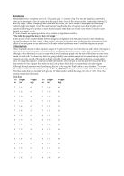
Now using Autograph to produce Box and Whisker Plots, I am going show the data from statistics of the student in the table above. Box-and-whisker plots are helpful in interpreting the distribution and spread of certain data. Also, they can be useful to display differences between without making any assumptions on its distribution or spread.
Boys Girls
Number in sample, n: 30 30
Mean, x: 1.552 1.51233
Standard Deviation, x: 0.100412 0.109169
Range, x: 0.45 0.48
Lower Quartile: 1.49 1.475
Median: 1.54 1.515
Upper Quartile: 1.65 1.565
From the box and whisker plots I can see that the there is only a small margin between the mean for data of the year 7 boys and girls heights. The data is much more distributed for the girls with a larger Interquartile range than the boy’s data. This is related to my hypothesis for the year 7 boys and girls height. I had alleged in my hypothesis that the height would be generally the same and as shown above it is.
Boys Girls
Number in sample, n: 30 30
Mean, x: 45.55 43.8
Standard Deviation, x: 7.89763 5.00932
Range, x: 34 18
Lower Quartile: 40 45
Median: 45 43.5
Upper Quartile: 51.625 48.25
From the box and whisker plot above I can say that the girls mean weight is less than the boys mean weight. This is not as expected; I had assumed in my hypothesis about the females weight approximately being the same as the boys. The male’s data is more widely distributed and the Interquartile range is larger than the Interquartile range for the females.
Boys Girls
Number in sample, n: 30 30
Mean, x: 1.608 1.59733
Standard Deviation, x: 0.117314 0.113253
Range, x: 0.65 0.48
Lower Quartile: 1.52 1.5425
Median: 1.61 1.61
Upper Quartile: 1.665 1.6825
In general, I had suggested in my hypothesis that was the mean height of the girls would be greater than the mean height for the boys; this is because puberty must be taking place in many girls as a result the growth rate being much quicker than usual. The box and whisker plot shows that the suggestion that I had made is correct.
Boys Girls
Number in sample, n: 30 30
Mean, x: 48.0333 49.2667
Standard Deviation, x: 10.747 7.43834
Range, x: 45 38
Lower Quartile: 38.75 45.75
Median: 45.5 50.5
Upper Quartile: 53.75 53.5
Overall, what I had expected in my hypothesis was correct as the mean weight of the girls is more than the mean weight for the boys, this is because the most of the girls will be going through puberty and therefore their growth rate is much faster than the boys. The boy’s data is much more spread out and the IQR is bigger than the girls.
Year 7 and Year 8
As predicted, the box and whisker plots above show that the height increases as age and gender changes. The skewness of the diagrams is identical to the diagrams for the weights. This again is supporting my hypothesis as the height and weight are clearly affected by age and gender.
Boys Girls
Number in sample, n: 30 30
Mean, x: 1.57633 1.63633
Standard Deviation, x: 0.0777382 0.112442
Range, x: 0.35 0.51
Lower Quartile: 1.51 1.5575
Median: 1.55 1.635
Upper Quartile: 1.6225 1.725
From the diagrams above, I can say that the boys mean height is much greater than the mean height of the girls. This also backs my hypothesis as I stated that the boys will be taller than the girls due to the increase in the rate of growth due because of puberty.
Boys Girls
Number in sample, n: 30 30
Mean, x: 50.4667 48.5
Standard Deviation, x: 9.66345 6.98928
Range, x: 35 29
Lower Quartile: 41.75 41.75
Median: 50 48
Upper Quartile: 57 54
The boys mean weight is greater than the girls mean weight and is linked to my hypothesis as I assumed that the boys will be heavier because of puberty. Also, puberty increases the growth rate of a person and this should also support my hypothesis as the taller you are the more you weigh. So, if puberty affects the height, then it should also affect the weight.
Boys Girls
Number in sample, n: 30 30
Mean, x: 1.69433 1.64367
Standard Deviation, x: 0.0813914 0.09271
Range, x: 0.27 0.41
Lower Quartile: 1.63 1.6
Median: 1.705 1.66
Upper Quartile: 1.77 1.705
From the Box and Whisker diagram above, I can say that what I had predicted in my hypothesis was accurate as the mean height of the boys is more than the mean height for the girls. The boy’s data is much more distributed and the Interquartile range is bigger than the girls. All of this is due to some of the boys in the year group going through puberty and therefore their growth rate is, at this time, much faster than the girls.
Years 9 and 10
Again the median, LQ, UQ and maximum and minimum values are increasing indicating that the students are taller and therefore hinting that my hypothesis in proving to be correct. The skewness of the box and whisker plots is identical to the previous one because as Year 8’s are taller than Year 7’s, Year 10’s are taller than Year 9’s. The pupils in Year 11 should be taller than the student in Year 10.
Boys Girls
Number in sample, n: 30 30
Mean, x: 59.5 53.5667
Standard Deviation, x: 9.83446 8.23684
Range, x: 40 37
Lower Quartile: 53.5 48
Median: 58 52.5
Upper Quartile: 68.5 60
To sum up, what I had stated in my hypothesis was correct because the mean weight of the boys is greater than the mean weight of the girls. The reason for this is that a quantity of the boys in the year group will be going through puberty and therefore their growth rate will be much faster than the girl’s growth rate. Furthermore, the boy’s data is much more spread out and distributed and the IQR is bigger than the girls.
Boys Girls
Number in sample, n: 30 30
Mean, x: 59.9 49.7667
Standard Deviation, x: 11.8585 6.20582
Range, x: 44 26
Lower Quartile: 50 45
Median: 58 49
Upper Quartile: 67.5 54
To conclude, the boys mean weight is larger than the mean of the girls mean weight as predicted in my hypothesis. Again, due to the effects of puberty on the rate of growth. The Interquartile range is greater for the boys than for the girls.
Boys Girls
Number in sample, n: 30 30
Mean, x: 1.71467 1.62367
Standard Deviation, x: 0.154569 0.126134
Range, x: 0.74 0.72
Lower Quartile: 1.62 1.5975
Median: 1.7 1.63
Upper Quartile: 1.8225 1.6925
Overall, I found out that the mean height of the boys is more than the mean height for the girls. This could still be due to puberty as some students may still be going through it. Puberty has a great effect of the rate of growth as it speeds it up.
Year 10 and 11
Again, the diagram above is showing that the height is affected by gender. However, the median is lower than the median for the height in Year 10. This could be because the data is secondary data or that there may have been a miscalculation. However, this may not be the case as some students in the year may not have been affected as much due to the signs of puberty i.e. growth in height or increase in weight. The data is also spread more as the minimum value in the Year 11 females is very low compared to the male’s minimum value.
In my honest opinion I feel that I successfully completed and analyzed my hypothesis and I have gained a sufficient evidence to back up my theories. I would like to remind you that my main objective for this hypothesis was to find out whether I was correct or incorrect in my thinking that Boys at Mayfield School are taller and weigh more on average than the Girls at the same school. Within this aim I was also aiming to find whether there is a certain trend or relationship between the height and weight of the students that I have chosen to analyse and as I explained earlier due to the large number of students I was not possible to analyse all students so I gained a sufficient sample which I made as unbiased as possible. MY HYPOTHESIS WAS CORRECT
Conclusion
Overall, I found that my hypothesis was correct. This is because the standard deviation, mean and median increased as the year group and gender changed. I also found that in each year group the males were heavier and taller than the females. Furthermore, as I predicted that they will also be affected by gender, this has proved to be correct because again, as the table shows that in the majority of the year groups, the males weigh more than the females. Moreover, the standard deviation is also more than the females and so is the correlation coefficient showing that the male’s data is much more spread than the females. The correlation is also positive correlation indicating that there is a relationship between the height and the weight.
The box and whisker plots showed that the median weight/height increased as the Year groups increased. This shows that the overall sample’s weight/height also increased and therefore again is proving my hypothesis correct.
I think that these findings are such because the older you are you tend to have a bigger body structure and therefore weigh more. There were also exceptions in my findings. This was expected because as the data was secondary data there could have been errors and this error may have led to miscalculations in representing the data.
There was a certain pattern in my findings which revolved around the hypothesis. This was that as the gender and year group differ, the median, upper and lower quartiles increase, again supporting my hypothesis. I can now deduce the fact that:
- There is a positive correlation between height and weight. In general tall people will weigh more than smaller people.
- In general boys tend to weigh more and be taller then girls.
- By doing stratified sampling, there were a fewer exceptional values caused by different year groups and therefore ages. I was bound to find irregularities within my data
- The spearman rank correlation coefficient shows that the correlation between height and weight is strong.
- In general the taller a person is, the more they will weigh.
- There is a positive correlation between height and weight. In general tall people will weigh more than smaller people.
- There therefore is a positive correlation between height and weight across the school as a whole. This correlation seems to be stronger when separate genders are considered
- If I had taken larger samples my hypothesis may become more accurate.
Hypothesis 2
I am going to investigate how the number of hours of television watched affects the weight of a person. I think that the greater the number of hours spent watching television per week, the greater the weight of the person. This is because instead of exercising and being active, people tend to watch television. Also, when watching television, people also eat snacks and other junk foods, which mean that they are gaining weight and not burning it of as they are not exercising.
With this particular hypothesis, I am going to be using simple random sampling. I am going to be sampling 150 students as this is bigger than the sample I used in my pilot study therefore resulting in a larger representation of the data and population. As this hypothesis in not affected by gender, I am going to sample 30 random students from each year. To do so, I am going to use the website that I used to generate random numbers for my first hypothesis and my pilot study, randomintegers.org.
I am then going to create scatter graphs to show the correlation between the two variables. I will also add a line of best fit to show the trend of the data and the two variables. I expect the two variables to have a positive correlation between them. From research, I have learnt that even though small amounts of television may be good for a person, too much television can be detrimental for a person.
“Children who consistently spend more than 4 hours per day watching TV are more likely to be overweight. While watching TV, kids are inactive and tend to snack. They're also bombarded with ads that encourage them to eat unhealthy foods such as potato chips and empty-calorie soft drinks that often become preferred snack foods.”
QUOTED FROM
The random numbers that I have generated for each gender in each year group are given below:
I am now going to see whether or not there is any relationship between the two variables by creating scatter graphs for each year. I expect the scatter graphs to show that my hypothesis is correct by showing that as the amount of television increases, so does the weight.
From the scatter graph above, I can see that many students weight is not affected by the amount of television they watch. Furthermore, only a few students weigh more but do not watch a lot of television.
This scatter graph shows me that the students in year 8 seem to watch quite a lot of television but do no weight a lot. However, even though this is the case, a considerable amount of students do weight more and watch more television.
I think that this is because in Year 8 there is not a lot of pressure on students and therefore they can afford to watch more television than do homework.
The points on this scatter graph for year 9 are much more spread out therefore this back up my hypothesis as the graph shows that people that are watching more television are weighing a lot more.
I feel that this is because Year 9 is the time when students tend not to care about school work, even though it is important at this time, and watch television.
The data for the students in Year 10 is much more spread out than the rest of the year groups. This may be to ease stress amongst students or it may be a habit. Also, this is backing up my hypothesis because as shown in my scatter that watching more television affects weight.
The data for the students in Year 11in less distributed than other year groups, as shown in the scatter graph above. This may be because it is a time of pressure for students and as they do not have time to go out they may spend the time watching television.
Conclusion
I feel that I have successfully completed and investigated my hypothesis to an extent in which I can be sure of my accuracy of my conclusion and I gained many sufficient forms of evidence. As stated above my hypothesis was to find whether Students who spent a large sum of time per week watching TV weight a lot, and I had come to find that my theory was incorrect to a certain level. I had used many statistical representations to prove my theory.
I was also aiming to find whether there was a regular trend between the two variable and aimed to make my hypothesis as unbiased as possible.
If I had taken large sample my hypothesis may become more accurate and able to form a successful conclusion. Overall I have found that my Hypothesis was incorrect and the statistical evidence that I had gained did not back up my theory. Another reason behind my misfortune is the range of data from 7-11 is too wide and I should have narrowed the frame down but now helps me in the future.
Evaluation
My results are not very reliable in making findings. This is because I do not know enough about Mayfield High School to make assertions about the teenagers in general. However, it would be better to track a year group thoroughly instead of using different pupils from each year group.
Furthermore, I cannot use my findings for the whole school as my samples of the pupils were not big enough. Furthermore, the findings could be used to make assumptions for my school but I would prefer not to because it is a completely different school and the hypothesis may prove to be completely false.
I think that my sample was representative considering the fact that there were 1183 pupils at Mayfield High School. Furthermore, as the data was secondary data, this limited me into using the data given and therefore limited my result as, if there may have been as error or miscalculation it was down to some of the data either being incorrect or missing. If I was to do this coursework again I would make sure from the beginning that I would not face any problems by checking if data was missing or inaccurate. This may be difficult as the database is secondary data and therefore it will be hard to search for and emit these problems. However, as it will be my second time for the project, I will be familiar with what to do and therefore the time that it took for me to complete the project will decrease. Therefore, I can use more time in searching and correcting these problems.