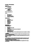
>To make standard deviation calculations as a measure of boy/girl height frquency distributions.
>To investigate in detail boy/girl height weight correlation, finding line of best fit equations, and spearmans rank correlation coefficient.
>To interpret my findings, as i go along bearing in mind my hypothesis, which i will state at the outset.
>To draw conclusions.
4. hypothesis
> I think that boys will be generally taller and heavier than girls.
> I think that There will be a moderate posotive correlation between height and weight for boys and girls.
>I dont think that there will be any link (in corelation) between IQ and pupil weight.
5. collecting data
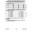
The data is secondary ( not primary because i would need to collect that myself) and is part of the whole mayfiled high school (with lots of fields) available on the internet.
This table shows the number of boys and girls for the two years in which I am interested in.
Since i am interested in gender, heights, weights, and IQ only, the remainder of the fields (except names) can be filtered out.
However this would still leave me with masses of data so in order to reduce this to a manageable style, i will take
sampler.
I will randomly pick samples from the spread sheet using the stratified random sample method. To avoid bids and ensure that pupils from different years and gender groups are equally represented.
My sample should be in excess of 109 to be realistic, but not so high, go to calculations too complex. I will comprimise 15%
which gets me the following numbers.
My sample data is as shown attached.
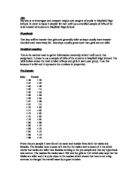
6. Representing data
The pie chart below shows the proportional breakdown of year 10 and 11 boys girls, based on.
I have decided to start by comparing boy/girl height. since height is a continuous variable i will need to produce tally tables with grouped class intervals for this purpose. I have chosen a class interval of _______________ which gives me ___________ groups.
Year 11 boy/girl comparison using frquency polygons
Personally Iprefer the frquency polygon comparison on the single graph, it shows an interesting __________ skew for the _________ data.
Another alternative presentation is to use a stem and leaf diagram.
This has the advantage of providing an accurate median ( ie middle) values.
I will compare year 10 and 11 boy heights using this technique.
Pie chart to show 56 of year 10 and 11 boys and girls.
Finally i will put this stem and leaf data into a back to back population pyramid.
This shows the height shift over the year for the sample data. as a distrobution- and indicates an average increase of around_________ over the year.
7. Interior Analysis
My work to date has given me some usefull quantative calculation. as an initial boy/girl comparison, the results from section 6 can be summarised in the following table.
The table shows that-
The evidence from my sample suggest that (on all three averages) boys in years 10 and 11 at mayfield high are taller than girls, ie my first hypothesis has shown to be true.
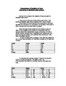
8. more detailed comparisons
I will extend my height comparison between year 10 and 11 boys and girls using box and whisker plots.
These show that median and inter quartile range plotted on a single axis. in order to find the IQR I need to extend my previous grouped frequency tables to include a cumulative frequency column.
The cumulative frequency curves are shown as the attached graphs. These predict proportions of pupils with height on a certain range, for instance my sample suggests that ________% of year 10 girls are smaller than _______, and ________% of year 11 boys are taller than ______.
Also they allow me to read of the median, lower quartile, upper quartile, and IQR form which i can draw my box and whisker diagram for comparison.
these show a possotive median shift for both boys and girls (which i would except unless they shrink) also, since a smaller IQR means more consistancy.
Another measure of data spread, this time with respect to the mean, is the standard deviation. First i need to work out the mean heights of each of my 4 sub groups, by adding the heights and deviding by the frquency of each.
6. Representing data (continued)
in order to better compare frequency distributions, i will now produce a histogram for years 10 and a frequency polygon for year 11 boy girl data.
In a histogram the area of the rectangles is proportional to frequency but, since my class intervals are equal, the height of the graph is proportional to are and frequency.
I have kept the class intervals equal for easier comparisons.
year 10 boy/girl comparison using histograms.
The formulas for standar deviation are-
I plan to use the second of these, since there are 56 samples to take into acount and this would be very time consuming using the first.
for ______ this shows a normal distrobution, in that less than 1% of the sample (none in my sample) lies outside of 35.1
8. more detailed comparison (continued)
I will further extend my investigation by testing my second hypothesis.(that taller pupils are heavier) the most sensible way to do this is to compare height and weight on a scatter graph.
I will draw two scatter graphs, one for year 10, and one for year 11.
These two graphs show a good possative linear
correlation between height and weight, which
backs up my second hypothesis. the lines of
best fit can be drawn, to pass as close as possible
to all parts- although there are exceptional values which fall outside the general trend.
Whilst i could find the predicted height form weigh or vice versa using my graphs, it might be simpler to have an equation.
Any straight line has an equation, Y=MX+C When C is the vertical axis intercept.
M is the gradient or shape of the line.
the equations of my lines are-
Boys H =MW+C
Girls H =MW+C
I can use these to make a prediction e.g for boys weight _______ height______
girls weight________ height______
at first glance it appears that _______ have better correlation, ie less offsets, from my lines of best fit.
however i would like to quantify this- using spearmans rank correlation coefficient. this will be ranged from 0 for correlation to 1 for points and straight line (perfect correlation)
To reduce my correlations on year 11 first boys I will eventually do for all sub sectors.
Boy name height-rank and weight-rank d d2
1
2
3
4
5
6
7
8
9
10
11
12
girls name height-rank and weight-rank d d2
1
2
3
4
5
6
7
8
9
10
11
12 This quantities my ''gut feeling'' since it shows boys with _____ correlation and girls with _____ correlation. (see statistics textbook page 176)