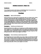
Year 8 Males:
Year 9 Females:
Year 9 Males:
Year 10 Females:
Year 10 Males:
Year 11 Females:
Year 11 Males:
Pilot Survey Questionnaire
The purpose of producing a questionnaire is to gather data about something, e.g. I need to collect information from the students at Mayfield High School so that I can test my hypotheses. By gathering this information I can compile the data and process it which can be used to make an analysis and a conclusion to prove if my hypotheses are correct or not. It is a form of field/primary research because I am collecting the information myself and am not doing it using the internet, newspapers, books, etc. There are two different methods of collecting data by questionnaires. These are: the interviewer asks questions and fills in a form and people are given a form to fill in themselves. If I choose to ask the questions myself then I can make sure that all the questions are correctly understood and if it is a house-to-house survey then I can return until the form is completed. Whereas, I have to ask the question in a way that does not influence the person answering the question or the answer itself which would make it unfair and biased and it is time-consuming and expensive. However, if I allow the people to fill in the from themselves then the advantages are that a larger amount of people can be questioned in a shorter amount of time, only a few people are required to distribute and collect the forms which is cheap and lastly the person filling in the survey has time to answer the questions in as much depth as they want and give it in by a reasonable deadline set. The disadvantages are that if the forms are posted, some of them may not be returned or they may get lost, and also there is no one to ask for advice if a question is not clear.
- What is your name?
- What Year group are you in?
- What height are you?
- What is your weight?
- How many hours of television do you watch a week?
Improvements
Firstly, I need to improve upon this Pilot Survey questionnaire by making the questions more detailed and by including more options to prevent them from being open-ended and making them closed. Also, if I include the units in the questions then the person being questioned knows exactly what to answer with and doesn’t become confused. For example, instead of simply asking “What is your height?” I can ask: “What is your height in metres?” Without this slight correction they may answer in centimetres, millimetres or feet. This ensures that the answers that I receive are relevant so they can be correctly analysed and so I can include it within my Coursework.
Final Survey
- What is your full name? …………………………………………………………..
- Which year group in Secondary school are you in? (Tick only ONE box)
Year 7 Year 8 Year 9 Year 10 Year 11
- What is your height in metres? (Please select only ONE option)
1.20 – 1.30 1.31 – 1.40 1.41 – 1.50 1.51 – 1.55 1.56 – 1.60
1.61 – 1.65 1.66 – 1.70 1.71 – 1.80 1.81 – 2.00 2.01 – 2.10
- What is your weight in kilograms (kg)? (Only select ONE preference)
35 – 40 41 – 45 46 – 50 51 – 55 56 – 60 61 – 65 66 – 70
71 – 75 76 – 80 81 – 85 86 – 90
- How many hours of television do you watch a week? (Please tick only ONE box)
Less than 5 5 – 10 11 – 20 21 – 30 31 – 40 41 – 50 51 – 60
61 – 70 71 – 80 81 – 90 Over 90
Hypothesis 1: Males are taller than females
My first hypothesis is that the male students on average will be taller than the female students. I believe this because in general males grow taller than females and grow until a later age, e.g. most males continue to grow until they are 21, whereas most females only grow until they are 18. The data that is required to test this Hypothesis is the heights of all years from 7-11 of both male and female students that attend Mayfield High School. This means that I will be using secondary data. I will first investigate this hypothesis by deciding whether my distribution is normal or skewed. I will use Grouped Frequency tables, Estimated Mean tables, Estimated Standard Deviation tables, Histograms and Box and Whisker plots to test this data.
Histograms
Grouped Frequency Table
Formula: Frequency Density = f/CW
Estimated Mean Table
Formula: Mean = Σfx = 190.75 = 1.6 (1d.p.)
Σf 119
Estimated Standard Deviation Table
Formula: S.D. = √ Σfx² – Mean² = √307.73 – 1.6² = 0.02 (2d.p.)
Σf 119
Observation of Histogram
From producing my Histogram I have discovered that the heights are normally distributed. It has a symmetrical distribution and no skew. This means that because the data is not skewed and I will not necessarily need to use other methods such as box and whisker plots to compare heights.
Grouped Frequency Table for Year 7 Females
Grouped Frequency Table for Year 7 Males
Grouped Frequency Table for Year 8 Females
Grouped Frequency Table for Year 8 Males
Grouped Frequency Table for Year 9 Females
Grouped Frequency Table for Year 9 Males
Grouped Frequency Table for Year 10 Females
Grouped Frequency Table for Year 10 Males
Grouped Frequency Table for Year 11 Females
Grouped Frequency Table for Year 11 Males
Summary Table of Box and Whisker Diagrams
Analysis of Box and Whisker Plot for Year 7
Year 7 Females:
Lower Quartile = 1.49m Median = 1.55m Upper Quartile = 1.6m Inter-Quartile Range = 0.11m
Year 7 Males:
Lower Quartile = 1.54m Median = 1.58m Upper Quartile = 1.62m Inter-Quartile Range = 0.08m
The median height for the males in year 7 was 3cm greater than that for the females. However, the Inter-Quartile Range for the females was 3cm greater than the males. These results suggest that my first hypothesis which was that males will be taller than females was incorrect for year 7. This is because the puberty effect is more evidence in females than males at an earlier age.
Analysis of Box and Whisker Plot for Year 8
Year 8 Females:
Lower Quartile = 1.51m Median = 1.58m Upper Quartile = 1.63m Inter-Quartile Range = 0.12m
Year 8 Males:
Lower Quartile = 1.54m Median = 1.61m Upper Quartile = 1.68m Inter-Quartile Range =0.14m
The median height for the males in year 8 was 3cm greater than that for the females. Also, the Inter-Quartile Range for the males was 2cm greater than the females. These results suggest that my first hypothesis which was that males will be taller than females was correct for year 8.
Analysis of Box and Whisker Plot for Year 9
Year 9 Females:
Lower Quartile = 1.58m Median = 1.61m Upper Quartile = 1.67m Inter-Quartile Range = 0.09m
Year 9 Males:
Lower Quartile = 1.55m Median = 1.59m Upper Quartile = 1.60m Inter-Quartile Range = 0.05m
The median height for the females in year 9 was 2cm greater than that for the females. Also, the Inter-Quartile Range for the females was 4cm greater than the females. These results suggest that my first hypothesis was incorrect for year 9 males and females as I predicted that the boys will be taller than the girls in my survey. This was proven wrong because on average the females are taller in height than the males in that year group.
Analysis of Box and Whisker Plot for Year 10
Year 10 Females:
Lower Quartile = 1.49m Median = 1.63m Upper Quartile = 1.71m Inter-Quartile Range = 0.22m
Year 10 Males:
Lower Quartile = 1.63m Median = 1.70m Upper Quartile = 1.80m Inter-Quartile Range = 0.17m
The median height for the males in year 10 was 7cm greater than that for the females. Although, the Inter-Quartile Range for the males was 5cm less than the females. These results suggest that my first hypothesis was correct for year 10 as the boys were taller than the females in that year.
Analysis of Box and Whisker Plot for Year 11
Year 11 Females:
Lower Quartile = 1.54m Median = 1.63m Upper Quartile = 1.69m Inter Quartile Range = 0.15m
Year 11 Males:
Lower Quartile = 1.59m Median = 1.73m Upper Quartile = 1.83m Inter Quartile Range = 0.23m
The median height for the males in year 11 was 10cm greater than that for the females. Also, the Inter-Quartile Range for the males was 8cm greater than the females. These results suggest that my first hypothesis was correct for year 11 as the average heights for males were taker than females.
Overall Conclusion for Hypothesis 1
My first hypothesis is that male students at Mayfield High School will on average be taller than females; albeit it is not correct for every year in my chosen sample of students. It was proven to be accurate for years 8, 10 and 11 but not true for year 7 and 9. The spread of the heights tends to suggest that the changes in teenagers due to puberty effects girls earlier than boys which means that my hypothesis is not completely true. However, for the majority of the years the males are taller in height than the females so my hypothesis is correct.
Calculating Spearman’s Rank Correlation Coefficient
Formula:
Key:
Table of correlation coefficients of scatter diagrams
Comments on Year 7 Females Scatter Diagram
In the Year 7 Females scatter diagram I found out that there was weak, no linear correlation of 0.34 (2d.p.) between their heights and weights. The line of best fit has an equation W = 18.389 H + 14.003. If a girl was 1.6m tall I would predict that her weight would be 18.389*1.6 + 14.003 = 43.4254m. The result shows that my second hypothesis that the taller you are the heavier you are may not be correct.
Comments on Year 7 Males Scatter Diagram
In the Year 7 Males scatter diagram I found out that there was a fairly strong, positive correlation of 0.65 (2d.p.) between their heights and weights. The line of best fit has an equation of W = 100 H – 109.33. If a boy was 1.6m tall I would predict that his weight would be 100*1.6 – 109.33 = 50.67m. The result shows that my second hypothesis that the taller you are the heavier you are may be correct.
Comments on Year 8 Females Scatter Diagram
In the Year 8 Females scatter diagram I found out that there was a very weak, negative correlation of 0.1 (2d.p.) between their heights and weights. The line of best fit has an equation of W = 34.052 H – 1.9533. If a girl was 1.6m tall I would predict that his weight would be 34.052*1.6 – 1.9533 = 52.5299m. The result shows that my second hypothesis that the taller you are the heavier you are may not be correct.
Comments on Year 8 Males Scatter Diagram
In the Year 8 Males scatter diagram I found out that there was a fairly weak, positive correlation of 0.54 (2d.p.) between their heights and weights. The line of best fit has an equation of W = 47.591 H - 30.518. If a boy was 1.6m I would predict that his weight would be 47.591*1.6 - 30.518 =.45.6276m. The result shows that my second hypothesis that the taller you are the heavier you are may not be correct. This is because my trend line shows that in general the shorter you are the heavier you are.
Comments on Year 9 Females Scatter Diagram
In the Year 9 Females scatter diagram I found out that there was a fairly weak, positive correlation of 0.5 (2d.p.) between their heights and weights. The line of best fit has an equation of W = 54.117 H – 38.848. If a girl was 1.6m I would predict that her weight would be 54.117*1.6 – 38.848 = 47.7392m. The result shows that my second hypothesis that the taller you are the heavier you are may be correct because my line of best fit shows this.
Comments on Year 9 Males Scatter Diagram
In the Year 9 Males scatter diagram I found out that there was weak, no liner correlation of 0.15 (2d.p.) between their heights and weights. The line of best fit has an equation of W = -2.8351 H + 58.951. If a boy was 1.6m tall I would predict that his weight would be -2.8351*1.6 + 58.951 = 54.41484m. The result shows that my second hypothesis that the taller you are the heavier you are may not be correct. This is because my trend line has a downward slope which shows that on average the shorter you are the heavier you are.
Comments on Year 10 Females Scatter Diagram
In the Year 10 Females scatter diagram I found out that there was a very weak, negative correlation of -0.07 (2d.p.) between their heights and weights. The line of best fit has an equation of W = -4.7263 H + 59.012. If a girl was 1.6m tall then I would predict her weight to be -4.7263*1.6 + 59.012 = 51.44992m. The result shows that my second hypothesis that the taller you are the heavier you are may not be correct. This is because the line of best fit has a downward gradient which suggests that on average the shorter you are the heavier you are.
Comments on Year 10 Males Scatter Diagram
In the Year 10 Males scatter diagram I found out that there was a very strong, no linear correlation of 0.46 (2d.p.) between their heights and weights. The line of best fit has an equation of W = 36.384 H + 0.5771. If a boy was 1.6m tall I would predict that his weight would be 36.384*1.6 + 0.5771 = 58.7915m. The result shows that my second hypothesis that the taller you are the heavier you are may be correct because the trend line has an upward gradient which emphasises this.
Comments on Year 11 Females Scatter Diagram
In the Year 11 Females scatter diagram I found out that there was a fairly strong, positive correlation of 0.68 (2d.p.) between their heights and weights. The line of best fit has an equation of W = 39.023 H – 17.166. If a girl was 1.6m tall then I would predict that her weight would be 39.023*1.6 – 17.166 = 45.2708m. The result shows that my second hypothesis that the taller you are the heavier you are may be correct because the trend line has a steep, upward gradient.
Comments on Year 11 Males Scatter Diagram
In the Year 11 Males scatter diagram I found out that there was an extremely strong, positive correlation of 0.97 (2d.p.) between the heights and the weights. The line of best fit has an equation of W = 83.183 H – 79.282. If a boy was 1.6m in height then I would predict that his weight to be 83.183*1.6 – 79.282 = 53.8108m. The result shows that my second hypothesis that the taller you are the heavier you are may be correct. This is because the line of best fit has a very steep, upward gradient which emphasises it.
Overall Conclusion for Hypothesis 2
The results from the table of correlation coefficients from the scatter diagrams supports my hypothesis that the taller you are the heavier you are. This is because there were five year groups that had positive correlation, whereas there were three with no linear correlation and two with negative correlation.
Hypothesis 3
The more TV you watch the larger your BMI (Body Mass Index)
In this section I will be calculating the BMI (Body mass index) of all of my samples, which I will use with number of TV hours watched to create scatter diagrams and work out Spearman’s Rank Correlation Co-efficient. Here are my samples with the extra column stated BMI.
Scatter Diagrams
After circling and removing inaccuracies, my scatter diagrams now look like this.
After doing this I will now work out Spearman’s Rank Correlation Co-efficient with only my 2nd version of my scatter diagrams.
From this data, my hypothesis is incorrect. The amount of TV that you watch does not affect a person’s BMI (Body Mass Index).