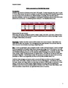
Scatter Diagram:
I will draw a scatter diagram to show the IQ against the KS2 SATS results, using tracing paper will help me compare easier since it’s on top. Using the scatter diagram I will be able to find the correlation in relation to my hypothesis. Since there is the mean on the tables above which shows the means of IQ and KS2 results I am able to find the mid-points of the scatter drawn on the graph and draw the line of best fit. With all this I can find the equation of the line using the formula ‘y=mx+c’.
Looking at the graph it supports my hypothesis. Since it is a positive correlation, it means that the higher the IQ the better the Ks2 results. A minority don’t support the hypothesis but the data may be inaccurate.
Since I have also found the equation of a line, I will test it to see if it works.
Formulas:
Year 8:
y=15x+40
Year 10:
This is just the first of my investigation. I will now go in depth to show that the next hypothesis is correct. I will draw more graphs so that I could have more to support my second hypothesis.
Hypothesis Two- “Year 10’s have a better Ks2 Results and higher IQ than Year”
Mean, Median & Mode of Grouped Data:
Grouped data is where data is divided into groups instead of having an individual category for each data.
An example would be:
50 < x ≤ 75
Instead of writing 50, 51, 52...etc. the ‘x’ represents all the numbers that fall into the group, which would be bigger than 50 but smaller of equal to 75. 65 would fit in the group.
To work out the mean you need to use a formula which is
∑fx f= frequency x=midpoint
∑f
To work out the median you need to find the ∑f and divide by 2. If the number is even then you add 1 before divided by 2.
The mode is simple; you just find the group with the highest frequency.
I am now going to find the mean, median and mode of the IQ and Ks2 results. To make it easier for my I am going group the data up.
Starting with Year 8 IQ:
Mean= 3040/30
= 101.3
Median= 30+1/2
= 31/2
= 15.5
Therefore the median would come between…
1+1=2
2+11=13 ← The number 15.5 lies in this so the median is…90 < x ≤ 100
13+12=25 ← This is too big so it isn’t the median.
Median Number lies within:
90 < x ≤ 100
Mode= 100 < x <110
Since it has the most occurring data within its group.
From this frequency table I have noticed that most year 8 IQ lies between
90 < x ≤ 100 and 100 < x ≤ 110. There are not many students with a low IQ but there are not very many students with a very high IQ either. This shows me that the students in year 8 have an average IQ for their age.
Year 10 IQ:
As you can see the totals end up being the same therefore everything should be the same.
Mean= 3040/30
= 101.3
Median= 30+1/2
= 31/2
= 15.5
Therefore the median would come between…
5+6=11 ← The number 15.5 lies in this so the median is…90 < x ≤ 100
11+14=25 ← This is too big so it isn’t the median.
Median Number lies within:
90 < x ≤ 100
Mode= 100 < x <110
Since it has the most occurring data within its group.
Looking at this table is shows that most year 10 IQ lies between 100 < x ≤ 110. Year 10’s don’t have a 70 < x ≤ 80 because there are no IQs that are under 80. The IQ for year 10s however are more evened out with more numbers on each category. This table shows me that nearly half of the years 10’s have an average IQ.
I am now going to do a frequency table for Ks2 results.
Year 8 Ks2 results:
Mean= 121.75/30
= 4.0583
Median= 30+1/2
= 31/2
= 15.5
Therefore the median would come between…
1+0=1
1+2=3
3+9=12 ← The number 15.5 lies in this so the median is…3.5 < x ≤ 4
12+8=20 ← This is too big so it isn’t the median.
Median Number lies within:
3.5 < x ≤ 4
Mode= 4.5 < x ≤ 5
Since it has the most occurring data within its group.
The table shows me that most year 8 Ks2 results lie in the average from 3.5 to 5. This tells me that year 8’s are fairly smart and done quite well in their SATs. There are not many year 8’s who got less than 3.5 because the majority got higher. This table tells me that 4.5 < x ≤ 5 has the highest frequency.
Year 10 Ks2 Results:
Mean= 102.75/30
= 3.425
Median= 30+1/2
= 31/2
= 15.5
Therefore the median would come between…
5+5=10 ← The number 15.5 lies in this so the median is…3 < x ≤ 3.5
10+6=16 ← This is too big so it isn’t the median.
Median Number lies within:
3 < x ≤ 3.5
Mode= 4.5 < x ≤ 5
Since it has the most occurring data within its group.
Looking at this table, the frequency is spread out. This means that the student’s intelligence spread evenly. Some are clever and some not so clever. The frequency gets higher slowly which means there are smarter people. This table tells me that 4.5 < x ≤ 5 got the highest frequency.
Comparison between Year 8 and 10 IQ:
Looking at both tables it shows that year 8 IQs lie around 90 < x ≤ 100 and 100 < x ≤ 110 whereas in year 10 most lie in 100 < x ≤ 110. Since most year 10’s are in 100 < x ≤ 110 this means that they are smarter because nearly half are in this group. Year 8’s however have less people in 80 < x ≤ 90 than the year 10 but no year 10’s got lower than 80 which meant that year 10’s had a higher IQ overall.
Comparison between Year 8 and year 10 Ks2 Results:
Year 8’s have a wider range of Ks2 results. They vary from the mean of 2 to 5 whereas year 10 has less, from 2.5 to 5. Since year 10 have less it means they should have better results but year 8’s have a higher frequency in the 4.5 < x ≤ 5 group which is the highest.
Looking at both results it shows me that the Year 10’s have a higher IQ and ks2 results. The range for year 10’s is much smaller than year 8’s on the ks2 results. Therefore linking with my hypothesis, it tells me that it is right.
I haven’t got enough to show that my hypothesis is correct just yet so I will now move on to cumulative frequency. This will help me further in my investigation.
Cumulative Frequency Tables:
Cumulative frequency is when you add up the frequency as you go along.
Eg.
The third row is the running total of the frequency.
On the Cumulative frequency graph, you will need to plot the Median, Lower and Upper Quartiles and the interquartile range.
Median= Halfway up.
To work out the median you find the number of students and divide by 2
LQ&UQ= ¼ and ¾ up the side and across.
To work out the LQ you divide the number of students by 4.
To work out the UQ you divide the number of students by 4 then multiply by 3.
IQ= The distance on the bottom scale between the lower and upper quartiles.
To work out the IQ you subtract the UQ from the LQ
A box plot will be drawn to show what the cumulative graph shows. It shows the lowest and highest value, Median and Lower and Upper Quartile.
I will now draw a cumulative frequency graph which shows Year 8 and 10 IQ and Ks2 results. This will help me gain evidence that my hypothesis is correct.
I will also draw a two way table using the tables and graphs above:
Comparing results of Year 8 & 10 IQ and Ks2 Results:
Using the Box plots below I will be able to compare my results that I got. I used the box plots because it is easier to see the difference.
IQ of Year 8 and 10:
Looking and both results of the IQ of year 8 and 10 I realised that year 10’s had a higher IQ than year 8’s with 99 to 97. Since the results are very close, it tells me that year 10’s are jus a little smarter. Either way year 10’s have a higher average of 99 so relating to my hypothesis, it tells me that I am right for the IQ.
Ks2 Results of Year 8 and 10:
Now onto my Ks2 results, looking at the graph it shows me that year 8’s have better ks2 results than year 10’s with the average or 3.9 to 3.7, whereas the lowest value of year 10 is higher than year 8. Which means that year 10’s have higher results since there is none that go below 2.5.
Together looking and both IQ and Ks2 results this graph tells me that my hypothesis is right, even though year 8 have a higher average, year 10’s lowest value is higher than year 8. Therefore it shows that my hypothesis is correct.
I now need to further my investigation more by adding Histograms and frequency polygons.
Histogram and Frequency Polygon:
A histogram is like a bar chart but the bars can be different widths, the bars also touch each other. A frequency polygon is when you draw lines from the top of each bar. The width of each column is in proportion to the size of the class or group of data it represents. The side of the y axis of the graph is the frequency density and the x axis is the scale.
I will compare the graphs on this page:
Year 8 and 10 IQ:
Looking at the graph I have noticed that year 8 has more spread out data than year 10. Even though year 8 IQ may have a higher frequency density, year 10 don’t have any under 0.4 whereas year 8 has 3. Knowing this, this tells me that year 10 have a higher IQ than year 8’s.
Year 8 and 10 Ks2 Results:
In these two graphs year 8 have a lot of high results whereas year 10 have a lower frequency of someone getting a low mark since there is no one getting below 2.5. In year 8 there is 1 person who got 2 for their results. Year 10 is more level compared to year 8 since their results are a big difference. Overall year 10 have a higher result with 4.8-55 being the highest whereas year 8, their highest is 3.6-4.
Overall the histogram and frequency polygon has showed me that my hypothesis is right because both shows that year 10 have a higher IQ and Ks2 results.
Standard Deviation:
The standard deviation measures the spread of the data about the mean value. It is useful in comparing sets of data, which may have the same mean but a different range.
The algebraic equation is:
The ‘n-1’ could be replaced by just n
X bar is the mean of x
N is the number of items
F=frequency
I will now use standard deviation to help me show that my hypothesis is correct.
Year 8:
Year 10:
Conclusion of Hypothesis 2:
Overall, I think that I have done enough to show that my hypothesis was correct. I am saying this because all my graphs support my hypothesis that Year 10’s have a higher IQ and better Ks2 results. I believe that my sample wasn’t large enough because there wasn’t enough data to plot my graphs and it was quite hard dealing with the shortage. Also if there was more data it would have been more accurate. If I were going to do the investigation again, the things I would do differently was to pick more data.
What I found out:
- There was a positive correlation, so that means that the higher the IQ, the better the
Ks2 results.
- The grouped data showed me that there was more year 10’s with a higher IQ than year 8’s and the same with Ks2 results.
- Cumulative frequency showed that Year 10 have a higher IQ and Ks2 median.
- The histogram and frequency polygon showed that also more year 10’s had a higher IQ and ks2 results.