I plotted a scatter graph of my findings and found out that there is a positive correlation between the age of a car and the amount of % the car value has decreased.
This shows that as the age of the car goes up the more percent is lost of its original value.
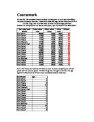
The next thing I tested was to see if the engine size and the mileage would effect the amount the car will lose, I recorded my results in the table,
To test to see if these have any effect on the overall percentage loss I had to compare them with the %loss column. I plotted them on a scatter graph to see if there was any correlation and I found out that there is a slight negative correlation between the %loss and the engine size, the bigger the engine the less money lost from the original price. I also plotted the mileage against the %loss and I found that there is a positive between the amount of miles done and the value that the car decreases.
From my research so far I have found out that the age and the mileage effects how much the car losses in value. The bigger the age or mileage the more the value is decreased in a second hand car.
After doing these scatter graphs I decided to test to see if the M.P.G (miles per gallon) would effect the price loss, to do this I had to work out the average M.P.G from a range of results.
I then plotted the average M.P.G against the %loss to see if there was any correlation between the two.
From the graph we an see that there isn’t much correlation between the average M.P.G and the % loss this means that the amount of miles a car does to the gallon doesn’t effect the price of a second hand car.
I also decided to test if the model of car had any effect on the second hand price as some cars may hold value better then others, this could be for many reasons such as the Ford Focus won awards and this may make it a more appealing car to buy. To do this I had to plot a bar graph of the average percentage price loss for a model as some models had more then other models in the data. For example, there are 4 Ford fiestas, so we add up each ones % loss and divide by 4 to get the average % loss for the all Ford fiesta.
From this bar chart we can see that the cars which hold there value the best are the Focus, Puma and Orion cars.
As well as this information I also have used some rough information to try different ideas out, I looked at if insurance groups affect the price loss, colour of car, number of owners and service history.
After looking at all this information I decided to put the %loss in a Cumulative frequency graph so I could eventually compare the Ford car company against another make, i.e. Vauxhall.
I put the information into a frequency table and then into a cumulative frequency table this is the results I came up with.
When plotting the cumulative frequency graph we can find out the medium % loss for the Ford company and not just one car, this an be compared with another company to find out which make holds its value the best and this will help use to find out if the make of a car affects its second hand price
This graph shows that the average % loss for a typical Ford car is 70%n and that the inter quartile range is 22; this is done by taking the lower quarter of the graph from the high quarter of the graph. This becomes useful when comparing as it allows us to see if a certain model of car keeps the value better then another. Another figure that is useful when comparing two makes of cars together is annual % loss as this can show which company losses the most % in value in each year.
From this table we can work out that an average Ford loses 15.07% each year and when compared to another car manufacturer we can see if Ford is a reason why cars lose value when it becomes second hand.